|
Re: A v y X S i g [The 3rd]
Link |
by
 on 2010-07-29 02:29:40 (edited 2010-07-29 04:35:04)
|
|
@Haseo: Well, your outcome turned out great so no worries. I just feel the light was just too bright but leaving it as it is would still be fine. I like the font you used, it suits the signature very well. The background by just looking at it is indeed hard to do. Great Job. I hope I could do one like that too XD Another set this time using Toyumi's tutorials XD   In the end, I decided to give it to someone close to me XD Hope she likes it XD EDIT Naru: Of course, I can make one for you but I cannot assure you I can do it so professionally XD You can have my icon if you want or you'd rather prefer me to make you one? GM-senpai: I'd rather call you that, I dont know why [Maybe thats what I call you in chat with Choco-senpai] XD Thanks for the comment. So, chaos was your theme this time. I love it but I think the black text in the bottom right was kinda out of place and the text in the upper left was totally packed. I mean you could put it in other places since there's a lot of space. Also, playing safe with the white color is wonderful, like mine XD  |
|
Re: A v y X S i g [The 3rd]
|
@Shae that's amazing, and I like what you did with the avy too :D can I has a BRS icon, if I may ask? The scratch tutorial's results. ↑ 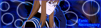 Another result of Toyumi's tutorials.  |
|
Re: A v y X S i g [The 3rd]
Link |
by
 on 2010-07-29 04:06:56 (edited 2010-07-30 03:33:52)
|
|
@naru that glow effect seems pretty nice on BRS.. cared to share some tut? :D @Shae that a nice background, thumbs up! anyway, new set   EDIT @provolution LOL, epic (i'd lol'd soo hard), anyway, thanks for the comment. Btw, those siggy look really NICE and NEAT, especially with the text. @ocean i expect nothing less from you, the siggy blend well with the background, and also the texture seems quite awesome (>.>)  |
|
Re: A v y X S i g [The 3rd]
Link |
by
|
|
i love that this thread is picking up again =) another set i did on request... lol i stared at the word purpose so long that i can barely read it properly anymore XD    blah i've been able to make less and less 'cause of packing up my room to get ready for university >_< (lol sorry for this novel XP) @Sayuri looking good,the colours turned out looking a bit muddy but other then that i like it =) It's hard to get colours not to bright yet not too muddy X_x and to answer your question before about getting the sig to get thinner at one end, i really didn't plan for it that way XD i used a layer mask at one point and i cut off the edges using grundge line brush set, which just happened to change the thick-ness. Whenever you want to change the shape of the sig, then just use a layer mask or a clipping mask, and then you can get all sorts of effects using different brush sets or even filters on the mask layer, PG's tutorial i find shows you how to use them realy well @GM The green one looks really nice, i would move the text up just a tiny bit though as for the white one, its a bit bright again... also the text was nicely incorperated into the sig but a bit hard to read nice work as alwasy though ^_^ @Naru try editing your posts rather then posting again, there is a 5 post rule here. For the three sigs before, you did a nice job blending the render with the background, the text however needs a bit more. Also i think moving you text more to the center of the rectangle-box-thing would look a bit better For the two newer ones, you really did an excellent job on the black rock shooter one i have no complaints XD for the second one the render doesn't really blend with the rest of the sig >_> that may just be my dislike for putting stroke around anything but text and borders. Try using outer glow or you could try this method i sorta discovered by accident and have used in pretty much all of my more rencent sigs. Ctrl+J the render, use filter->pixelate->fragment, move it below your main render and then set that layer to screen, overlay etc... both ways create a softer glow around the render which allow it to stand out yet still blend with the rest of the sig @Haseo your sigs are always pro, i wish i could make 'em like that >_< @Shae amazing! i have nothing to say about it! its really well done ^.^ edit: @PG i love the new set, like always its really awesome looking! I'm definitly going to try out that tutorial i don't think the word placing in the avy looks bad btw ^_^ edit 2: so heres a super rushed sig >_> took me less then 20 min to make and thus the lack in quality and size XD  edit 3: zomg this post is getting long @Toyumi lol i know that a lot of my sigs have been looking similar lately and thats because almost every request i have been getting is to make a sig in the same way as my current set =P personally i want to experiment more with vintage or vector styles if i could find the time >_> (currently planning a bunch of Soul Eater ones in those styles) I love that new set btw, the colours used are really pretty O_O (and the avy isn't bad so i wouldn't worry about it XD). It may be my imagination but the text looks a bit off somehow... like it's all solid and dark while the rest of the sig is soft and blendy even with the squares 
 |
|
Re: A v y X S i g [The 3rd]
Link |
by
|
|
_______________________________________________________ _______________________________________________________  / -")  -- My Avatar X Signature Shop is currently [CLOSED] -- Check my profile for more information Links : Any Indonesian, Here! | Avy X Sig | My tutorial thread |


|
Re: A v y X S i g [The 3rd]
Link |
by
 on 2010-07-29 19:37:24 (edited 2010-07-31 12:18:24)
|
|
Hello! I recently applied to join and was accepted in so I guess I should start posting here @ PG- Really nice set! Separate they're a bit small, but both of them put together looks nice. @ Ocean- Your 'Purpose' set is very nice! I like it better without the square effects, but that's probably because a lot of your sigs recently have been using that sort of style. Maybe you could try switching it up a bit? But the avy is really nice! (I'm not very good with avys...) And with your second sig, it's nice but you are right about it lacking in size (I don't see a problem with the quality of it, it's only the size that bugs me since it's so small). @ GM- With your 'Chaos' set, Ocean's right about the text being hard to read. And you also spelled middle wrong (It says 'Midlle'). XD And with the avy for that set, it's very good, but the one thing I don't like is how it's empty towards the left side, but making it smaller will easily take care of that. XD And I love your 'Future' set! Its very nice, and I don't see a problem with anything (I think the text is fine). @ Naru- Your scratched BRS sig is very nice, I like it a lot! But with your sig based on my tut, the background just seems a bit... Weird. I don't know why, it just does. With the 'Orin' sig, the only thing that bothers me is how the color of the rectangle area around the text doesn't match with the border color, but other than that it's nice! And same with your 'Flawed Fate' sig, I don't like how the rectangle area doesn't match the border but other than that its nice. And your 'Harmony' sig is very nice too! @ Shae- I really like that set! It's very nice, and I don't see any problems with it. @ Haseo- Very nice sig! I've experimented with sprites before, and you're right, they are hard. But you did a very nice job with this sig! @ Sayuri- I already commented about this sig in Renma's tut thread, so I'm not going to repeat my comments. XD @ Zero- The sigs are all nice, but the thing that bothers me is how they all hardly have any background (Except for your 'Cold Beauty' sig). Like with your Izaya sig, it just seems like an image of Izaya with the 'Keep out' border and some text. Oh, and I volunteered to help out with the club by making the first post nicer (I already got permission from Renma for this), putting some nicer HTML there and maybe making a CSS for it as well (Maybe, depends on how time consuming the CSS part is, but I'll definitely do the HTML). Just wanted to let you all know that it'll be updated soon. Also, any comments on my current set? I know the avy isn't too good, but anything other than that?   Okay, now that's the end of my long post. XD [Edit] @ Zero- That's really good with Gimp. Although I do have to agree with Shae, the text doesn't seem right, but I have a problem with the "Konoha's Will" part. It doesn't match the font that's used for the Zero in the corner, and the font doesn't seem to fit either. The font for the Zero in the corner seems to fit with the sig, so if you had them as the same type of font it would look better. (But then again, I have to work on font and text stuffs as well) XD @ Shae- I sent 5 sets to try out, but I think that might have been overdoing it. Plus I sent the link to my tut. And you can always ask me for comments! I don't mind it, I always ask others about my sets too The Gumi icon and sig both look very nice! The only complaint I have is that the sig doesn't have any text in it, but other than that I like it a a lot! Your in your 'Pink and Yellow' sig, the render pixel-ish for some reason, and I don't really like the black and red part behind the render. It seems like you overdid it with the effects in that sig. And with your BRS icon, the lens flare in the top right corner seems too bright, making it not as noticeable might help. Other than that it looks nice!  |
|
Re: A v y X S i g [The 3rd]
Link |
by
 on 2010-07-30 16:44:30 (edited 2010-07-30 16:45:12)
|
|
@Toyumi, Nice a lot less chaotic than many of your previous sets. Still you should try to edit your font a bit, I know how you like your font plain and such, but I suggest you experiment around a little with the font to bring out your sets. By using the mode layer for the font, sometime when I do my font I would set the layer mode to value or Grain merge for my fonts. well here is another set I did, my newest one.   I might even make a tutorial out of this sig. XD Anyway please comment.  |
|
Re: A v y X S i g [The 3rd]
Link |
by
on 2010-07-30 22:49:30 (edited 2010-08-01 06:02:42)
|
|
@Toyumi: I've heard you got accepted as an official member in this thread. Congratulations. I've been here a lot lately but still I'm not yet a member. If I may ask, how many sets did you send? I'm thinking of repeating my application since my previous sets are not that good. I hope this time I get admitted like you. If you can help me, please do. I will ask for comments regarding my sigs from you from time to time THANKS XD Regarding your current signature, in totality it looks great but pay more attention to the text as Zero said. As for the rest, no problem. I love your sets XD @Zero: You used GIMP, right? I'm kinda jealous. You make good sets with it but as for me, I can't do a single set using GIMP. Thumbs Up. For the signature, the text Zero is kinda misplaced for my taste. Its way too close to the border, maybe try to place it further next time. But the effect behind it was really good and I guess its really meant to blend the text to the whole signature. Nice move then. Anyways, it still is great! @Naru: I did all what I can do for the icon and I came up with this. I had the hardest time on the text but something is still missing and not right (I can't figure it out though). Anyway, you still want to keep it? I can make revisions if you want, just tell me so XD Sorry for the late reply XD    @Sayuri: I ended up doing a signature too XD I forgot that it was an icon. Hope you like. If you want any changes please tell me so XD COMMENTS APPRECIATED! @Toyumi: I intended not to put a text in it, really XD As for the BRS Icon, I felt like it should stay that way but thanks for the comment. Last but not the least, "Yellow and Pink" I'm just experimenting with the C4Ds I got which was originally red and black. When I did Hue/Saturation it ended up that way, and I use some splatter brush on one of the clipping mask where in one point it ended up staying the same color and in one point having the color yellow and pink. So I just let it be like that XD I used sharpen on the render and the horizontal scanlines added in making the render pixelated. I'm gonna work in this one though. But Yellow, Pink, Black and Red blends well in my view XD @Yuki: Well, thank you for the comments. You really did great with those previous signatures too, I must admit XD Not all signatures require those complicated fonts, some are just better off with plain ones. The signature itself is complicated so I let the text stay plain. Besides I want to have the emphasis on the signature and background not on the text XD Regarding your current signature, to tell you the truth I like your Lily signature better. Try adding borders into it ^^ For me that usually sees signatures in 350px to 400px, I can't really comment about this one except for the text too XD You should have place it higher and not too close to the corner. And that's it! Continue doing great signatures! Oh wait for the avatar, you should have used a smaller size for it since you only used a portion of it to insert the text "Yuki" or maybe placed the text something in the middle of the background. Also, the stokes (I'm not pretty sure if its strokes but anyway) for the text do not blend too well try using other colors or maybe outer glow would do better than strokes ^^ Edit Again! >.< I really like this thread a lot! Ocean: For the Gumi signature, to tell you the truth I can't decide on what text to put so I just left it like that. Also, I experimented on the fonts I will use once Sayu sees this but to no luck I cant find the right text. So I find the best solution (leave it blank) For the BRS Icon, I made it for Naru but when I asked him he didn't want any changes so I just left it like that again. And, BTW are you already a member of this thread? I'm so jealous to those who made it to the list. You see, I sent my application long ago but I guess I didn't get accepted. It was just now that I get this skills in Photoshop so I guess I'll try again. Thanks for the comment. For your signature, I have no complains. I just want to ask you why is it that the lower right edge is the only round? Besides that, simple is great I say! My post ended up super long >< Why does nobody post that often here? |
|
Re: A v y X S i g [The 3rd]
Link |
by
 on 2010-08-01 04:21:05
 |
|
hello Im back again ;D Thanks for the comments everyone i appreciate it.. I guess i shouldnt think too lowly of myself XD ok here's my recent sig  please do comment XD I shall send the application form when i get better at photoshop so i'll be an outsider for a while @Shae all of those look soo good *o* i just love your Gumi sig and icon ;D but i have to say the vocaloid Lily one the font is a bit plain.. just my opinion though >.< the rest they're awesome >3 @zero you did that in gimp? O_O super special awesome O: @Tokumi very nice, I like it ;P but i have to agreed with Zero and Shae with the font XD |


|
Re: A v y X S i g [The 3rd]
Link |
by
|
|
@Zero i like it ^_^ like shae says though, the font on "zero" should be a bit more centered vertically @Shae (sorry it got soo long XD) Im going to repeat what toyumi said about the BRS icon, the little flare thing in the right top corner is taking all the focus from the main image because its so much brighter then the rest of it. For the green one, i like both the icon and the sig =P perhaps you could go in and add text since the right side does look a little lonely. finally for the yellow and pink one, i really like the colours used ^_^ i would recomend though to use a gradient map to help tone down the brightness a bit. The scanline problem is one I have had before XD try erasing the scanline layer around the render to remove that pixel-y look Looking good though! ^_^ (and i think you could have gotten in the club a while ago since your stuff has been pretty good since you started posting =P when i got in, it was with my first sigs (seen here) and one really bad avy XD) @Yuki NATSUNO! lmao i did a sig with that pic a while back before the anime started airing XD I like the glowy effects you have going on there. I think i would add a border to it just to give it a more finished feel Finally, i had some time to make a set, tried to keep it simple (like the vampire knight ones i did a bit ago)   Also made a stein one... NEVER AGAIN will i try to draw a background with a laptop touchpad thing -__-   edit: @Shae yup i've been a member since june-ish. And perhaps your message wasn't seen before? anywho you're sure to get in XD and the one corners round for a very very very good reason... i was bored and thus decided to add in a layer mask somehow XD also if you look back at the old threads, there were posts by many people being made every day o_O seems like many of 'em just stopped posting >_> heck even within the month-ish that i've been here, there have been a lot less postings going on T_T
|
|
Re: A v y X S i g [The 3rd]
Link |
by
|
|
@__________________@ since there is too many to reply to... I'll reply to Shae's first and then edit this later and say my replies to everyone else later. Shae: Thanks so much for the Gumi Icon plus sig XD As for the text I really don't mind what type of text you want to use or what you want the sig to say. anything is fine with me. Oh and one more thing, is it okay if I ask for an avy to go with that? |
|
Re: A v y X S i g [The 3rd]
|
|
*ahem* Now then. /straightens shirt /cracks knuckles /gets comfy @Toyumi I know the BRS sig looks weird 'caused I failed a step ;n; but thanks for the comments! Your sigs are amazing and I can't say how good they are. But the squares on the current one, can you tone 'em down juuuust a smidge? :D @Zero I think I already commented on your sig in chat. Make the render more visible and the text in the corner seems out of place and out of color. The squares aren't really needed either. @Shae o: holy smudge. I like the icon, I really do. But a small revision, a quote actually. "I want to protect you." can you somehow fit that in? :3 @Yuki I like the sig, it's nice, but there are kinda too many dots, and it throws off the render. @Ocean Hm. The Stein sig is good, but the white brushes don't look they have a place in the sig, maybe it's me. But both sigs are good. Meanwhile...     |
|
Re: A v y X S i g [The 3rd]
Link |
by
 |
|
@Naru-chama The poster edges filter indeed is nice to make the render look more artistic. I tested it and I would recommend duplicating a layer, poster edge filter it and set it to soft light/any other blending options which appeals to you if you do not want the effect to be too strong :D |
|
Re: A v y X S i g [The 3rd]
Link |
by
on 2010-08-02 09:46:25 (edited 2010-08-03 16:28:38)
|
ahh.. i'm back, with my new sig of course! @naru wow, a few siggy.. i dunno how to comment those, but they seems gorgeous, especially in the color selection [EDIT] OMG!, typo again?! LOL btw.. i'd make a new one  |
|
Re: A v y X S i g [The 3rd]
Link |
by
on 2010-08-02 09:57:30 (edited 2010-08-04 14:06:08)
|
|
@ Yuki- The sig is very nice, but like what Ocean said adding a border would make it seem more finished. Also, in the lower left corner there's this yellow-ish red-ish that seems like it doesn't belong there. But other than that it's very good! @ Ocean- Your 'Perfection' set is awesome! I love it! Your 'Insanity' set is really nice, especially the background! The only thing that bugs me is the text in the sig, since the i, s, and a of "Insanity" is a bit hard to read. Other than that, it's very nice! @ Naru- Your first sig is really nice, but in the second one the render seems too pixel-ish and the background seems too red and kind of lacking because of all the red. The third one is really nice, I would have just made it a bit smaller. And the fourth one is very nice as well! And I'm flattered that you like my sigs so much! It means a lot to me! ^^ @ GM- Your sig is nice, the background and the lighting especially, although I sense another typo (It's cheerful, not cheerfull). XD [Edit] @ Anke- I'll take your request! @ GM- Your "Leave the Past Behind" sig is very nice! I like it a lot! (And no typos! XD) @ Ocean- No problem! And for your resound sig, the render doesn't seem too good (like it seems to be low quality), other than that it's good, but I would try to use something with higher quality. And your "Suspicion" sig is very nice! I love it! The colors are nice, and so are the effects! @ Zero- Nice sig, but I would have to agree with Shae about using a different font color for it. @ Shae- I plan on making another tut... Sometime. It might be awhile. XD Your "My Playmate" sig is good, but the render used seems really bright (but that could just be me) and the font used for the Shae part doesn't seem to go with the sig. Other than that, it's nice. And your "Fate" sig is very nice as well, the font seems to fit and it looks good... But I think I see a typo (where it should say "will" it says "wll"). XD [Edit 2] Moved this to my next post here |
|
Re: A v y X S i g [The 3rd]
Link |
by
|
|
@Naru the white brush strokes were acually from a stiches and sutures brush pack thingy.. deviantart would let me download the one i wanted so i was stuck with using this blurry weird one XD as for your sigs, they are all really nice but, like toyumi said, the second one is a bit pixel-y and red and the third one is a bit long @GM looking good ^_^ the lighting is really well placed but i personally prefer to make it not too bright since the original render can get lost in it other then that keep up the good work @toyumi thanks XD for the insanity one i'll fix that text problem for when i use it ^_^ im glad you pointed it out annd finally, i made a new sig using a tutorial by Dfly i found =P unfortunatly the render i chose was horrible so i had to spend forever editing it o_O  i seem to have failed at adding vector curves in the background >_> Edit: @zero it looks stretched? i used used the % thingy in tranformations to scale it this time and i made sure both the height and width were at 20% >_< perhaps its just the way the render's positioned? Anywhoo as for you sig, the background looks really nicely done, the font itself is ok but what bugs me is the blue outer glow... idk it doesn't fit the rest of the colour scheme you have going on there which is a warmer one. @Shae really great sig yet again! The pipes and stuff create a cool effect on the left side of the sig but then the other side of the render theres that spring pattern... perhaps either reducing the opactiy or using a simple gradient would have worked best there since you don't want it to stand out too much and get too busy... i still really like that sig, its really well done. as for the second one the only things off with it is the pattern overlayed on the render and the text on the arm. For the pattern, try erasing the part over the render to help keep the image clear and focused. For the text, it competes for the focal point since its so contrasted with the white its on...Another good sig though, I like the texture in the background =P and trust me, i doubt you'll get turned down if you submit an application now XD and thanks for your compliments XP i'm still not as good as the vetran sig makers (the majority of which seemed to have disappeared >_>) oh! and the background of the insanity sig... lets just say it took a whole heck of a lot of patience drawing it in DX on another note, i found a tutorial on deviantart that i thought was a good refresher for how to choose renders, how to place 'em, choosing colours etc. here I reccomend it to anyone who hasn't had visual art lessons at one point or who is a bit removed from them (like me XD) edit 2: moved this to new post... Edit 3: I'll take anke's request since i have nothing better to do >_< request filled on new post
|
|
Re: A v y X S i g [The 3rd]
Link |
by
on 2010-08-02 19:44:34 (edited 2010-08-04 11:33:51)
|
|
@Ocean, nice sig however why does the render look stretched or something, have you anchor both width and height of the render before you scale it? @GM awesome sigs as always, the only thing I don't like is the rectangle boxes that's all. @naru: Nice, you are getting a lot better than before, but try to not overdo it with the scale lines, they are nice and all but sometime they are not necessary for the whole sig. Perhaps you should have the background only in scale line where the render is not. It might look better that way. Well this is just my opinion. Well here is a set I did for the tutorial I just recently made, it is based similar to PG's style but made in GIMP. Check it out XD  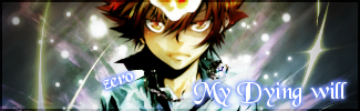 The one on the right is the complete version before I turn it into the one on the left. I know choosing the type of font is not my strong points, just don't have that much space in my hard drive, but I will try to download a few new ones if I have time.  @OOC: I will be on hiatus for a week starting this saturday. Just to let you all know. I'll take anke's request EDIT K here you go Anke, your set is done. Hope you like it.  http://i221.photobucket.com/albums/dd88/ZeroKnight_0/Ankesig.png  http://i221.photobucket.com/albums/dd88/ZeroKnight_0/ankeavi.png |
|
Re: A v y X S i g [The 3rd]
Link |
by
on 2010-08-02 23:18:26 (edited 2010-08-03 05:50:03)
|
|
Yay! I won't edit my last post anymore. New post! Naru --Nice Siggies! I particularly liked the first one XD Love Pink! And I have the same comment as Toyumi for the second signature. Keep it up! And BTW, I'm in the process of modifying the icon. Hope I can give it to you by tomorrow XD GM-senpai --Its suppose to be "cheerful" but even with the typo, it still is great and it doesn't seem too obvious BTW Toyumi --Your tutorial is indeed helpful. I'll be waiting for the new ones from you XD Ocean --I have no complains in your signature but rather I idolize them XD I super liked the signature INSANITY. The background looks like a sewed cloth which I don't know how you've done it! And you blend the text very well, not only with this one but all the others! And BTW, I think I'll wait till I made enough good signatures until I submit another app. I'll try my best not to be turned down this time. I'm gonna be an shadow member until then XD Sayuri --I'm gonna try my best to find a text which fits the signature I made. Since its you, I'll also try to make it super special XD Zero --Nice effect! But I'm afraid I would suggest you to find another font color or font for it. Anyways, result of another experiment by me!  And this one I made for another user a week ago, I think XD  |
|
Re: A v y X S i g [The 3rd]
Link |
by
 on 2010-08-04 10:32:50
 |
|
Hello All! I would do this myself, as I said last time, but since I don't have photoshop on my computer at the moment, it would be a little hard to do much of anything. So if you wouldn't mind making me a set using this picture:  All it needs to say is Anke and the sig can say "Undying Heart" I really appreciated it! Haha, I know I just asked for one, but "summer love" doesn't really apply to me anymore >.> xD ~Thanks again!!!! Anke  |
|
Re: A v y X S i g [The 3rd]
Link |
by
|
|
just for Anke, i'm going to purposely break the 5 post rule >_> not enough people are posting here anyways >_< also someone needs to shoot me if i try to do everything from scratch again T_T its eating my time but im too lazy to find stock images DX anywhoo heres your request (click for links)   just tell me if you want anything changed at all ^_^ edit: tried a c4d sig out after running away from them for soo long >_< ... took longer then i thought it would DX  any comments/suggestions on either of the sigs? its my first time using C4D's like this @__@ errrmmm zero... did you see me taking the request at the bottom of my last post? cause when i did, i checked through all the posts to make sure no one else had taken it... and that was like 2-3 ish hours ago I checked the date modified on the original pic i saved and it was about 2 hours and 50-ish minutes ago that i took her request (now 1:35 gendou time as im writing this) edit: @Toyumi Gah really? >_< i have a feeling we took it at about the same time this would be a lot easier without that evil 5 post rule DX i'm going to petition that it be changed to either a 3 or at least 4 post rule... i can understand a 5 post one being practical when a lot of people are posting frequently but there really isn't very much being made T_T And if this can't be changed then at it should be allowed to make a new post if you are taking a request (easier on the requester and the requestee) and thanks for the comments =P i agree that the render i used in the resound one was too low quality
|