|
Re: Renma & Toyumi Signature Tuts |UPDATED 31/07/2012|
Link |
by
|
i'm not i'm running windows xp. >.< gosh it sucks i am bad at these kinds of programs they are so confusing.  |
|
Re: Renma & Toyumi Signature Tuts |UPDATED 31/07/2012|
Link |
by
|
|
Thank you soo much for posting this! your awesome looking siggys has inspired me to try photoshop for the first time XD Tutorials were amazingly helpful however i have yet to make something big enough to use as a siggy >_> question, where do you get your renders from? i can never seem to find any good ones... edit: ok i sat down for a few hours and attempted the third tutorial result:  Edit 2: sat down for another few hours (yay for procrastinating ISU's ^_^) and attempted the 4th tutorial Result:  Edit 3: bordom came again (9 hour bus rides do that) so i made a few more....      hehe the forth tutorial is alot of fun to do so most of them i made using that one XD edit 4: made another one ^_^ man these things are fun  
 |
|
Re: Renma & Toyumi Signature Tuts |UPDATED 31/07/2012|
Link |
by
|
Alright here is my attempt at a Siggy. >.<   I tried really really hard. My newest attempts and efforts using GIMP:  Dark Magician Girl Attempt One-->  Dark Magician Girl Attempt One Modified a little -->  This one is an attempt that i made for you daddy cuz i love you sooooo much! -->  So i'm trying to improve on this and whatnot so yeah. ^^ |
|
Re: Renma & Toyumi Signature Tuts |UPDATED 31/07/2012|
Link |
by
 on 2010-06-09 14:36:51
 |
|
@Ocean: You're pretty good at this, you should consider joining AvyxSig and help out in the Claim thread! Dang those are good! One thing though, you "Reach" sig. I dunno what happened there, but that's WAY too BRIGHT, and WAY too CHAOTIC. I think you over-abused some lighting effects there. All the others are pretty good, but there's one thing, that almost none of them have: flow. Flow is pretty much what it means, the flow of the sig. You want you sig to "flow" directly to your focal. The focal being what you're trying to focus on. You can achieve flow bu using shapes, that literally flow, blur the background and sharpen the render, or use lighting effects. In my sig, I used a few of those: Shapes- as seen by the lines near the face, lighting- the two white soft brushes above and below him, sharpen- i sharpened my image and it made it more defined. You have a lot of potential, so keep at it! By the way, i really like your Izaya sig XD @Tifa: it looks like you're just doing random things without a desired outcome. Try and look up tutorials on deviantart and google buck make sure they're for GIMP and not photoshop, because GIMP has so less to offer than photoshop and some effects cannot be recreated. 

|
|
Re: Renma & Toyumi Signature Tuts |UPDATED 31/07/2012|
Link |
by
|
|
@haseo I should be getting photoshop soon until then i have to scrap by with gimp so...gomen Using the school's photoshop this is my end result. -->  |
|
Re: Renma & Toyumi Signature Tuts |UPDATED 31/07/2012|
Link |
by
|
|
@ Haseo thanks for the feedback and awesome compliments ^_^ i'll try some of those tips you mentioned to help with the flow in my next siggy i agree that the reach one does look a bit... messed up o_O i shall try to re-work it a bit XD Edit: hmm i went through it and tried some stuff, toned down the lighting and added some adjustment layers 
|
|
Re: Renma & Toyumi Signature Tuts |UPDATED 31/07/2012|
Link |
by
 on 2010-07-07 01:43:17
 |
|
I was asked to make a signature.. I dont really know what to do soo.. In the end I made 3 tries.. I want to get some comments from you guys!! THANKS 1st TRY  2nd TRY  3rd TRY   |
|
Re: Renma & Toyumi Signature Tuts |UPDATED 31/07/2012|
Link |
by
 on 2010-07-07 05:32:03
 |
|
I like the second one though I hope you make the font color more visible choose a color that will contrast on the background color. I think it would be look better like that. |

|
Re: Renma & Toyumi Signature Tuts |UPDATED 31/07/2012|
Link |
by
 on 2010-07-07 15:52:24
 |
|
@ Shae- With your first try, it's nice but behind the "Mizore" there's a flower, which is a bit weird considering that the rest of the sig has snowflakes in it. Also, the background shouldn't be as blank as it is, try to spruce it up with brushes and c4d's (But don't go too overload on the brushes). With the second try, the background is nice up until the top left corner, where it just gets a bit plain. Also, there's this big white spot towards the center, which bothers me. If it's supposed to be the light source, try to make it less noticeable. Also, with the text for this sig try an outline in black, or putting some brush strokes or a box around the text and filling it with a color to make the text easier to read. And like the first one, sprucing up the background with c4d's would make it look better. With the third try, the background is nice, but the colors don't really go with the main image. Also, there's this weird lens flare in the top right corner, and it's out of place. Try putting it where it fits (which in this sig would be towards the left side). And like the background, the text also doesn't match the colors of the sig. And one problem with all three of the sigs is that the main focus of the sig should blend in with the rest of the sig. Just keep that in mind as well.  |
|
Re: Renma & Toyumi Signature Tuts |UPDATED 31/07/2012|
Link |
by
on 2010-07-07 21:53:25 |
|
Thanks for the comments guys, I'll try to apply those comments to my next sigs :) I'm really bad at colors, I need a lot of practice on that one, esp color combi, BTW, I have another 2 signatures I want you to comment on.. I made this a few weeks ago :)) THANKS again :)) 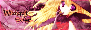  |
|
Re: Renma & Toyumi Signature Tuts |UPDATED 31/07/2012|
Link |
by
|
|
@ Shae I think everyone said what i would want to say for the first three, just need practice at getting everything to work together to make a single look. It's probably the hardest thing to do once you get how to use photoshop >_< However those 2 sigs that you posted show a big improvment! I quite like the first one ^_^ The second one i would think the text is a bit too blended in with the image, so i would use either a darker colour or other blending effect to make that stand out a bit more. Also the boarder used doesn't really suit the image so i would try changing it up >_> Good work though! ^.^
|
|
Re: Renma & Toyumi Signature Tuts |UPDATED 31/07/2012|
Link |
by
|
i haven't posted any of my work lately so i think i will. I've been fiddling around with photoshop trying to see what works and where everything is and these are some of my latestwork: <-- Sig I made for mah wifey Ember. <-- Sig I made for mah wifey Ember.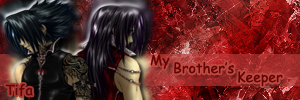 <--I was having an Uchiha Brother moment. XD <--I was having an Uchiha Brother moment. XD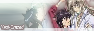 <--Yoai sig that i made for mah wifey Soosi. <--Yoai sig that i made for mah wifey Soosi. <--Naruto and Hinata Sig <--Naruto and Hinata Sig <--Mah favorite game. I love making Persona Sigs. ^_^ <--Mah favorite game. I love making Persona Sigs. ^_^ <--Another Persona Sig. ^_^ <--Another Persona Sig. ^_^ <--Tsukasa Sig(I know the render is blurry.) <--Tsukasa Sig(I know the render is blurry.) <--Shino Sig. <--Shino Sig.Yeah so that's what I've made so far. These are all experiments so yeah. I'm proud of what I'm able to do now so far. ^_^ |
|
Re: Renma & Toyumi Signature Tuts |UPDATED 31/07/2012|
Link |
by
on 2010-07-08 11:57:16 |
|
@ Shae- The first sig is really good, not much that can be improved in that except for lighting (Which I'm still working on too, it's easy but it requires patience). As for the second sig, Ocean is right, either use a darker color with the text or stoke it in a darker color for an outline. @ Tifa- Well, there's a lot there... I'll start from the top left one and work my way around. That one needs to have more effects in it, especially towards the top of the sig. Also, where the render is, that part doesn't blend into the sig. The Gaussian Blur around it is a start, but try experimenting with different layer modes and opacities for this part (Usually Soft Light or Overlay is best for this, but it really just depends on what you're trying to achieve with the sig). The text is pretty good in this one. For the sig at the top right, the background is really good. However, again with the render you have to make it blend in with the background. Also, with the text... The font used doesn't seem to fit with it. Try out different font types. For the sig 2nd from the top on the left, the background is really bland and it needs more effects. A lot more effects. Try vector brushes and c4d's, along with some gradients (But don't go overload on the brushes). Like the others, the area around the render also needs to blend in with the background more. For the one 2nd from the top on the right, this one is pretty good, except that it needs more effects towards the right side of the sig (In this case a c4d would be the easiest, but there are other options as well). Other than that, it's pretty good, the render for this blends in with the background nicely and the sig has a nice color combination. For the sig 2nd from the bottom on the left, I don't like that circle in the top left corner. It just looks like it doesn't belong. The color combination for the background also doesn't blend with the render, and the font doesn't seem to fit with this sig as well. This one also needs more effects in the spots where it is empty. For the sig 2nd from the bottom on the right, the color combination is nice, and the background is nice as well. My only complaint for this one is that the render doesn't blend nicely with the background. For the sig at the bottom left, the color combination is nice, but the background needs more effects. And like the most of the other sigs, the render needs to blend in with the rest of the sig. And for the sig at the bottom right, the color combination is nice. There are more effects in this background than th others with is good, but it could still use more. And for all of you sigs, try making a border on them (Just a border can make the sig seem more complete!). And with all of you sigs, try to make use of some lighting effects, like lens flare or even just putting in some gradients on different layer modes and opacities. Sorry that this seems like an essay (I have way too much time on my hands XD), but I just want to help out. |
|
Re: Renma & Toyumi Signature Tuts |UPDATED 31/07/2012|
Link |
by
|
|
Well i am still learning and thank you for your thoughts. i can't download much for ps since it is on my mom's computer so i'm doing the best i can for now with what i have. ^_^ |
|
Re: Renma & Toyumi Signature Tuts |UPDATED 31/07/2012|
Link |
by
|
|
@ Tifa I'm definitly seeing some imrpovements with your sigs ^_^ I think Toyumi said most of what i would want to say so i'll build up a bit on her advice Overall you need some more effects... I think using C4D's would really help. Try going on Deviant Art and searching for C4D in digital art. Download a pack that has a name like "______ effect pack" also downloading a bubble pack would also come in use. Resize and position them over your render (keeping light perspective in mind) and then set to colour dodge or screen and lower the opacity (as seen in renma's forth tutorial). Burst ones give you nice light rays and the bubble ones can give you texture for you background. You can also set them to different blending options to get a bunch of cool effects! don't be afraid to try stuff out so long as you don't go overboard Also some of your renders are looking a bit flat, like they've been rendered and pasted on with no adjustments. This is ok so long as the original scan is clear enough and has vibrant enough colours. Overwise try making copies of the render and setting them to different blending options, adjusting the opacity of each and earasing the parts that don't look good. I find an overlay layer at about 50-75% and earasing the parts that are too light or dark with a soft earaser set to about 50% opacity really makes a difference. use screen and multiply layers to lighten dark areas and darken light areas repectively (multiply brings out the shadows on skin tones well i find). Don't overdo these layers (as it can turn out with weirdly vivid colouring and everything too contrasted). Also you can try taking a soft brush (white) and brushing it onto a new layer on/near your render (again keeping light perspective in mind) and then setting the layer to soft light. See renma's second tutorial for a better lighting explanation! Colour wise i think your doing awesomely. The "Burn my Dread" one could use a bit of work though.... the lime green circle really stands out too much Finally i think emphasizing on what toyumi said about boarders is important. Even a thin low opacity boarder makes a huge difference. I like to use inner glow for them (since you can adjust the softness of the edges) but you can also use stroke. Bevel&Emboss can be used to make some cool boarders as well I'm pretty new to photoshop myself though so i'm not quite sure if everything i said is really correct as i've learned most of this through my own experimenting... Hopefully some of the vetran users will point it out if my adivce is shot XD also if you want to use gimp....i'm not quite sure the difference between gimp and photoshop.... I highly suggest you go and look up some gimp tutorials online (deviant art has a huge array of gimp stuff! like free brushes, scripts/plugins and tutorials). For Photoshop, i find the only thing that would come in use that you can download are brushes (again found on deviant art). They don't take up much storage on you computer so i don't think your mom would mind if you downloaded a few packs. If you can't then its still ok, all of the ones i made above are using just the basics that come with CS2.
|
|
Re: Renma & Toyumi Signature Tuts |UPDATED 31/07/2012|
Link |
by
on 2010-07-09 11:24:57 |
|
@ Ocean- No everything you said was correct (I'm also new when it comes to using Photoshop, but I can't find anything wrong with what you said). @ Tifa- I aslo agree with Ocean about going on deviantART for tutorials. Renma's and Provolution's tuts here are only the tip of all the things you can do with Photoshop or Gimp! And Ocean's right, brushes don't take up a lot of storage at all. All you need to do is unzip them (If they're in a zipped folder) and just put them where they belong (Just use Google for that part, I'm bad at explaining where brushes go since it goes into the Program Files and all that stuff. This part can get confusing.) And if you still can't download brushes, try searching "Brushless Sig Tuts" on deviantART. There are two that I found that seem very simple but also effective. |
|
Re: Renma & Toyumi Signature Tuts |UPDATED 31/07/2012|
Link |
by
on 2010-07-09 13:24:48 |
|
This should solve the problem for installing brushes. FOR GIMP: 1) Unzip the file if it's zipped (like Toyumi said) 2) Look through your GIMP folders until you find your Brushes folder 3) Go back to the brushes and copy it, then go back to the brushes folder and paste them. 4) Open up GIMP and your brushes should be there / if GIMP is already open, click the refresh button at the bottom of the layers/brush channel. FOR PHOTOSHOP: 1) Unzip the file if it's zipped (like Toyumi said) 2) Click the brush tool and look at the top of the program. You'll see "Brush: [the brush your'e using and its size and pixels will be here" Click the arrow next to it that's pointing down. A dropdown menu should appear. 3) All the way to the right of the dropdown menu there will be an arrow pointing to the right encased in a circle, click that. Another dropdown menu should appear. 4)Then from there, click load brushes. You will be prompted to find the .abr file. Find it, double click it, and your brushes will be loaded onto photoshop. *NOTE: In newer versions of GIMP, you can use both Photoshop brushes as well as GIMP brushes. But in Photoshop, you are only allowed to use .arb file brushes; no GIMP brushes.
|
|
Re: Renma & Toyumi Signature Tuts |UPDATED 31/07/2012|
Link |
by
|
|
@luv the ocean Actually the lime green cirlce is the moon from the game. lol i was trying to go for the game effect of what happens on the full moon. i tried to Incorperate Pharos in there as well since he is a big part of the game. ^^ @everyone else thank you so much for you help. i don't think i could have gotten this far without being inspired by all of you with your awesome signatures. I love you all you are awesome. ^^ ________________________________________________________________________________ here is a couple of sets that i made recently(i know a few things may be off but i think from my perspective they look pretty good overall): Ogihci Set:  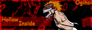 Samsonov Set:   < < |
|
Re: Renma & Toyumi Signature Tuts |UPDATED 31/07/2012|
Link |
by
|
|
@ Tifa Much better! ^_^ For whats off i can see only 4 things... 1) Try making the boarders a bit thinner. The hollow one is a bit better since you layered the render ontop of it but for the other one i would try to reduce it by a pixel or two 2) The background of the hollow one is a bit pixel-y so try to use a bigger image 3) Hollow-Ichigo sorta blends a bit too well into the background (i can't quite see his arm 'cause of the black-on-black XD)... Try using smudges, outer glow or stroke to make him stand out a bit (smudges usually work the best)... thats probably personal preference though 4) This may again just be personal preference but i think you should leave the sword uncovered for the second one. You can do this by either changing the text effects by reducing the stroke used and making it more transparent or moving it somewhere else (preferably below/above/beside the larger text). Edit: hmm toyumi is probably right with the no two texts in different spots XP Then moving it near the larger text would be a better idea. I also agree with toyumi at the text in the hollow one being mismatched with the tone of the whole siggy... something a bit less retro would fit in more Good job though! they are really looking a lot better =) Edit: @ Shae I like it! the colour combos are nice and the lighting is done really well ^_^ only thing is that those three boxes sorta disrupt the whole feel of the thing... I would try using something that will flow into the hair a bit better (like you did with your text) rather then cutting it off
|
|
Re: Renma & Toyumi Signature Tuts |UPDATED 31/07/2012|
Link |
by
on 2010-07-10 17:36:42 |
nee, how about this one?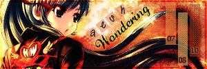 |