|
Re: Share Your Graphix II
Link |
by
|
|
@Suzaku the shame is that the icon wasn't made by me XD it was just drop off in the chat X3 |
|
Re: Share Your Graphix II
Link |
by
|
|
Any takers on the logo design? I've tried to make a few base designs but can't get it to look right. Here's a base for something I'm going to make for the Guest account on my computer. This is the non funny, basic welcome wallie. I should have the humorous wallie done tomorrow.^^  Ignore the white line, I need to edit that, but I'm too tired right now. |
|
Re: Share Your Graphix II
Link |
by
![[DA] ⤠devils-angel](http://img100.imageshack.us/img100/200/datar31.png) on 2007-09-02 20:59:25
on 2007-09-02 20:59:25 |
|
When do you need this design? I haven't used Photoshop in a LONG time, man. You shouldn't have that cute girl for guests. ^_~` I'm curious to see this comedy like wall that you're going to make. X3 
------- |
|
Re: Share Your Graphix II
Link |
by
  on 2007-09-03 11:01:57
 |
@Jon: I'd like to help you out there, but Im bad when it comes to making things from scratch... Good luck though. Maybe add something else to the lower right corner of the wallpaper... Idk, that space being blank bothers me or some reason. : / I've found this neat trick while I was trying to figure out how to do a little idea of mine: Love and Life:   Miko and Kei:   Yoko and Nikku:   Hopefully I can figure out the real trick I need... |
|
Re: Share Your Graphix II
|
|
|
|
Re: Share Your Graphix II
Link |
by
|
|
lol funny pic XD and png quality is way better ne? :3 |
|
Re: Share Your Graphix II
Link |
by
![[DA] ⤠devils-angel](http://img100.imageshack.us/img100/200/datar31.png) on 2007-09-04 12:46:24
on 2007-09-04 12:46:24 |
|
.png files are better when you want a transparent backgrounds. i think it also reduces file size as well. as you can see, it clears everything in the background, in comparison to the first image. nice stuff tod. i like those symbols. i was messing around with macromedia flash today in school when i was supposed to be doing a class assignment. man, flash is one cool program, but it costs a lot. crap, ALL adobe softwares are expensive. T-T` 
------- |
|
Re: Share Your Graphix II
Link |
by
  on 2007-09-09 15:14:41 (edited 2007-09-09 15:20:11)
|
|
Woohoo~ profile updated again (I get bored a lot xD) I can't decide whether to use the one with or without character/anime names...the one with it is more crowded (plus you can't read it really well anyway), but if i use the no name one then people might not know who they are xD With: 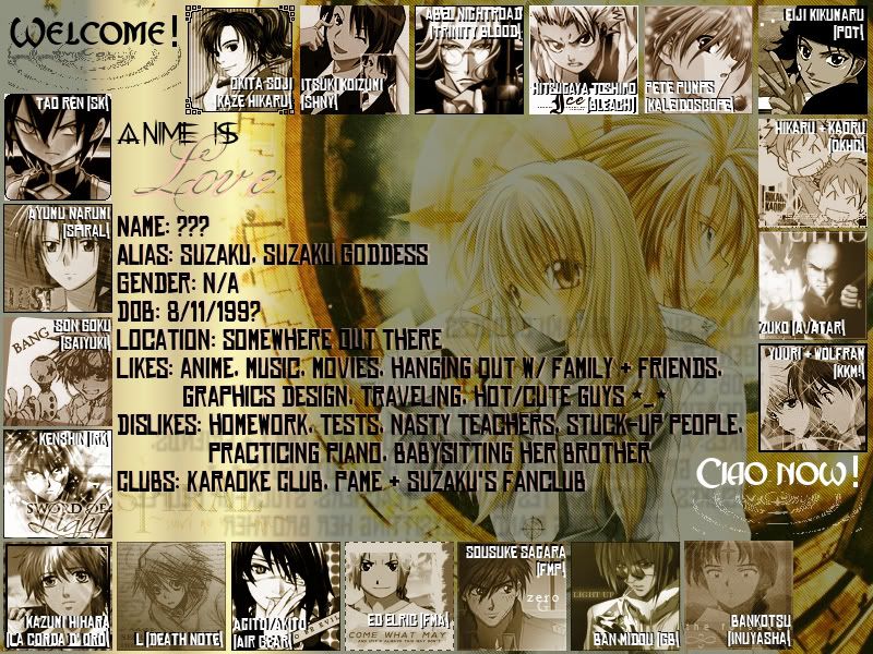 Without: 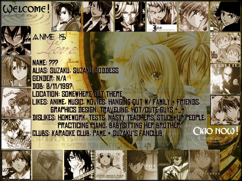 |
|
Re: Share Your Graphix II
Link |
by
![[DA] ⤠devils-angel](http://img100.imageshack.us/img100/200/datar31.png) on 2007-09-09 15:18:30
on 2007-09-09 15:18:30 |
|
why not use a different font? i like the second one better, with one reason being without the font. i learned this strange, yet pretty cool bubble technique last night. i might make some test thing later tonight or tomorrow since i need to get back into photoshop again... fast! 
------- |
|
Re: Share Your Graphix II
Link |
by
  on 2007-09-09 15:21:44
 |
|
so you like the one without the words? a different font...i dunno. it seems that no matter which font it is, it will still look crowded. so i guess i'll just leave it without words. a bubble technique? |
|
Re: Share Your Graphix II
Link |
by
|
|
buble tecnique? you mean the brushs? @suzaku i liked the one without the fonts too is cleaner... but it is sure awesome profile card :D and i did a request of profile card X3 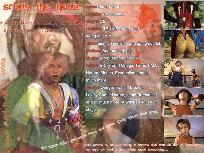 |
|
Re: Share Your Graphix II
Link |
by
  on 2007-09-09 15:34:29
 |
|
@ Dfly: Thanks :3 *uses the one w/o words* haha, i never thought of taking requests for profile cards. it's really nice!! do they just tell you what they want to be said on it, and you make it or something? |
|
Re: Share Your Graphix II
Link |
by
|
|
more or less in the end he sent everything the things he wanted write and the pic... i just "make it" X3 |
|
Re: Share Your Graphix II
Link |
by
![[DA] ⤠devils-angel](http://img100.imageshack.us/img100/200/datar31.png) on 2007-09-09 16:17:04 (edited 2007-09-09 16:20:10)
on 2007-09-09 16:17:04 (edited 2007-09-09 16:20:10)
|
|
in a few months, i'll create a new profile card for my profile. now about this bubble technique, i haven't mastered it yet since there's some issue with a filter i decide to use. but, i made an example here, but the file size is over 2 mbs (i had no clue). well i thumbnailed it, but it's almost perfect to the tutorial i learned off of: tell me what you guys think then. i made it as an "example", but it's one of those things you play around with to find out more. also, it depends on the image, how the bubbles turn out so that makes it even harder and more tricky. about the image i used, i didn't make the entire thing. you can sort of tell what i simply added to the image just... for random purposes. X3 [edit] yeah, it doesn't look much like bubbles since the filter is off. that's the major thing i need to try to figure out. >.<` 
------- |
|
Re: Share Your Graphix II
Link |
by
|
|
let me guess how it is done copy the imagem with a sferal copy and them paste it put in hard light mode in the layer and let it with 30% opacity. them paint it with hard light opacity low and erase part of it... just guess XDDD put it really is a cool tecnique with just this fill bubbles more bubbles would be a litlle too much |
|
Re: Share Your Graphix II
Link |
by
![[DA] ⤠devils-angel](http://img100.imageshack.us/img100/200/datar31.png) on 2007-09-09 16:33:44
on 2007-09-09 16:33:44 |
|
that's not really close. ^.^; and i saw a wallpaper where there was a single character standing near the center, with like, millions of bubbles surround him in the background. i'll keep working on the bubbles thing, and re-post another test-example. 
------- |
|
Re: Share Your Graphix II
Link |
by
  on 2007-09-09 16:41:56 (edited 2007-09-09 16:42:03)
|
|
Ohh, i see what you mean now. That looks really cool 8D <~ will probably take forever to figure that out :P |
|
Re: Share Your Graphix II
Link |
by
|
|
i would go crasy doing this DA! @_@ well coloring B&W manga it is alread insany for me XD |
|
Re: Share Your Graphix II
Link |
by
 on 2007-09-09 17:02:24
 |
|
Oh man~ There have been some amazing creations since I've been gone~ X3 I really like the second profile card for DF~ And that bubble technique is awesome dangel~ X3 Sadly, I don't have photoshop at the moment... soyeah~ DX |
|
Re: Share Your Graphix II
Link |
by
  on 2007-09-11 18:28:59
 |
|
I was bored...pretty simple thing xP It's a wallpaper, i guess (the full size is 800x1100) @ DA: how do you make it so that when you click it it goes to the full image?  |

