|
Re: A v y X S i g [The 3rd]
|
|
... :O Mang : thanks for the comments, dear :D i know what you mean on the "squary" thing. -w-d maybe you dont realize, but i used a soft pattern for the un-dodge square :D and colorburned dark green... i'll try it XD and once again, thanks XD ... OMG Sebastian XDDDDDD whoa. nice color and lighting there 8U i dunno what to say, but... i wonder, why the siggy didn't have a border like the avy? i think it's nice on the siggy too :3 LuvTheOcean : nice patterns dude. 8D absolutely love it. but maybe you can calm down your coloring? so it's more... like... natural -w-'d and 1 more, i like that you've done on DX's siggy. but... i think he/she wanted a siggy? :X Tummeh : nice work! XD for the 1st set, -maybe- it's better if you give a border on :D and for the 2nd set, i like the 2nd siggy with the effect on the 1st siggy. and i like the 1st avy :D Sayuri : hmm... what tutorial? 8D i wanna try that XD btw, maybe you have to balance the color between the border and the bg, or balance the weight of the border. it might looks better :D (i'm an amateur, so dont mind my comments deeply. >___>'a) Zero : quick change of style 83 i like your ciel siggy. :D nice work but... are you applying the same bg on that two siggy? :3 better if it's different on the Kira Yamato one, make it more "tech" -w-d |
|
Re: A v y X S i g [The 3rd]
Link |
by
 on 2010-07-01 14:27:46
 |
|
no tifa, but if you wish to have zero sig then I would be glad to make you another one. Anyway here is the sig or rather set you requested. The moving avi is still on work. But the sig is done.   |
|
Re: A v y X S i g [The 3rd]
Link |
by
|
|
I have finally stopped being lazy and i went scan-hunting. I found a huge stock of Hakuouki ones on minitokyo so i decided to make a series in which to practice lighting and render adjustments (instead of just pasting on the image like before >_<) i also had fun with some clipping masks ^.~ Edit 2: replace with the edited toned down ones. Added gradient masks and relayered the original image to make the colours not so in-your-face XD     comments or suggestions? @ Sayuri i like the siggy! i don't think you went overboard with the effects really. It turned out nice ^_^ Renma's tutorials are awesome-ly fun to do ne? Edit: @ Provoltion/PG thanks for the awesome comments ^_^ and srry about the whole complicated thing... even my art teacher scolds me for putting too much detail into everything i do >_< Its more of an obsession rather then style XD ah btw i love the tutorial! i've been wondering about the whole use behind the mask layer thing >_> @ Haseo hehe the choatic-ness, like i said for PG, is really a bad habit >_< i'll try to work on it for my next siggys. lighting wise, i'm only using brushed on white and black at low opacities set to soft light. Also i've been duplicating the render and setting it to different options and erasing parts to bring out colours more. I just thought that the images seemed sorta flat and dull without it, an example would be for my last siggy (original on left and adjusted on right)  the rest of the shading you see in the image in the siggy is from a motion blur i added in later XD if it really looks to crazy i'll try to tone it down in the future =P @ Emiya ack! i do overuse the colour dodge a bit.... or a lot XD i'll work on avoiding it for my next siggy -_- i need some sorta feature on photoshop that slaps me in the face if i set half the layers to colour dodge/burn Edit 3: ok i attempted to do a couple simpler, not as crazy colourful/lighting ones... and i think i sorta failed as i ended up going crazy with the overlay blending instead of the dodge DX curse my obsessive tendencies   |
|
Re: A v y X S i g [The 3rd]
Link |
by
|
|
_______________________________________________________ _______________________________________________________   -- My Avatar X Signature Shop is currently [CLOSED] -- Check my profile for more information Links : Any Indonesian, Here! | Avy X Sig | My tutorial thread |
|
Re: A v y X S i g [The 3rd]
Link |
by
![Haseo [Retired Moderator]](https://puu.sh/uQqet/eee7fc915b.png) on 2010-07-03 11:23:47
on 2010-07-03 11:23:47 |
|
Long time no post. @Sayuri: Since I already critiqued your first sig in chat, I'm going to critique the second one. I agree with PG, the edges are way to sharp whoch in turn made them grainy. What you can do to fix this, is go to edit, and if you just sharpened without doing anything else, about three commands down will be "fade sharpen". Now if you click that, A slider will come up. The farther you slide left, the farther the opacity will go down. @Ocean: here I am again, C&C'ing XD. All right, for starters, I'm going to agree with PG on this too: your sigs are really busy and effects can be achieved without so much chaos. Although my sigs used to be chaos so I know how that is XD; but, that might also be your style so I'll leave that to you. Also, you seem to go crazy with lighting effects. You don't need much light in a sig, you just need light to help the flow/depth onto your focal. As you can see on my sig right now, I brushed a soft brush behind his head. That added to the flow in the sig by attracting your attention on that spot. Another thing, if you're like me, you'll want to keep your lighting in perspective. On my sig, the perspective works. You can see how it looks like the light is shining on his back, but most of his body is shadowed because he's turning away from it. The render helped me because it was already shaded like that, but you can make your own shadows and shine areas with the dodge and burn tools if the render doesn't help you. Keep up the good work! @PG: Like I tell a lot of others, if I don't have any comments on something, you're in good shape. And that sig seems to be too since I don't have any comments. Also, if you don't mind, I could do a depth and clipping mask tutorial for your tips and basics section. PM me though, we don't want you breaking the 4-post rule do we now? XD Last but not least, any comments on the sig I'm using right now? |
|
Re: A v y X S i g [The 3rd]
Link |
by
 on 2010-07-03 23:08:54
 |
O_O So many sigs after I disappeared for some time. Anyways, some comments on the Starcraft 2 sig? I know this one's a bit messy though... Felt that the BG needs ton of fixing, especially on the left side of the sig.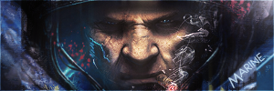 Learned the skill from a tutorial featuring Master Chief from Halo. Planned to remake this again when the time's right. @Haseo: Got some nice flow over the sig. Clean and simple ftw. @Provoltion (PG?): Interesting sets IMHO (with fitting texts below the images). But the color is a bit dull for me? @Luv the Ocean: The sigs reminded me of my older works btw, and is a bit hard on the eyes IMO. Perhaps decrease a bit of color dodging effects and bright colors? @Sayuri: Nice work from Renma's 3rd tutorial (better than mine xP). I love the first set (sig with the name Listen!), but the 2nd one (nurse render?) it is a bit grainy. Oversharpened I think? And it is a bit bright too...   |
|
Re: A v y X S i g [The 3rd]
|
|
just wanna say a thing to PG-sama. your tutorial is absolutely... AMAZING 83 but i dunno if i can make it on GIMP >____> |
|
Re: A v y X S i g [The 3rd]
Link |
by
 on 2010-07-06 13:25:51
 |
here is the zero sig that you requested. Sorry that it has yuuki cross in it, hope you don't mind. http://i221.photobucket.com/albums/dd88/ZeroKnight_0/tifa1sig.png @OOC: please comment on the sig I did for tifa.  |
|
Re: A v y X S i g [The 3rd]
Link |
by
|
Yay my favorite characters daddy!  |
|
Re: A v y X S i g [The 3rd]
Link |
by
|
|
PG: Yeah the reason why the edges are really sharp is because of the brightness I picked. I made it too bright so it came like that. Also I saw your tutorial, it looked awesome, so I tried it out... but then got last when it came to the black and white and yeah... Haseo: Like what I said to PG its because of the brightness, I'll tone it down next time though. Emiya: You made some tutorials as well? Can I see? Zero: It looks nice, but do you mean to say "Belief" instead of "Believe"? Tifa: You need to delete some of your posts because you already went over the 5 post limit. Here's a set I made for Nox (Fharis). I think I made the font a bit too dark on the avy, but not too quite sure. Then I just played around with the brushes a bit.   And here's a set I made for Tem. I particularly liked having nothing on this sig, just because of the flow of it.   So any comments or suggestions? |
|
Re: A v y X S i g [The 3rd]
Link |
by
 on 2010-07-06 19:10:02
 |
|
@sayuri; your sig, you kind of overdid it with the sharpness, also the font try having the border by 1px instead of 2 px. The first sig, you made the font stand out too much, your main focal is the render, right. I suggest you have the font not too big, also try blending the render with the background more. Well these are my opinion and advice. As for the background, you kind of overdid it a bit. I think it's just me that thinks it not sure what the other people thinks Yes my sig, the word is believe, like believing is betrayal. here is another sig I did, with my newest style the same one I did for the zero sig. Not sure but I think I overdid it with the background a little. Anyway please comment.   |
|
Re: A v y X S i g [The 3rd]
Link |
by
|
made another set... I don't like the text in this one so i'll probably go back and fix it >_>  Comments? @ Zero I agree with sayuri, i think it should be Belief instead of beleive but thats a small thing... more like an obsessive-ness with grammer XD also does zero looks a bit yellow? it may be the scan but i would recolour that a bit Other than that i think its awesome ^_^ The new sig you did is amazing O_O i like it a lot =P @ Sayuri =O nice job! (i wish i could make avys like that <_<) The text on the first one is sorta eating the focus though... maybe make it smaller or more transparent? Also the second one, since there is no text, you could shorten it a bit but thats entirely up to you. It's very pretty though, that background really suits the image ^.^ Edit: @ Haseo thanks for the advice again XD i changed my sig to a new version where i tried to fix it by darkening the left side and brightening the right side a bit (since i wanted the purple thing to stand out more) Not quite sure if that solved the flow problem though >_< Edit 2: Was requested to make a set by BTL (it turned out very pink XD)   another one i made...  yet another one i made (i keep putting circles around the faces >_<)  also made a avy to go with this one...    Any comments/suggestions? btw, I've been seeing this weird line show up when I smudge some of the renders that stays transparent no matter how much i try to smudge over it. Anyone know what it is and how to get rid of it? Edit 3 (more people need to post here so i can stop editing this one post) >_< @ Sayuri You're right about the text being hard to see! thanks for pointing that out (i fixed that up a bit) For your first sig, i think the colours work well together, but i don't think it should just stop near the render >_> For the second sig the text is again eating the focus a bit, try using different effects on the text to get it to blend in a bit with the background For the third sig the text is a bit better but could be a bit smaller? Overall very nice ^_^ i'm still super jealous of your avys >_< |
|
Re: A v y X S i g [The 3rd]
Link |
by
![Haseo [Retired Moderator]](https://puu.sh/uQqet/eee7fc915b.png) on 2010-07-06 19:51:36
on 2010-07-06 19:51:36 |
|
@All: Remember, there is a post rule. In the past few pages, it has been broken a number of times and once again on this page. Take note of the 5 post rule please and adhere to its conditions. @Ocean: I like what you did with the latter of the sets the best. it's much better, and not fail by any means. One thing about the latest sig though; your current one, it has 2 contrasting flows. The motion blue going to the left and then that purple object going to the right :x @Zero: This is just a suggestion, but try sticking to a style for more than 2 sigs. I know you want to experiment with new things, but I wouldn't go around smacking the label "style" on a work just because it's different than the others. |
|
Re: A v y X S i g [The 3rd]
Link |
by
|
|
_______________________________________________________ _______________________________________________________   -- My Avatar X Signature Shop is currently [CLOSED] -- Check my profile for more information Links : Any Indonesian, Here! | Avy X Sig | My tutorial thread |
|
Re: A v y X S i g [The 3rd]
Link |
by
 on 2010-07-07 23:43:03 (edited 2010-07-08 03:09:35)
|
|
I can only say one thing about those siggies.. They're great :)) Anyways, I need some commenting on my signatures.. I'm currently practicing to improve my skills.. I'm still new so please bear with commenting on such signatures.. THANKS    I made three tries in this one but I'm posting two :))   And also, please bear with the color combination, I am super weak at this!! But I'm working on it and your comments would help me :)) |
|
Re: A v y X S i g [The 3rd]
Link |
by
|
|
LuvTheOcean: Yeah I probably should have made the font a bit smaller on the first set. But its okay. And I really like the 4th sig you made but the font is a bit hard to see. PG: Yeah when I started the transparency I got a bit lost. And I don't make my own renders. I actually get them off a site. Tracy: The sigs are really good. Except for the last two sigs that you made both the font are a bit hard to read. The one that says "Ice Princess" you can't really see the words. And then the other one with the cyan font color, its a bit hard on the eyes. Well that's just me. Okay first one is just an avatar for someone. Nothing too much on it.  This one was a set made for Zen since she asked for it. I wasn't quite too sure on what to do for the background on the sig, so I just messed around with it.   Next is a set made for Nai. The character was quite hard to work with since I wasn't quite sure on how to go with it. And as for the sig, I was a bit too lazy to use the brushes, so there isn't a brush involved in this whole set. It still came out good though.   Finally is a set for myself. Again I was lazy with the sig, so there really isn't any use of the brushes, except I did use it when I used it to smudge the image, to create the sunset like effect in the background. And as for my name in the character's hair, I meant it to be blending in with the hair.   |
|
Re: A v y X S i g [The 3rd]
Link |
by
 on 2010-07-19 06:52:36
 |
|
I made another siggy XD and I used my own style this time.. Comment Please.. I made this for Cyselle since she's a close friend of mine XD  And here's one I made for another user, I want to get your comments before I give it to her, It has no name yet, Same style as above..  |
|
Re: A v y X S i g [The 3rd]
Link |
by
|
heres my latest sig attempt. i tried something a little more sepia-looking this time... i think Yuuko and Watanuki looked too white in the render i used though >_< any suggestions? @ Shae You colours really work well together in those two ^_^ they are both very good However the scanlines on the two small zoomed-in pics on the first one look out of place o_O i would erase them but that may just be my preference >_> The three pics on the second sig are a bit too transparent and perfectly lined up for my taste... anyways nice job on those two (i like how you have the main image showing just from the mouth down, it gives a nice feel to 'em) edit: thanks for the awesome compliments =P oh and you should probably edit your previous post instead of posting again since theres a 5 post rule here (which is why my posts end up being so long XD) @GM woahh looking good! =O For the first one, i really like your use of the mask layer but since the render is cut off and some of the outer glow is cut off, i might add a boarder or something.. that could just be my preference though for the second one i would change the font colour on "GM" also for the the second and third one, i would try keeping some of the original colours for the render in there by lowering the opacity of the gradient map or whatever you used to recolour them finally the last one looks a bit unfinished, a boarder may help with that But yeh, those look great together XD good work! edit 2: I love that new sig! it looks amazing! =O btw you should also edit it into your last post rather then posting again, remember the 5 post rule! |
|
Re: A v y X S i g [The 3rd]
Link |
by
 on 2010-07-19 21:51:39
 |
|
Luv the Ocean: I really love your works XD the sig above is really great, by having two different image together, you really have great blending skills XD and I like the vintage or old fashion thing, IT goes well with the whole sig, BTW i love the butterfly.. Thanks for the COmments XD |
|
Re: A v y X S i g [The 3rd]
Link |
by
|
well, its my first time in this thread, anyway.. here's some of my siggy~    |


