|
Re: A v y X S i g [The 3rd]
Link |
by
 on 2011-05-22 03:49:57 (edited 2011-05-22 04:11:37)
|
|
@Kazumi I have finished your request, but I used different words for the text though. Should you require a remake, feel free to say. Signature  Link: http://i257.photobucket.com/albums/hh230/emiya_shin/bcksmsk2e.png Avatar  Link: http://i257.photobucket.com/albums/hh230/emiya_shin/smka.png And now the comments... @Toyumi: Rofl you delayed your homework for a set? Anyways about the signature... (using point form now, thanks Aoi.) And yes, I like dramatic lighting (thanks to Renma's tutorial xP). - Checkered BG. :o Interesting. - Is there a visible word called "hut" on the left side of the sig? Guess it's in the BG design... - The orbs/dots can be smudged to create a sense that the orb is flying. (lolwut?) - As usual, nice text! xO Tried different texts, just like what I did for the request above. Since I'm quite bad with text style, thus I stick with single type of text all the time. And the space sig, yes it's from a tutorial by Sunjo from dA. (this sentence also directs to Ocean btw) @Ocean: Hmm, I think you used swirling brushes for your sigs? Anyways I'm not pro though ||orz|| Redemption Signature - Got flow and the lines are nice. It matches the birds on the far right. - I wonder how you create with the jittery flow effect though... - BG looks weird on the upper left corner of the sig. - Could use some lighting/contrast effects eg Toyumi's Apply Image -> Other -> High Pass -> Soft Light blend mode. Alight With Passion (Sorry, not much to comment on the sig :p) - Nice lighting on the center. - Once again wondering how did you create the sparkles. @Aoi: Ocean and Toyumi covered most of the comments that I intend to say xP /slack. @Naru: Lots of bling-bling for the Flowering Night sig! But you should put a focused lighting. Anyways like Toyumi said, the color. The Forbidden Destiny is overrippled for my taste IMHO, and the render should stand out a bit. And yes, too much blurring. @Sayuri: Just like everyone said, the font. The colors are too oversaturated IMHO. @Zero: Thanks for the comment on the Lyner signature :o Anyways about your signature... Ultimate Coordinator - The BG for the text needs some fixing. - Try using render's color as the main color, and little lassoing. - Text should be more subtle, but that's my taste anyways.   |
|
Re: A v y X S i g [The 3rd]
|
|
*Sigh* Is there no one want to take my request? Everyone so busy lately? Jz to update here. Still waiting for my sigs , anyone can do for me? Request list on the previous page, 23. Will be waiting a lil longer.... 


|
|
Re: A v y X S i g [The 3rd]
Link |
by
|
posting this here just cause it was soo far up before ;P Im reverse ordering this cause i feel like it XD (sorry for the length) @ Toyumi first starting with your last sig on your other post (the rainbow one) I like the background you got going there =P the only thing that i find off is the render looking kinda faded >_< but then again renders from manga or older anime usually look like that XD onto your newest one i still like the background DX soo pretty O_O the render is a bit bright but it still looks good =) @ Aoi HOLY- that first one is gooood ._. i agree with toyumi about the text but otherwise tis very well composed As for your Q one, im fairly C-biased so i like it XD the lighting could use toning down a touch (but i currently suck with lighting so who am i to say anything). Also the left side looks sorta empty, perhaps some swirly vector brushes behind could do the trick? ALSO zomg i love that colour-choosing site XD although usually i just pick 1-2 colours from my render and go with it, its still a useful tool =P @ Sayuri nice work! the whole thing could use a bit of work colour wise, I personally avoid 100% saturation colours like the plague since they om-nom-nom at the audience's eyes XP especially for the text >_> some gradient maps at the end can really give you cool effects while toning down the colours A good technique to use for getting what you want to stand out i find is to have "4" layer groups each at a different sharpness: 1st is you background group, this can be blurred the most and have the least amount of detail (as you can see, i fail spectacularly at this XD) 2nd can be smudges and other shtuff that goes behind your render, this can either be blurred a bit or left as-is 3rd is you render, sharpen the face/other-focal-points, and either slightly blur the rest or leave as-is. Make sure everything that is pixel-y is blurred to be smoother 4th is everything that goes above the render, can be done however you please @ Naru the one on your profile is niiice, theres kinda a bit of pixel-y-ness going on to the left but otherwise tis very pro looking the one posted here seems a bit muddy, i agree with toyumi with using colour balance to fix it. You may also want to add in more flow-y-ness as the square shapes seems to cut the flow of >_< otherwise i like it! the motion-y effect on the render is a cool touch @ zero lol i like to use the same sig-style and refine it until mastered, which is why all my recent stuff looks similar. As for text, i just like blending it in to the sig as much as possible so it doesn't draw away too much attention from the render XD thus the same-ish treatment to most of my text as for thine sig, the giant yellow right side really distracts from the render, i think without the glow and perhaps sizing the text down a notch could make it look plenty better (and not cover up that super-cool background) ----- Due to being introduced to the root of all evil *coughStumbleUponcough* ive been fairly distracted from photoshop >_> however due to a sudden release of stress upon finally getting a job i have made this:  in the same style as my alight with passion one. Comments please? ^_^ ----- EDIT: blah more people need to post XD @ Toyumi =o thats a cool way to do backgrounds >_> recently ive just been using a mix of smudge and blurred layers and building up on that =P maybe i shall try using stock images again like i used to >_< As for the redemption sig, i actually didnt use much sharpening other then in the render (near the eyes). I could try blurring it next time though XD I dont quite see the pink... @ Miya all the sparkle-y stuff is brush-work and smudges... mostly smudges using the splatter-y brushes XP as for your sig for Kazumi, a bit more blending work could go into the render and a bit more shtuff to fill in the empty-ness on the left side, but otherwise tis nice! Trying to make those cool burst-y effects behind the render have always escaped me =( Finally i hath made 2 more sigs  (the render in this one was originally black and white. All the colouring was done with C4Ds~)  (music sigs are always more fun to make XD) comments? 


 |
|
Re: A v y X S i g [The 3rd]
Link |
by
 on 2011-05-18 16:40:30 (edited 2011-05-22 16:33:29)
|
|
@ Zero- Like Aoi said, the text is really weird, the glow that you have on it just looks really bad, and the text would be better without it. The render could be blended in better, and I think the lighting could be less obvious too. @ Naru- Your current Forbidden Destiny sig is nice, I just think there could be less lighting on the text since that makes it too distracting from everything else. Other than that, it's alright. As for your Flowering Night sig, the text on that one is better, and the sig itself is nice, but I like your Forbidden Destiny sig more. The colors in the Flowering Night sig could match more, adding a color balance layer would help a bit in that regard. The blurs and the lighting effects all kind of seem weird in my opinion too. @ Sayuri- Like what Aoi said, the text does stand out too much. There could be better lighting in the sig as well, which, along with a some gradient layers or a color balance layer, might fix the background problem that Aoi pointed out (Although, the background itself is nice). Also, like what Aoi said, fix the blurriness and sharpness on the render too. But that's a nice sig considering that you haven't used Photoshop in awhile. @ Aoi- Welcome! Now let's get down to business. XD About your Sakuya sig, it's very good, it has to be the best work I've seen from you so far. Although, there are a few things I'd like to comment on. First, the text/text effects. I think it would look better if you made the circles in the background clipping masks, and had the text in blue. The way it is now, the World part of it is kind of hard to see, because of the way the clipping mask is and because the effects behind it are too distracting. Also, the lighting, it is good, but it could be better. Take the lighting of the image itself into account as well; for example, the shadowing on Sakuya shows that a good portion of the lighting is coming from the right, whereas you have it coming form the left, where most of the shadows on Sakuya are. It's just something to consider. As for your sig for Fharis, it seems like it was kind of rushed/lacking in my opinion. The flow and the lighting of the sig seem a bit off, and the text could be worked on a bit as well. Having just plain white text is generic, since white goes with just about anything. Try to experiment with text color more, as well as fonts (You seem to use the font that you used in your sig for Fharis quite a lot). You have a few problems with text yourself, so you could be a bit nicer about it to Sayuri. XD Well, instead of working on an English essay, I made a new sig. XD Comments on it? [Edit] @ Ocean- Thanks! What I usually do for my backgrounds is either start them with a color and put a stock behind it then work up with C4D's (Like I did with my Rin sig a few posts ago, that one actually had a blue flower behind it and I just blurred and smudged it), start with a color then take a larger version of the render and smudge it or blur it and lower the opacity on the layer (I did this with my Rainbow sig a few posts back, this one's a simple method and I don't really use it too often because sometimes it looks weird), or I take a texture and put it in the background and work up with some C4D's from there (Which is what I did with my Row Row Fight the Power sig). Also, before I get to commenting about your latest sig, you do more with sharpness then I do. XD Here's my method, I just do it after everything except for the text, lighting, and border (Which I always do at the very end, in that order): - New layer, apply the image and do one smart sharpen with my custom settings (Fading the smart sharpen if needed). - Another new layer and apply the image again, then blur it at 1 px, erasing only over the render/focal point of the sig and putting that layer at around 30-50% opacity on normal. - One more new layer and apply the image again, then blur it at one px again, erasing over the render/focal point and anything that you don't want to be a part of the background, and put that layer at 60-80% opacity on normal. Now, onto your Redemption sig. I agree with Emiya, the sig looks really weird on the left side, especially around the render, where it looks like there's too much white and there's some random spots of pink there too. It also looks like it's sharpened a bit too much. @ Emiya- Well, it wasn't a set, it was just a sig. I was bored with the essay so instead of working on it I made the sig. I tend to make my best works when procrastinating on something else. XD As for the word in the background, yeah, it's there. Well, it's actually shut, and on the other side is up, since that was in the texture I used in the background. Although, the S in shut was cut off when I repositioned the sig on a smaller canvas, and the UP is blocked by Yoko and the Row Row Fight the Power text. XD I can understand about the text, I was the same way before as you are now, and I always used to use Century Gothic for all my sets. I still do for most of my avys, but I've experimented more with the sigs. The thing is that you just have to experiment with the text, find out what looks good with a certain sig and what looks bad. It can be time consuming at first (I know that when I started to experiment it took me as much as half an hour on the font even for simple text), but with time and practice it gets easier (For example, with my Row Row Fight the Power sig, I already knew which fonts I want to use for the text, and it only took about 5 to 10 minutes). As for your sig for Kazumi, it's alright, I just think that it's kind of lacking. The render could be blended in more, and you could use some brushes and clipping masks to spice things up.  |
|
Re: A v y X S i g [The 3rd]
|
|
Hey guys. I've actually been a member for a few months already, I remembered asking Dfly to join in chat. I just never bothered to make a post Dx Debut post~ This one was made cause my net went bye bye two days ago, and I raged shopped a signature. With my lack of sanity during that time, I forgot the size limits of Gendou. Oh well. Naru wanted the sig for somewhere else though, gave it to him. :S This is a signature I made for Fharis. She requested a Q signature, so I made one :S Not much to say... @Zero You must've had one hell of an artist block. That looks...not you. The render doesn't blend one bit and the text is really weird. >.> @Naru Your BRS signature is AWESOME. No arguments from me. I assumed you did an apply image + ripple and moved it around, right? The text bothered me a bit though. As good as your second signature is, it doesn't seem to match up to that BRS signature. There are no problems for it basically, just the background doesn't seem to fit with the render. Try using this, and you'll definitely get awesome results. Unfitting BG aside, the big, distracting light on the left bothers me a bit. Lower the opacity or something. Text placing...move it to the left side or nearer to the render. @Sayu POINT FORM TIME. -DAT TEXT. It takes away TOO much attention. Try using a more subtle font, add blending effects, and tweak the colors? -Background As much as how red and pink are supposed to mix well, that render and that background doesn't. At all. It's to red and orange to fit with the render. Can't really fix it without changing a lot of things. Try using this if you need help choosing colors. -Render In most, if not all signatures with renders, the main point is the render. In that signature, Luka was just..overshadowed by everything else. Her main point is her pink hair, and with the strong background behind her, all attention is taken away. Main problems with the render itself are... edges that are too sharp, and Luka's face too blurry. Fix it with filters and blur/sharpen tool :> Sorry if I sounded harsh or anything エェェ(´д`)ェェエ  |
|
Re: A v y X S i g [The 3rd]
Link |
by
|
|
Just doing a quick stop by. Haven't been here in a couple of months. And I haven't really touched my CS5 to create anything really so I'm surprised at how this turned out. The sig is big because its for somewhere else. Not for Gendou. |
|
Re: A v y X S i g [The 3rd]
Link |
by
 on 2011-05-16 10:49:10
 |
|
Just stopping by to see what everyone's up to. Seems everyone is still turning out some epic creations as always! Hopefully with the summer here, I can begin to work on improving my skill at signatures and work on some new sets for myself. I mostly do site banners/logos these days for Roleplays I do with some friends, so shifting back into signatures and Gendou-style avatars should be fun. I'll be sure to post up some if I can get to any this week, since with the summer here I'll be hanging around Gendou a lot more. No classes is gonna be great! Just remember not to be too harsh on my work, haha! |


|
Re: A v y X S i g [The 3rd]
|
|
Nice sigs, guys. I won't comment or anything, they all look okay to me. I've been screwing around with more tutorials lately and I made two new sigs from this. The first is the signature that's on my profile. Here's the second one: Comment if you wish.  |
|
Re: A v y X S i g [The 3rd]
Link |
by
 on 2011-05-14 22:41:29
 |
|
Hey everyone, I see a lot of nice sigs. This will take awhile to comment all of them. I'll start off with ocean's @ocean; I've noticed you've using the same style for many of your sigs. They all look chaotic. Your first edit sig, lies and secrecy is nice but a bit blurry to me. Your next sig is too bright, though its nice. Just too bright. Try to also change your text a bit. For I noticed that your text for all your sigs look a bit similar. I like your forth sig, very nice but the focal seem to went to the circle around your render's hand. Also your third sig, tad bit messy and dark to me >.> Still they are all nice @Emiya; Awesome lyner barsett sig. Wish I could make it like that using gimp but sadly I don't use PS nor have one. Also your last sig, I recognize it from a certain tutorial. @Toyumi; Your exorcist sig, Its nice but what I don't like about it is that it is too rippled or distorted. I think you over did it with the ripple effects. The font for it or rather the text effect . . .seems lacking to me. As for your Rainbow set. I like it is really good. Especially the lighting effects, the font is ok but since the text is rainbow I think you should do a rainbow gradient effect for it or something. And here is something I made before I fly off to relax XD I have a lot trouble with this sig, the lighting on the right hand side and the text effect. Stupid artist block. Anyways please comment. 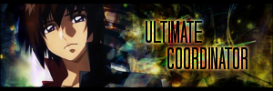  |
|
Re: A v y X S i g [The 3rd]
Link |
by
on 2011-05-12 19:40:02 (edited 2011-05-12 19:43:39)
|
|
Just passing through xD Anyways, I have a view about signatures' size. I prefer shorter sigs, because it minimizes the risk of making the sig much more empty and don't have to whip out additional effort to fill the BG with more effects. Just a little view of mine though. @Toyumi: About your Ao no Exorcist sig, did you use Displacement for your sig, or the effects are purely C4Ds? IMHO, the effects are very good. Could use a little erasing at katana's hilt, but that is just my personal taste, since I'm used to cleaner effects. And there's an effect (the yellowish effects) which looked slightly out of place, on the right-end side of the sig. Here's one of the signatures that I have made using Displacement/C4D effects, it's an old work though.  And, I have been trying out different styles and makings for signatures. One of them is a space-themed sig and a sig made of smudging effects. Hope that you guys can comment a bit :)   |
|
Re: A v y X S i g [The 3rd]
Link |
by
on 2011-05-12 08:01:37 (edited 2011-05-14 19:45:53)
|
|
@ SRT- I agree with Dfly and Ocean, your main problem is with the text. The stroke you're using on the text is way too big, and the text just looks kind of ugly when it's all pixelated like that. Also, since it seems as though you're still starting out with sig making, I suggest going to sites like deviantArt and look for tutorials (There are quite a few tutorials here too, in the Help section of the forums). Tutorials are always the way to go when you're just starting out, they help you learn the basics of sig making, and from there you can branch out and create your own style. @ Dfly- I agree with that system, if someone wants a set from a specific person then they really should just PM them with their request. And I suppose the people who will be taking the requests would be only actual members of Avy x Sig, or is it something else? By the way, are there any new members of Avy x Sig (Ones that aren't on the first post)? I think that all of the members of the club (Or all of the people who can accept the requests made here, if the new rule you want to use here will let non-members take requests), should all be listed on the first post. Just for easy reference and whatnot. Also, if you need some help with deciding on who to become a member of the club, I'm willing to help out with that. Also, thanks for your suggestions! I used some of them with my latest sig. @ Ocean- You're right about your Chaos sig, it really is way too messy. I don't like it. The render's too dark, and it looks like you just went happy-go-lucky with all of the brushes there. XD But the Temptation sig you're currently using is really nice, the only thing I don't like is how it's really bright on the left side in comparison to the right side of the sig. It just looks kind of weird, and it's a bit distracting. And also, about your comment about my sig in the 'Rate the signature above you' thread, the flame is actually a part of the render (It's a part of Rin's demon tail), so I can't really lower the opacity on it. XD I managed to make a new sig about a week or so ago (Finally XD). Any comments on it? [Edit] @ Ocean- Your Lies and Secrecy sig is very nice, the lighting in it is good and I like pretty much everything about that one. I think his eyes are just a tad too red, but then again that could just be a personal preference. XD The Blinded one is good, except for the funky lighting in it. I already commented on your Temptation one above before the edit. You're right about the focal point comment in your Cultivation sig, and the lighting is kind of weird in that sig too. And the set you made for Zaku is nice too, although I think it's a bit lacking (It seems empty towards the upper parts of the sig). By the way, what font(s) did you use for your Lies and Secrecy, Temptation, and Cultivation sigs? Whatever it is, it's a nice font. @ Emiya- The effects are just C4D's actually, I'm not too much of a fan of the displacement filter so I hardly ever use it. As for the first of the two newer sigs you posted (The Eirin one), I really like it. The only thing that I don't like is the lighting. It's good, but it's just too dramatic for my tastes, it could be a bit softer. And like what Ocean said about the space sig, I think I know what tut you used for it as well. But it's still a nice sig. XD Also, another comment that's just a general comment, but it seems as though you like to use the same fonts and the same size of fonts for your sigs. You could try to experiment a bit more with that, and use different fonts/a larger font size. [Edit 2] @ Ocean- Thanks! And I get all my non-default fonts from there too. XD As for your Alight with Passion sig, the lighting and the focus are both much better. The only thing I don't like on that one is the border, I think it could be smaller and maybe the opacity could be lowered on it as well. And I made another set. The sig started out as 375 px width, but I didn't like some of the things on the edges so it kept on getting shortened and ended up at 335 px width. XD The text I wanted was too long for the sig, so I put some of it on the sig and put the rest of it in the hover over for the sig. XD Comments? |
|
Re: A v y X S i g [The 3rd]
Link |
by
 on 2011-05-11 13:16:08
 |
|
its been a while, i'm not bringing any goodies, just looking around & spamming :3 and i like that corruption text style   |
|
Re: A v y X S i g [The 3rd]
Link |
by
|
|
rages DX i tried to click modify and clicked delete T__T i guess this is what happens with large periods of no-sleep... thankfully i have copy-paste-saved all of my forum posts since google chrome has been hating on me for the past week >_> onto the re-posting: _______________________________________________________________________ Yaaay!! I'm finally finished with all things school related and thus had some time to do stuff that didn't involve quantifying by-catch! --- From what i can see right now (Toyumi's, Zero's, and Holker's sigs), they all look fabulous =P @ Toyumi I really like both sigs although the text on the first one is somewhat off. Maybe the gradient is the problem >_> @ Zero I like the second sig better. Also, if there is no text, you should probably fix all that empty space-ness. Otherwise it looks good =D @ Holkers The fixed sig looks awesommme and thus I have no complaints about it ^_^ --- And finally, now that i had free time i opened up photoshop... and failed at everything since i forgot what filters did what and where half the commands were XD buuut i still managed to make something (and with two versions?! although they look very similar to one i did like a year ago...) =o   (it took me forever to make those little boxes on the side DX) anywho comments please? I'm fairly sure there is plenty wrong with them so feel free to rip them apart =) EDIT: Thanks for the comments toyumi =D I tried to make use of some of them below ^.^ and its good to be back XP @Srt (i cant read your avy >_>) Have you tried any of the tutorials here? theres a whole bunch that could help teach you how to use photoshop and properly compose a sig =P I'll see if i can give you any tips (i will even try to help with pointers for the text) The first sig, you may want to try to blend the text more with the actual sig. Personally i prefer to stay away from text gradient and stroke and stick with outer glow and overlay with extra layers set to soft light to make it more visible. As for the rest of the sig, the random rainbow part in the upper left corner and the bottom right sorta looks out of place. I don't see any background since the render looks like it takes up the entire sig which also leaves less room for creative-ness. I suggest either using a different render or rotating that one so it doesn't take up so much space, making the font a size smaller wouldn't hurt as well. For the second sig, it looks muddy and dull. If you want to mute the colours, then use gradient maps or photo filters to give it a different colour (e.g. vintage or monochromatic). You also will want some lighting to come through. Lighting is important to draw the audiences attention to where you want and it makes the render look cooler =P The text on that sig is too hard to read (the opposite problem from your first sig). Duplicating the text layer and repositioning it may help. I think your main problem lies within your render though which takes up too much space and doesn't have much going on. Overall, both sigs need some more effects, either with C4D's or brushes (search deviantart for either of these) i recommend going here since you have good ideas but need a bit of work in composition. This tutorial helps with creating flow as well as render and colour-scheme choosing. I look forward to seeing your next tries =D --- I also made a messier sig using the same render in a giant rush to remember how to get to liquidify and all the other random filters XP I kinda went C4D crazy at some point but i still liked the result so i shall post it anyways XD  EDIT 2: @srt/kanji-guy I quite agree with dlfy about the cursive fonts =P they are difficult to use in the best of situations and go more with simple, clean and elegant looking sigs with fewer effects/stuff-going-on-ness as for you third sig, colour-wise you are doing better (it no longer looks muddy) however the text is still all blocky. With sig making you want your render to be the center of attention and your text to nicely complement it (not the other way around). I do fully understand the difficulty of doing this while keeping the text legable though *hides sigs done earlier in life* >_> ... Like i said in my previous edit, try changing the render position, making the text smaller and then adding in some simple effects =) --- EDIT 3: zomg more people need to post anywhoo @ Toyumi oooooh its part of his tail! its kinda hard to tell =P That was pretty much my only dislike about that sig, tis really nice =D i like the ripple-y-ness Also I used one brush (for two of the black lines behind him) for the chaos sig XD the rest was smudging or C4Ds XP and I'm still working on getting the lighting right T_T gah long photoshop-lacking periods are evil -_- @ Miya those are some nice smudging effects! =O those sigs look pro D= also did you use a tutorial for the last one?? O_o if so then i think i know which one >_> and finallyyy, ive been stuck at home job hunting so I went on a sig-making-spree.  (i didn't use motion blur once in this one XD)    (the focal point turned out kinda confusing on this... i was attempting to get an eye movement going from the card to his face >_<)   (on request from zaku~) comments? --- EDIT 4: am i allowed to break the 5 post rule once i get to 5 edits? lol @ Toyumi ahaha i think i need to go through renma's lighting tutorial again XD thanks for your comments btw, they really help ^_^ As for the fonts I used: Secrecy --> Light from Behind Temptation and Cultivation (same font =P) --> Opticon Actually, all my non-default fonts I use come from that site XP - see next post...
|
|
Re: A v y X S i g [The 3rd]
Link |
by
 on 2011-04-30 20:57:36
 |
|
Hello guys I've being trying to make a coherent text for about 20 minutes. So please carefully what comes next ok? I've being inactive for a quite time now and Some stuff changed in the site, some others not.One thing is people keep appearing claiming they want to learn how to do sets. And there is this tread. that one hand allows people to review your work. And another take "jobs". I think everyone deserves being reviewed. Good feedbacks makes better works. Not random scores in I like your avatar/signature. That most of the time i think they are quite unfair. And taking "jobs" is something we put a name on it. more then personal It is a view of the this our little group. if you get a bad result you won't ask for more works on here, right? To conclude, I don't think it is appropriated for me alone to judge who is in and who is out, as much i don't think it is good to let everyone get in. So let's make it easy? Everyone may have a good and decent feedback in here, anyone can post your work. But, just some may take requests. For those who will take the requests May I ask to send me your most recent set? Just to make sure that everyone that is taking requests are up to the job. It is just that I'm seeing so much people requesting for certain people, I want to make sure that if ask for something in here, you will certainly get a good set. And if you want for a certain set from someone you will just pm that person >.>; Of course, if everyone agree with that... >w @mister kanji I still don't know your name, but allow to feedback you? Are you using gimp? I don't really know how it works, but as far i see you better not use this cursive fonts. Try something more legible. It got pixelated. it is a sign that something went wrong in the middle of the way. And try some tutorials, It will totally help you to get some results like ocean, or any other advanced user. And totally follow what ocean wrote... Got it!?!? @ holks I vote for the second! Smaller but with everything needed. More harmonic. @Zero I like more the second one. Little details added but it makes the signature more interesting. @Toyumi Liked both. Good work in text. clear and matching with the image. Good blend between character and the effects. Couldn't ask more XD But, it is kinda of personal opinion, I don't like the CD4's showing like that. I can almost guess you used a star CD4 from planet renders. pink with blue. Blur, sharpen and other filters on that would get a personal touch on your work. blabled enough.   |
|
Re: A v y X S i g [The 3rd]
Link |
by
  on 2011-04-29 23:25:24 (edited 2011-04-30 20:22:49)
|
|
Hello people. I have been attempting on making my self a sig and need some real help. the only thing you dont have to tell me is how much the text sucks so give me tips and advises on the sig it self. the following are my attempts:  this one i was told Bad combination of text, background color, brightness, and position. this one i was told Bad combination of text, background color, brightness, and position. this one i was told that i killed the material(dont know wat that means...) this one i was told that i killed the material(dont know wat that means...)EDIT:  reminds me of the american flag... reminds me of the american flag...  |
|
Re: A v y X S i g [The 3rd]
|
|
@ Toyumi I didn;t realise it's LQ pics. thx 4 the notice. Here r the renewed links. Avatar:http://konachan.com/post/show/52941/blush-close-male-maria_holic-shidou_mariya-signed- Sig:http://konachan.com/post/show/46244/maid-maria_holic-miyamae_kanako-shidou_mariya-shin http://lh6.ggpht.com/_ilk5scECgac/ScRBeDShnvI/AAAAAAAAAOI/5lqEI3qPUQU/snapshot20090119223814.jpg http://img.online-station.net/_news/2011/0308/45972_maria_holic_01.jpg Banner: http://oreno.imouto.org/post/show/68520/maid-maria_holic-shidou_mariya-shinouji_matsurika- http://www.hiroanime-media.com/wp-content/uploads/2011/04/Maria-Holic-Alive.jpg jz to rewrite here. The sig should hv KaZuMi on the left. THe banner on the right " still alive and goin" This should do the trick. Thx in advance.
|
|
Re: A v y X S i g [The 3rd]
Link |
by
on 2011-04-28 13:07:23 (edited 2011-04-28 13:13:57)
|
|
Finally I can post again. It's been almost a month with a lack of posts here. And it's also been almost a month and I haven't made a new sig. >.> @ Kazumi- You might have a hard time getting someone to take your request because both of the images you posted are low quality. If you made a request with higher quality images, people might be more willing to take on your request. @ Zero- Like what Ocean said, I like the second sig more, and if you're going to leave the sig like that you should either add some text or shorten it or do something else about the empty space in it. @ Holkers- The second one is better than the first, less empty spaces and I like the sub-text you added in that one as well. Although, the border seems to be a bit messed up in the second one, there are some blue parts that seem to kind of spill over from the rest of the sig and they're on the border as well. I just think that the border looks weird because of that. Other than that, it's nice. @ Ocean- Both of them are alright overall, but there are quite a few of small details that I don't like with both of the sigs. With the first one, I just think the the render isn't blended in with the rest of the sig as well as it could be. It is blended in a bit, but when you look at it, the render seems to pop out in comparison to the rest of the sig. Other than that, it's not that bad. The second one has the same blending problem as the first does, but with this one there's also a problem with the boxes too. The boxes themselves are nice, and they add a nice touch to the sig, but they cause two problems. First, the text. I really don't like how part of the text is overlaying the boxes, it would look better if you moved over all of the text that's like that. The other problem is that the boxes aren't transparent, and for someone that has a different colored CSS background (Like myself, I have a black background on everything with my CSS), the gray looks weird (Although that isn't as big of a problem as the text is XD). I noticed that both of the sigs could also use a bit of work with lighting too. But like I said before, both of the sigs are nice besides those few things. And it's nice to see you around Avy x Sig again too! |
|
Re: A v y X S i g [The 3rd]
Link |
by
on 2011-04-27 14:25:31 |
|
there is a contest in ism? I didn't find the information in that link holks ToT |
|
Re: A v y X S i g [The 3rd]
|
|
It's been awhile lads! I'm having a bit problem with Photobucket since they are in a maintence of some kind of thing. So all of my photos in my account "Holkers" has been un-showing... ;____; But not to worry my old account is still available to use, so I'll start uploading using the old account until the new account has been release from it's Abyss. At the mean time, replies! Erebos: Practice and more sprite signature searching. That's how I got the keen to make a sprite signature. Or just ask Toyumi some of her sprite. That is also how I started to feeling to do sprite signatures. Toyumi: Ahh thank you for the opinion/advice. The eyes are suppose to be like the "Dream Eater" effects. But not literally in the TV but in my own imaginations. Some ghost likes to do those kinds of effects, so I've added it to see how it was done. The confetti was a brush from Photoshop. It's a default brush. I've asked some lads in the chat about it and they've said about the flames too. But I've think it looks good to me rather bosy up to find a pixel flames xD Chiny: Have faith in yourself that you could do at least what some of us can't. There's a lot of tutorials laying around in Gendou forums. Also new news about the -ISM on the bottom of this post. Haseo: I like your style :D It has it's blurry effects or fog effects. Toyumi again: Somehow.. Your signature makes me wanna hear Adele singing again = w=! The second sig's text would do some work D: Anyhow. There are about 2 request. :D Lastest news on -ISM! Show your skill here! Latino's Radio Contest Some has forgotten or not, but I'll try to join in since there's no dateline. There was, but I didn't had time to do it. So do help our moderators! I've said in the first paragraph that my "holkers" account is un-showing, I've uploaded my new sprite experiment signature in the old account.   The first was 300px and taken everyone opinion in chat, saying that there's some empty spaces. So I've made it into the second sig. Yes a little typo'd on the first sig. Opinion please :D
I claimed someone that I can't remember because photobucket is ended.
|
|
Re: A v y X S i g [The 3rd]
Link |
by
on 2011-04-04 08:57:02 (edited 2011-04-04 13:10:50)
|
|
Hey everyone, ok its been awhile since I made any signatures. Been really busy and also have a artist block -_- *sigh* I think my skills is lacking or something these days. Anyway this is my latest sig. I didn't put any text in it, for I had no idea what words fits this signature. Like I said, an artist block. I made two version of it. Comments? versions one:  Version 2:  |