|
Re: Rate the signature above you! [V7]
|
|
6/10 Needs work, a lot of work. |
|
Re: Rate the signature above you! [V7]
Link |
by
  on 2010-03-05 19:40:01
 |
6.5/10   |
|
Re: Rate the signature above you! [V7]
Link |
by
 on 2010-03-06 02:54:56
 |
|
7.5/10 |
|
Re: Rate the signature above you! [V7]
|
|
@Naru rather than just stating that, perhaps if it'd be better if you actually can elaborate the spots that need to be improved on..... another example of excessive space |D hey, it's good to have a constant size for all signatures, but sometimes it needs to be adjusted. Take a look at the left side properly, it feels empty right? Well I felt that way.. so, either you fill it with something (idk, maybe brushes? Textures? Though I'm not quite fond of those, Usually I'll end up cropping the size. The fonts are good enough, I noticed the simple trick with the white-ish boxes. Simple yet effective to adjust the flow of the font ^^ Quite well done.. 7.5/10 I Took some points off from the empty spaces. It's quite good but you could have done better!  |
|
Re: Rate the signature above you! [V7]
Link |
by
 |
|
8/10 Awesome ;w; I wish I could use C4D renders... But I notice something...her head got cut off? O,o or is it because of your C4D? xD |
|
Re: Rate the signature above you! [V7]
Link |
by
![Haseo [Retired Moderator]](https://puu.sh/uQqet/eee7fc915b.png) on 2010-03-07 18:32:08
on 2010-03-07 18:32:08 |
|
8/10 I always rate yours god dammit Liwen |
|
Re: Rate the signature above you! [V7]
|
6.5/10 

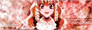
 |
|
Re: Rate the signature above you! [V7]
Link |
by
![Haseo [Retired Moderator]](https://puu.sh/uQqet/eee7fc915b.png) on 2010-03-08 14:55:21
on 2010-03-08 14:55:21 |
|
9/10 for the gray one 4.5/10 for the blue one I don't like giving low ratings, but the scan lines pretty much overpower everything, and disrupt the sig entirely. Also, the funt is blurred. |
|
Re: Rate the signature above you! [V7]
|
|
Izayaaaaaaaaaaaaaaaaaaaaaaaaaaaaaaaaaaaaaaaaaaaaaaaaaaaaaaaaaaaaaaaaaaaaaaaaaaaaaaaaaaaaaaaaaaaa *Ahem* Don't mind that Well, tbh I Kind of notice this style. Did you do it based on my tutorial? o: Anyway, moving on. Hmmmm, first thing that I kind of noticed is that.... I have that render too ;___; I was planning to use that... *ahem* OKAY OKAY Another fan moment there. tbh, The sig would be a better one if you kind of crop it so that there would be no or at least minimum empty spaces. Those empty spaces could really make the signature looked small and distract the viewer from seeing what you intend to show as the main render. Another point here is the font you used. Well, I'm not exactly a font master either but I Don't think a drop shadow will fit in the signature that well. And oh yes, somehow it's lacking a depth. Try blurring the background for a bit. See this for example  As you noticed, the signature has some depth in it. You may notice it by the way I Blurred everything accordingly except for Izaya which in this case is the main focus. The concept here is to visualize that the objects which has your eyes focused on will blur away everything else, right? You might want to use Gaussian Blur or just some Blurring tool :'D Final Rate : 7.5/10 Keep it up man. Sorry for the long post.  |
|
Re: Rate the signature above you! [V7]
|
|
Oh look it's Izaya XD anyway. ______________________________ Renma: 9/10 I love it. But the small font is that necessary? I mean I would understand if it was at least 14px but it's hard to read and enjoy your sig with small font. Just saying. |
|
Re: Rate the signature above you! [V7]
Link |
by
 on 2010-03-09 12:34:51
 |
8/10  |
|
Re: Rate the signature above you! [V7]
Link |
by
 on 2010-03-09 15:11:06
 |
7/10  |
|
Re: Rate the signature above you! [V7]
Link |
by
|
|
6.5/10 |
|
Re: Rate the signature above you! [V7]
Link |
by
|
8/10 really nice! :D  |
|
Re: Rate the signature above you! [V7]
Link |
by
 |
|
Left signature: The font could be smaller ._. It's so big that it blocked most of the character out...background's pretty bland Middle one: LOL cute ;w; Right signature: Nice and simple =D I notice there's an I below the "is". What is it for? There's a lot of empty space...you could increase the size of the guy a little to cover the emptiness though...gives him a lil more close up xD 7/10 |
|
Re: Rate the signature above you! [V7]
Link |
by
 on 2010-03-11 13:51:19
 |
8/10  |
|
Re: Rate the signature above you! [V7]
Link |
by
 on 2010-03-12 03:20:34
 |
|
8/10 classic ~ |
|
Re: Rate the signature above you! [V7]
Link |
by
  on 2010-03-12 06:01:08
 |
|
Gundam-kun's siggy!! o.0 9/10   |
|
Re: Rate the signature above you! [V7]
Link |
by
 on 2010-03-12 08:22:37
 |
|
9/10. i really like the color combination in the larger one. and to whoever rates me, please tell me anything i need to improve on with my sig! (this is my 2nd set... just want to know what i can work on! ^^)  |
|
Re: Rate the signature above you! [V7]
|
|
Hmmm, I really should have asked you what do you use to make your signature, Toyu~ Well, let's see. Ah okay. First thing first, I noticed that this time you use the colours harmoniously. That's an improvement from your previous signature... However, it is a bit plain. I Myself isn't exactly a fan of brushworks but, perhaps a little bit of brushing here and there could spice things up. Unless those in your background is a grunge brush? because if yes, There's one thing I'd like to suggest. Click Here Check that page out, well *ahem* Shameless advertising mode |D but hey, The lighting tutorial should work great with that kind of background. Another point that I noted is the text. Rather than erasing it with reduced opacity, try erasing it with 100% opacity, however only leave very little part of them so that they will resemble that of drop shadows. IF you're using photoshop, you might want to try Adjustment layers and make some gradient maps with it and set those on soft light. Overall? Slightly increased from your last one, 6.8/10 Keep it up~  |


