|
Re: A v y X S i g [The 3rd]
Link |
by
 on 2011-01-27 17:21:43
 |
|
@Dib: There's a 5-post rule here, and you broke it. Please refrain from doing it again. If you want to improve, but don't understand tuts, there's nothing you can really do but experiment. Experiment with filters, brushes, and such until you understand enough to understand tutorials. @Jejechi: I like it, but the grainy texture is killing it for me. I think that it could do without. 

|
|
Re: A v y X S i g [The 3rd]
Link |
by
 on 2011-01-28 08:05:14 (edited 2011-01-31 07:05:57)
|
|
@ Jejechi- I like the set you made for Thanatos a lot. I kind of like the grainy texture on it actually, the only thing that could be a bit better are the effects for the text, and maybe the size of the text on the avy could be smaller (Although I have difficulties with text as well). As for your current set, the sig is nice, but I think the avy could use some work. So, I made quite a few sigs since I last posted here. I'll post them in order from oldest to newest.    I just realized that they're all 300px in width. XD And here's a set I made for Mistress.   Comments on any of them? [Edit] @ Zaku- Like what Holkers said, work on text placing. Actually, you should work a lot on text in general, all of the sigs seem to have the same font and the same font effects for each. Mix it up a bit and use different effects. Now since the general stuff is out of the way, the Shrine Maiden sig has the best text out of all the sigs with both placement and effects. But there's quite a lot to work on with the sig itself. It would look nicer if the edges weren't cut off. And what is there behind the sig? It's like there's something behind it and it looks kind of weird. And now that I notice it the sig is uneven as well. XD The border on the 'Love' sig looks weird, and the text positioning does too. Sticking to normal, horizontal text isn't a bad thing, and that's what I do with most of my sigs. It makes the text look nicer, and it's easier to read when it's horizontal. Also, I think the sig could do without the circles in the background. The 'Magic' sig isn't that bad, like the others it needs better text, and I think a normal, 1px border would make it look better as well. The bright stuff in the Kakashi sig is really distracting, and the text isn't good either. The focus of a sig should be on the render (Or the character, if you're using a stock), not on the background that's away from the render/character. And the text in the Reimu sig could be better, in both effects and positioning. Like I said before, sticking to horizontal text isn't bad. Also, I think the border could be fixed here too. Also, you broke the 5 post rule (Well, your post would be the fifth post from your last, but I think that's still breaking it). @ Holkers- Your post is confusing like always. XD And there is GM's style in my sets? That's news to me. I wasn't trying for that or anything. And yes, I know the text could use work. Usually it depends if I'm in the mood to experiment with text. Like with the set I did for Mistress, I was in the mood so I experimented. As for your profile, it's nice. But, I think the text around the desk area could have matched the paper with the main 'About Me' stuff in it. I know that would have been a problem with the marriage list that way, so maybe making your paper a darker color and making all the text match? Also, the shoutbox could be a bit longer, to cover the random feet of the doodle-like stuff. XD But don't mind me, it's still an awesome profile. Also, are there tuts on text placing? I've never run into any. Then again, I hardly use any sites other than Deviantart for sigs tuts and stuff. XD  |
|
Re: A v y X S i g [The 3rd]
Link |
by
|
|
Worked my fingers off to make a sig tut today so i guess i'll show you guys my style: _____________________________________________________________________________________________________________________________________________________________________ EDIT: K i'll work on it. Since my style isn't good enough it seems but meh whatever you three say. 
 |
|
Re: A v y X S i g [The 3rd]
|
|
Eeylo. I come hereby, that my computer crashed and I can't design anymore until it's fix. ;w; Not that I am care of designing some sets :U But for profiles. Lol. Toyumi's First post in page before this page. Then the first one shall be kept. It was only a few layers.. which to my surprise, I hate less layers. Probably that's my theory. Less layers, look dull. More layers, look too much. Average layers, awesome. The first signature to the same post. GET RID OF THAT NASTY FONT/TEST and then all look pretty to me. Douji: That is good. Seeing the fact it's simple and doesn't need much work to restrain yourself. Zero: Thank you. And I know lol. Just making experiments and see the feedbacks. You've changed styles. And I like this style. Everything has balanced in two signatures. Well done seeing the fact I still hate the profile matter :U Toyumi's second post in the page before this. The first set is awesome. I like it. Second sig. For the first time, there is not much visible C4D in that sig. Doesn't even look like your style. But since it's artist block, I guess it could have been worst xD The third set looks more kinda of your style. The way you put your fonts are a bit out. Font's should be near or close enough to the render or so I've read a few tutorials about it. Ocean: I see a bright future of a graphic designer. The way you play with the fonts are good. You know where and how to insert the font and types of 'em. And still the symbol of your design is well seen in those signature. Hmm I didn't much on the signatures. And the under parts of her arm do look out of place. I guess the first did seems prefect then the others I've experiment with. Sometimes your fonts are hard to read sometimes they took time to burst out from the contrast. But I still like how you managed to control your text in every signature. Zero: hmmm more new styles. Sometimes no text is good looking xD Toyumi's third post. One maniac of designer coming right up! I do think you might consider the text a little bit more. The design is well fixed just the text. And the swift of the hand could done better with some C4D? Yet it looks fine to me unless you want to update it some future? Jejechi. Yay she's back. Looks simple and clean. Nicely done. The text of the sig in "Thanatos" should do better since mostly focus on the signature sentences. The second one I think just have a transparent background. Seems nice to make it transparent. Yay page-- maint. /waits. Toyumi's first post. Oh jolly, I shee some Gm's style. Yay you changed the text. I like the Dragon. As Yat called it D***head. x: Shadow's text should do a little better. Like I've said, try review some text placing tutorial. Or I don't know. But do try not to keep your text look unconnected. You did better in Mistress' set. Brotha Zaku :D Work on text placing :D The transparent border would do some work. Like the top of it. It looks like being cut away. Try to make the render a little bit down and then make sure you have a good "star" like background rather having it cutted. Good good everyone is in the spirit to change their style :D Whereas I, did an extreme job on the profile design. Do comment on the profile design if you don't mind? The end.
I claimed someone that I can't remember because photobucket is ended.
|
|
Re: A v y X S i g [The 3rd]
Link |
by
 on 2011-02-06 15:37:58
 |
|
@zaku, all your sigs need work. I agree with what holkers said about the text placing, also try scaling your images a bit to make it not so big. The only sig I find that is good is the first one, the only problem with the first one is yet again text and font. Try using different text effect and different fonts. K its been awhile but here are a few sigs I made.     |
|
Re: A v y X S i g [The 3rd]
Link |
by
 on 2011-02-14 02:52:57 (edited 2011-02-14 06:02:54)
|
|
It's been a long time since I posted in here. Here's one of my latest works :3 I'm still exploring the wonders of photoshop <3  Since I'm here, I might as well comment on those awesome sigs above me :) @Zero Those new signatures though simple are great as it is. Seriously, you've been using a lot of styles lately. And I salute you for that :) @Zaku I agree with all the comments before me, those signatures need some revisions on the text, But remember that not all great sigs has text on it, so keep on going :3 A suggestion from me: try not to scatter your text and use other font styles/sizes. Like fashion, all it needs is a little mix and match :3  |
|
Re: A v y X S i g [The 3rd]
Link |
by
 on 2011-02-14 08:37:02
 |
|
Hey guys so here is a request. It isn't anime centered so I hope it's okay... I would like a set using these two pictures (you don't have to use both in the avie you can just pick one.) Nickname: Anke Words in Sig: - Always smiling - Jang Geun Suk Links to pictures: http://i882.photobucket.com/albums/ac30/icelovejungmin/Jang%20Geun%20Suk/JangGeunSuk0006.jpg http://i882.photobucket.com/albums/ac30/icelovejungmin/Jang%20Geun%20Suk/JangGeunSuk0087.jpg Thanks ahead of time :)  |
|
Re: A v y X S i g [The 3rd]
Link |
by
on 2011-02-14 14:01:50 (edited 2011-02-18 19:33:36)
|
|
Finally I can post here again~ @ Zaku & Holkers- I commented on both of your posts in my last post (In case you didn't see my edit there). @ Zero- Out of the three sigs you posted, the first one is my favorite. I think a different font might have been better for the text, but other than that it looks good. The second one is nice too, although I think the render could have been blended in a bit more with the rest of the sig. The third one is nice as well, but the white in the top corners is a bit distracting from the focal point of the sig. But the text in that one is really nice. @ Shae- That sig seems kind of seems like a sig Ocean made sometime... Oh, here it is. Or at least, it looks like the sig there to me, with the music theme and all. XD The sig itself is nice, but a lot of your sets seem to have the same style. Maybe you could try experimenting and changing things up a bit more? Well, I made another set since I last posted here. Comments?   In case you were wondering, the render is supposed to be covering up that small portion of the 'Night' in the text. Also, I have all of the judging and the results and such from my contest ready, I just want to make a banner for the winner before I post the results. [Edit] Here's another set I made a few days ago. It's the first sig I made for myself that's over 350 px width in awhile. XD   @ Sayuri- I think the avy for that set is really good, but the sig could use a lot of work. The border on it looks weird, the text could use a lot of work (It's hardly noticeable, when I first looked at it I thought that it didn't even have text), the render could be blended into the background, and the render itself looks weird as well (Although that might come from it being too sharpened). Like you said, it could be better, so keep on working at it. |
|
Re: A v y X S i g [The 3rd]
Link |
by
|
|
After being hiatus, and not using my CS5 for the past 3 months, I created a new set. It's a bit to my liking, but not too much. It could be a lot better. I am not really proud of it. Zaku: I have to agree with everyone's past comments. The text is really big, and the placement isn't in a really nice place. Vary the sizes, and the fonts but especially the placements. Aside for the render/stock, its not wise to have it occupy the whole sig, since it can be distracting and it takes away from the sig overall. There are times when having the render/stock occupy the whole sig working, but not all the time. Zero: Those sigs aren't too bad. I like the styles. But maybe tone down the use of the color white just a little bit, it makes the sig a tad bit too bright. Aside that its nice. Shae: I have to agree with Toyumi, it does remind me of Ocean the music theme. And like Toyumi said, experiment, or change something in your style. Other than that its really nice. Toyumi: I like the sig, except its bright well to me. And the text for "Night" is barely readable, I had a hard time the first time reading it. |
|
Re: A v y X S i g [The 3rd]
Link |
by
|
|
Nickname: Giselle Words in Sig: - Skipping down the rabbit hole. Picture: http://i124.photobucket.com/albums/p7/Rinera367/Anime/Wonderland.jpg 

|
|
Re: A v y X S i g [The 3rd]
Link |
by
on 2011-02-24 10:25:07 (edited 2011-02-27 22:34:40)
|
|
@sayuri; your sig is too sharp . .. .and somewhat weird. . .I don't see the flow in your sig at all nor does your render blends into the background or match it at all. I agree with toyumi about the text, I can't exactly see the text at all. @Toyumi; Your signature. .. .The T in night seem to be missing or rather too blend in with the signature. The right seem somewhat chaotic, perhaps tone down the circles a bit. As for the second sig, its nice, not much to comment on. Ok I made another sig. But this is my first time making a sprite sig. So bare with me if its not that good. Please comment as well. This is another sig I made. the light source in the bottom left hand corner is part of the background stock I use. I can't do much about that. Please comment though.  EDIT Here are a few more signatures I made. Yes the first one is black and white. I purposefully made it that way.   |
|
Re: A v y X S i g [The 3rd]
Link |
by
on 2011-02-26 09:55:15 |
|
Avy x Sig Food Contest Results And finally, here are the results of the Avy x Sig Food Contest! Liwen   Judge 1 Quality: 28/35 Style: 18/25 Impact: 15/15 Theme: 20/25 Total: 81/100 Comments: The banner flows nicely, but you shouldn't have blurred parts of the noodles. You should have kept them normal since it's part of the theme. Judge 2 Quality: 20/35 Style: 20/25 Impact: 7/15 Theme: 25/25 Total: 72/100 Comments: Some how different and I like the initiative! But got silly. With the fish bellow and the border that isn't a border. Look out for the color combination! Nice icon though. Judge 3 Quality: 29/35 Style: 20/25 Impact: 14/15 Theme: 21/25 Total: 84/100 Comments: First of all, I really love the icon! It's very cute. The banner, on the other hand, needs some work. I think that some parts of the banner shouldn't have been blurred, like around the fork. Also, I think Rumia could have been blended into the background a bit better. Zero  Judge 1 Quality: 21/35 Style: 20/25 Impact: 6/15 Theme: 20/25 Total: 67/100 Comments: Very jumbled and messy; you can hardly tell what's what. The text doesn't blend nicely due to the black stroke. Judge 2 Quality: 30/35 Style: 15/25 Impact: 7/15 Theme: 25/25 Total: 77/100 Comments: It is clear that you know the effects and all that jazz. But you need something different. Something that calls attention as well. This style is way too used and overrated. Judge 3 Quality: 18/35 Style: 17/25 Impact: 6/15 Theme: 19/25 Total: 60/100 Comments: The text really is an eyesore. The black stroke looks terrible, and the color doesn't look too good as well. In some parts, the C4D's look out of place and just weird. Holkers   Judge 1 Quality: 31/35 Style: 23/25 Impact: 12/15 Theme: 18/25 Total: 84/100 Comments: I think you could have used a render that had more to do with food, than just chopsticks. However, making a vector banner was a nice touch, however I don't think vector was a right choice. Really nice use of depth though. Judge 2 Quality: 35/35 Style: 20/25 Impact: 7/15 Theme: 25/25 Total: 87/100 Comments: Really lovely!!! Different from the normal C4D effects you tried the vector style. AND I LOVE IT! Clean, with less impact, but with a highly chance of matching colors. Next time maybe you can add some lighting effects. It may look like it is something that doesn't match but I recommend a try. Judge 3 Quality: 32/35 Style: 23/25 Impact: 15/15 Theme: 20/25 Total: 90/100 Comments: I love it, both the banner and the icon. I really do. Personally, I think vectors are hard to do, and you pulled it off very nicely. I really don't have much to say. Very nice job. Congratulations Holkers! Congrats to Holkers on winning this contest! And congrats to Liwen and Zero for participating as well, both of you made good efforts as well! And I actually have a banner for the winner! Although it isn't really good... But it's something.  Like I said before, I know it's not too good. I tried to think of something that would go with the theme of the contest and this is what I got. XD Again, congrats to everyone who participated, and also a thank you to the judges for helping out as well. I wouldn't have been able to do this contest with you as well. That's it for the Avy x Sig Food Contest, keep on designing everyone~! |
|
Re: A v y X S i g [The 3rd]
Link |
by
on 2011-02-26 12:31:36 (edited 2011-02-27 12:15:05)
|
|
Congrats to Holkers for winning the contest! I was too busy to participate, but maybe next time! And now, moving right along: @Zero: The reason the "t" is missing in Toyumi's sig is because she wanted it that way. She even pointed it out in her post. And there's ALWAYS something to do about a background stock so your excuse is invalid. You can always: 1) Smudge it out, 2) burn it out (with the burn tool, not literally), 3) Blur it out, or 4) Clone tool over it. So I think your excuse is laziness, which in this case, dampens the effect on the sig, since your focal is way off. @Sayuri: Agreeing with Zero on the fact that it's too sharp. And you really could cool down a bit with the liquify filter, it's not the only thing in photoshop you know. And now, a set of my own. I'm not sure if I'm going to use it or not though:  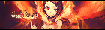 EDIT: Here's another sig that i started yesterday and finished today. It's in tag-wall version since there were two versions of it. 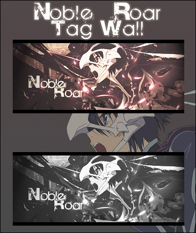 *Note: May take a while to load
|
|
Re: A v y X S i g [The 3rd]
Link |
by
 |
|
Owh~ congratulations Ah Holk ♥ Nice work done there too Zero. Thank you judges for taking your time to evaluate our works as well. Without you the contest would not be a success and most importantly thank you Toyumi-chan for starting this contest~♥ I had fun thanks to you, I really do. |
|
Re: A v y X S i g [The 3rd]
|
|
Woah. I won? Thank you to the judges and participants who didn't won. And thanks to Toyumi for the signature. It looks great :D And it's gonna make me hungry thinking about food... soon. Nevertheless, keep up the good work lads! Toyumi: Okay.. I'll try to minimizer the confusion in the future :D Well, is either my eyes are playing tricks or it does really looks some of GM's style. But, never mind about that. You still will come back to your own style. Yeah I sort of dislike the font of the "About Me" section. Can't find something that's really, like, writing fonts to my liking. The shoutbox part was a bit typo-d. I suppose to upload the new background, but I sort of can't use tinypic, since it's banned of my IP. So I've tried someone else to help me upload it. She's not around that much xD Oh gawd. My English is bad. Hopefully you'll understand what I'm saying. Got a bit sugary rush at the moment. Lol. About the link to a text placement tutorial please view the last line of this post :D Haseo: DAYUM! I love the signature (Burn). It goes well with the flow and the text are intact with all the pieces around 'em. And the placement is exactly where it should too. /nods nods. The Noble Roar looks good. For my eyes are messy. But that's just my eyes xD So. I thought to bring myself up back to design. And I start by doing some sprites signatures. Plus, don't want to post another empty work xD Since, I notice everyone seems to use sprites nowdays. So here is my first ever sprite signature :D!  Comments: It supposed to have a smudge background, but when I apply gradient it totally disappear the smudge lines. I suppose to make it ghastly, but it turned shinny. SPARKLING! I sort of new to these kind of design, so if you have any advice, I would like to take it :3 EDIT: Kuro requested it :D  ______________________________________________________________ Text placement for signatures: Tutorial Icon text placement: Tutorial Also this was a bit helpful for me. Credit goes to here 
I claimed someone that I can't remember because photobucket is ended.
|
|
Re: A v y X S i g [The 3rd]
Link |
by
 on 2011-03-02 09:47:07
 |
did somebody say.. GM's style?  anyway.. i'm not sure if this is a new one or not, a sig that i make for other forum   |
|
Re: A v y X S i g [The 3rd]
Link |
by
|
|
So I did a lot of thinking and played with my effects with the text and I created a new set. What does everyone think? >.> _____________________________________________________________________________________________________________________________________________________________________ EDIT: I chose those words because it means something to me zero
|
|
Re: A v y X S i g [The 3rd]
Link |
by
on 2011-03-03 13:42:30 (edited 2011-03-03 19:39:39)
|
|
@Zaku, better but the render seem somewhat squish also keep working on your text placing and effects, sometimes sigs do not need text. So my suggestion is that the sig you put up will look better without any text, for it doesn't look good when you put the words on top of the render especially her hair. @Holkers, Nice sprite signature, better than me from what I could tell. *sigh* I am still a noob at sprite signature section. @GM, Nice work there I could still see some of your old style especially the ripple effects but the left side seem somewhat empty or plain to me, perhaps add some words to it or something. @Haseo; Nice work on the Noble war signatures, I tried doing a sig in Black and white but it didn't turn out too well as you can tell from my previous post. :( Oh well, keep up the good work though. Ok here are some signatures I made base on my newest tutorial. I also made a text tutorial for some people who have trouble with text especially on the size and such. 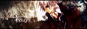   I use stock for this signature ↑  This was requested by Zaku, the only thing I don't like about it is the words use for this sig which Zaku chose. |
|
Re: A v y X S i g [The 3rd]
Link |
by
on 2011-03-11 17:42:57 |
|
After a bit of a hiatus from the graphics scene, I'm back~ First, the comments. @ Zero (On your first post here)- Like Haseo also said, I wanted my text to be that way, and I also pointed that out in my post as well. As for your sigs, the first sprite one could use some work. The sprite itself could blend into the sig better, and the effects you used for the text don't seem to fit with the rest of the sig. With your second sig, there's a lot that needs work on. Like Haseo said, there are things you can do to correct lighting with using a stock image for a sig, so that isn't an excuse for the weird light source. And, like with your sprite sig, the text effects you used don't fit with the rest of the sig. Your black and white sig looks like it needs a lot of work. The entire left side is way too dark, and the white on the right side looks weird and it attracts too much attention away from the render. And it also seems like there's a light source on the render itself too, so having the white be so stand-out-ish there screws up all of the lighting in the sig... That one sig just needs a lot more work. And for your last sig on that post, its nice but... I think that it could use some more work. Aside from the text, it just looks too plain. @ Haseo- Your Burn sig is AMAZING. It's a good change of pace from your current style, and I love it! But... Then you went back to your regular style with the Noble Roar sig(s). Don't get me wrong, they're both nice, but it seems as though you've been using the same techniques with your signatures for awhile. I liked the Burn sig because it was a change of pace, and was different from what you usually do. Like I've told you in the past, try not to make all of your sigs with the same style, and to mix things up. But nonetheless, your works are still great, and keep up the good work~ ♥ @ Holkers- No, I swear I do not have GM's style. I do not know what makes you think that, and if you say that I have it again... I think I might just go crazy (Well, not literally, but it'll start to get on my nerves). XD Oh, and thanks for the text placement tut, I used it with the text placement in my latest sig. Although the text color/effects are a fail in my sig, I think the tut at least helped with the placement of it. I hope. >.> As for your Gengar sprite sig, that one could use a bit of work. I love whatever technique you used to get the confetti-ish effect, and I love how you have the different pairs of eyes in there too. But once you get away from the focal of the sig, the rest of it seems a bit barren. And I think the text could use a bit of work as well (Although, I can't tell why at the moment...). As for your Typhlosion sprite sig, I think it's better than the Gengar one. I don't have much to comment about except that in two areas of the sig, the flame effect just kind of stops abruptly and doesn't blend in with the background of the sig. Other than that, it's really nice. @ GM- Yes, Holkers said something about that. But it's a lie! I have no idea why he's saying it. >.> As for your sig, it's nice, there are just two big things I have to comment on. First, like what Zero said, the left side looks a bit empty, and that could be fixed with putting some sort of text there. Second, it seems to lack lighting (Either that or if there's lighting already in it then it isn't enough). @ Zaku- I can see that you're getting better with sigs! But there are still things that need improvement. First, there's the border. That kind of border doesn't look good with the rest of the sig, especially since you can't see it in some parts. Next is the text placement. I suggest looking at the text placement tut Holkers mentioned in his post here. You want to have the text near the render, but not on the render itself since it takes the focus away from the render too much. I also think that you could play around with lighting a bit, but this sig is still a major improvement from the last few your posted here. Keep on improving! @ Zero (On your second post, the post before this one)- Your Lost in Thought sig is alright, although the background just seems way too chaotic. The big off-white rectangle behind the render looks weird, along with the area of blue on the other side of the render. The Sorrowful Love sig is better, and the background isn't as chaotic in that one. With your Sorrowful Night sig, it could use a lot of work. The lighting for it could be better, and the sig looks like it needs to be sharpened. The circle-ish things around the character's face look weird and out of place, and the left side of the sigs seems empty. And with the Holic sig you made, it's nice, although it's following the same style as the others. Like I said to Haseo in this post (And I think I've said this to you before too), don't make all of your sigs with the same style, and mix things up. Okay, so now that all of the comments are finally done, here are two sigs I've made since I last posted here. The first one I made before I went on graphics hiatus, which was about 2 to 3 weeks ago, I think? And the second one I made yesterday, so it's the post graphics hiatus one.   Yes, I know the text/text effects with the Music and Rhythm sig aren't great. Like I said, that one I made while coming off of a graphics hiatus, so I felt rusty while making that sig. >.> Other than that, comments? |
|
Re: A v y X S i g [The 3rd]
Link |
by
|
|
Wow, this place is so interesting. I feel like joining in. Unfortunately, I doubt I have the skills to join o_Q 
 |