|
Re: A v y X S i g [The 3rd]
Link |
by
|
|
Thanks guys but i really feel rusty like my last work:  /shame on self /looks Haseo's Work /goes to emocorner OTL   |
|
Re: A v y X S i g [The 3rd]
|
|
after months. i came back and lur--looks the works. and i was like speechless rofl. i don't know what to say. ... so, very, very incredible works all, keep it up. if you're kind, this is my new work...  Critics and Comments are appreciated. :D |
|
Re: A v y X S i g [The 3rd]
|
I just don't know which is the best.   It might look the same but they have different concept and meaning. And also different layers editing. Still a little rusty after 6 months of not designing.
I claimed someone that I can't remember because photobucket is ended.
|
|
Re: A v y X S i g [The 3rd]
Link |
by
 on 2010-12-21 12:39:34
 |
|
@ Haseo♥- I've already commented in detail about both of those, so I'll just keep it simple. The Burst Angel one is very good, and the Rage one could use some work. @ Zero- The Megaman sig is alright, but I think that the background doesn't really go too well with the render you used or the render doesn't blend in well enough with the background. @ Dfly- You don't look rusty! That sig is really good! @ Jejechi- I love it, the colors go together very nicely and the text looks really good too. I can't see anything to really comment on, other than the fact that I think it's awesome XD @ Holkers- Personally, I think the first one is the best. The first one has a lot of really good lighting, whereas the other two don't have that lighting. Plus the third seems a bit lacking when compared to the other two. And you don't look rusty either XD Well, I made two sets in the past few days. I didn't like the first one (It seemed lacking and I didn't like the text for it). The second one is the one I'm currently using. Comments?    |
|
Re: A v y X S i g [The 3rd]
Link |
by
|
srry to post here when im not a member but can i request a set here? 

 |
|
Re: A v y X S i g [The 3rd]
|
|
@Dib yes you can, don't worry about it. @Toyumi the Aya one is good, but it really doesn't capture her entirely. The quote doesn't match her personality or what she does. "Wind God Girl" or "Rumored Journalist" would have been more useful. The second one is quite good actually.  |
|
Re: A v y X S i g [The 3rd]
Link |
by
|
|
thank you for letting me know. i would like a set of kohta hirano from highschool of the dead preferably using this image http://typenights.com/images/highschool/highschoolofdead_02_04x.jpg i would like the avi to read Dib i would like the siggy to read "Target, Confirmed" and if possible have a crosshair next to it.
|
|
Re: A v y X S i g [The 3rd]
Link |
by
|
Erk What do you guys think of this siggy? Pretty much made it on a hunch >.<  |
|
Re: A v y X S i g [The 3rd]
Link |
by
 on 2010-12-23 16:06:31 (edited 2010-12-23 18:29:22)
|
|
@Toyumi, I like your darker than black sig but the other sig. . . not so much @holkers; I like the first sig as for the rest it is so-so even if they all look the same. XD Here is a sig I made, this is requested by roxas. It's been awhile since I made any set. With this sig, I decide to experiment a little. Comments?   I made this one for lacus↑  |
|
Re: A v y X S i g [The 3rd]
Link |
by
on 2010-12-23 20:27:53 (edited 2011-01-07 10:35:40)
|
|
@ Naru- Actually I didn't know who it was, I just found it in a render pack and I wanted to make a set with it XD @ Douji- The only thing I don't like with the sig is the background since it blends in a bit too much with the hand (Or at least, it looks like that to me). Other than that, it's nice. @ Zero- The one you made for Roxas is nice, the font for the text really fits well with the rest of the sig. It seems a bit simple, but it looks good that way. With Happy Holidays one, I like it except for the text. The font is alright, but I think a combination of where it's positioned and the effects you used for it make the text look bulky and out of place with the rest of the sig. [Edit] @ Ocean- The first one and the last ones are both good. I really like the text for the first one, it fits in really well with the rest of the sig. The Demon and the Clockwork ones are both good too, but I think something is missing from them or something is a bit off in them. But I can't tell what it is. Or it might just be me XD And I made a new set. I've been having artists block lately >.>  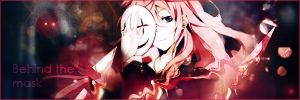 [Edit 2] Where has everyone gone; it's been pretty slow here lately. I hope not everyone is in artists block like I am >.> Although, my case of artists block has gotten a bit better, and after a week full of bad sigs I managed to make another sig (The avy for this one didn't look good so I'm just re-using an old avy for now XD).  And I guess I'll post some of my 'better' 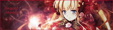 |
|
Re: A v y X S i g [The 3rd]
Link |
by
|
finally got photoshop on my new lappy... it too me a couple sigs to remember where the heck everything is though DX i ended up opening up some old sigs i made to figure out what the heck to do lol    yeah i know they aren't that great XD anywho onto the rest (will comment on only what i see here) @dfly looks nice! kinda a lot going on though in it >_> @jejechi =O i love the colours there! it looks really soft and pretty =) @holk i like the background and everything on the second one best except for that weird stuff going on under her arm =/ for that part in specific the first one is nicer ^_^ oh and the text is just a tad hard to see but it still looks amazing XP @toyumi the first one there is AWESOME! =O the colours are superb and the lighting is well done. The hei one looks good too... that empty space to the left is bugging me though >.< other then that good work =P @douji i like it except for the background... perhaps change the colour or add a couple more effects? as toyumi said it blends with the hand a bit much @zero =o i like both of them! they have a really cool drawn look to em =D the text on the second one is a bit off though... blah sorry for the ultra long post >o< ------ edit: @toyumi lol the sigs you are making look fine XP the first mask one feels like its missing something but i definitly like the full bloom one =D (for artist block i find working on stuff during classes helps a lot XD) @zero it looks good! the only thing that bothers me is the text... it might just be me but it stands out a bit much compared to the render that flows in with the rest of the sig and finally i was feeling very seasonal-y during my math class and decided to ignore the prof and make these =P   
 |
|
Re: A v y X S i g [The 3rd]
Link |
by
|
|
Hello, if no one's too busy I would like to put a request in? Character : Colette Brunel Series : Tales of Symphonia As always with me whoever is available can take the request and has free reign with the design. I would like the sig to say "Chosen." Image I'll find another image if you can't do anything with that one :D 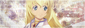
|
|
Re: A v y X S i g [The 3rd]
Link |
by
 on 2011-01-09 06:32:09
 |
|
Hey Guys! :D Your works are all so nice. You are all so good. :) I'm very happy that this club had a hand in honing your skills. Keep up the good work. I'm so proud of you guys. ~ashley |
|
Re: A v y X S i g [The 3rd]
Link |
by
on 2011-01-09 22:02:01 (edited 2011-01-15 13:57:41)
|
|
I'll be taking Yuna's request since no else is taking it. Please wait for it, yuna. EDIT Here yuna, sorry it took so long. Sorry, I use a different image of colette, I hope you don't mind. Hope you like it, if you want me to make some changes let me know.  http://i221.photobucket.com/albums/dd88/ZeroKnight_0/yunaavi-4.png http://i221.photobucket.com/albums/dd88/ZeroKnight_0/Yunasig-4.png @OOC, here is another set I made, please comment. My skills are lacking lately *sigh* 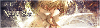 EDIT Here is another sig I made. I didn't put any words on it, for I do not know where to position it. Please comment.  |
|
Re: A v y X S i g [The 3rd]
Link |
by
|
|
has anyone taken my request if not its ok i'll wait just wondering if anyone has taken it..... i'll repost it though http://typenights.com/images/highschool/highschoolofdead_02_04x.jpg i would like the avi to read Dib i would like the siggy to read "Target, Confirmed" and if possible have a crosshair next to it
|
|
Re: A v y X S i g [The 3rd]
Link |
by
on 2011-01-12 08:51:35 |
|
@ Ocean- I can't work on things during classes, first of all my computer is a desktop and second I'm still in high school and in my school we can't bring laptops and such. XD As for your sigs, I really like the Peaceful Days one! The Frozen in Time one, not so much. The text looks a bit off, and the hand at the top left bothers me. But it's still good too! @ Zero- I have to agree with Ocean, the text in the sig stands out a bit too much when compared to the rest of the sig. Also, there's this white line going down the sig on the right side that isn't the border, and it looks a bit out of place. Other than that, it's nice. @ Dib- I don't think anyone's taken your request yet. Some people (Like me) are probably busy, so you'll have to wait for someone to take it. And I managed to make a new set. I really hope my artists block is gone. Although I know the avy for this set isn't that good >.>  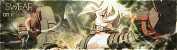 |
|
Re: A v y X S i g [The 3rd]
Link |
by
|
|
@Toyumi - I like it if it means anything and thank you for letting me know.
|
|
Re: A v y X S i g [The 3rd]
Link |
by
|
|
If it's alright can i request for someone to make me a Radio DJ Banner? >.> if possible have it say Star Zaku Radio ______________________________________________________________________________________________________________ EDIT: @Dib: for basics i suggest using this -> http://gendou.com/t/26426&ent=884914#884914 
 |
|
Re: A v y X S i g [The 3rd]
Link |
by
|
|
i would like to cancel my request becuase i've started using gimp and i'm gonna start making them myself. but i would like any tips if anyone has them as i'm not really good at all and the tuts are really confusing.
|
|
Re: A v y X S i g [The 3rd]
|
|
ohaaaaiiii i'm back after 1 year lol. just kidding. thanks for the comments, i appreciate the every letters. again, thanks, minna-san :3 replies. Toyumi: reply for this. i saw your 1st set and i think you want to experimenting the text on the siggy. well done, actually. the colors are nice. :D 2nd set, as always, you're always blend the colors beautifully. i just can say it's marvelous. XD reply for this. 1st, Behind The Mask. again, berry nice colors, but i can't read the text easily. maybe you can flip over the color for the text, lighter on the darker background and the opposite. :3 2nd and 3rd, siggy, Full Bloom and Elegant Maiden. no comment, i love it. but maybe you can enlarge the text on the 3rd siggy X3 reply for this. nooooo comment on the set. awesome, indeed. Ocean: reply for this. i just fall in love with the "Frozen in Time" one. Turns out nicely. <3 while the others, it's OK. :DD maybe the blend of strong colors is your identity. XD Zero: reply for this. i see that you really love to play with C4D and colors, also with the text. well, i can't comment too much, because i'm a simple-siggy maker. i like the texture cause of the C4Ds, and nice smudging, absolutely gorgeous. maybe you can teach me sometimes. XD @Zaku: if you don't mind, maybe i can take your request, Zaku. can i? :3 @Dib: it's okay Dib. you can ask something that confuse you here. for the tips... hmm. - beginners, have to know the basic tools. that'll help you a lot. - if you rightly follow the steps in the tutorial, maybe you can make it. i'm sure of it. :D good luck exploring the GIMP. :D i need comments or even critiques on my current set. ("one-sided sight" set) :U it's semi-transparent on the background. =='a ... now i have an artblock. rofl, what a disease. also c&c on this, please. when i was making it, i didn't know what i do lol. made for Thana.   i'll appreciate every comments and critique. :3 よã‚ã—ã。 |