|
Re: A v y X S i g [The 3rd]
Link |
by
 on 2010-08-08 08:09:17 (edited 2010-08-11 06:32:09)
|
|
@ Ocean- Very nice! (Although I misread the text as "We Walk Fonvard" and I was wondering what fonvard was XD) I agree with GM about adding some darker tone, but still it's very nice! @ Haseo- Very nice, but the only thing I can suggest is to make the canvas size smaller, since the sig is kind of empty towards the right side of it. @ GM- Your "Equivalent Exchange" sig is awesome! I love it! Your "Ren" sig is nice too, but I think that you overdid it with the arrows. [Edit] @ Shae- With your "Dreaming of You set", both the avy and the sig are nice but that could effect doesn't suit the render. But your "Hiatus" set, that one is really nice, the cloud effect suits it and I love the vector brushes that are giving it a grassy/flowery effect. That set is really nice! The Yanma sig is nice, but the text doesn't seem fitting for the sig.  |
|
Re: A v y X S i g [The 3rd]
Link |
by
|
My latest signature. (Btw going by Lillith now.) [EDIT:] Not to be rude or rush you naru but umm is my set done?  |
|
Re: A v y X S i g [The 3rd]
Link |
by
 on 2010-08-13 07:16:32 (edited 2010-08-13 15:13:54)
|
its been a few days since the last post.. anyway, i'll bring something new today  [edit] moving some new stuff here~     |
|
Re: A v y X S i g [The 3rd]
Link |
by
|
|
Well. It's been a while, so here's a new sig. Used photoshop elements for this. It's okay, for me. I didn't add text to it yet. And I might make the character aboved the polkadots things.  |
|
Re: A v y X S i g [The 3rd]
|
 Kogasa~ ♥  |
|
Re: A v y X S i g [The 3rd]
Link |
by
|
|
T_T been without photoshop for a few days while updating my laptop >_< Now that i have finally installed it again i have made a set! (lol sorry for going effect-crazy... i kinda got bored XP)   anywhooo... @Haseo another awesome sig >_> you should seriously consider making tuts for them @GM lol thanks XP Although i may not be the best at creating the sigs, i try to comment on other's just cause i know that i like getting comments XD Im glad that you can get something out of 'em =D for the ones you posted on the 8th, The first one looks a bit plain on the left side and the second one is kinda lacking flow, other then that i like what you're doing (gah i need to learn how to do the whole "render coming through a bunch of effects" thing >_>) for the ones you posted on the 13th, the one yiou did for Kotaro is pretty but i have this thing about cutting off the shapes if you do the whole transparent thing >_< that just may be my OCD talking though =P Nice job on the other two though =O btw i think it has been decided that the 5 post rule remains unless you are taking someones request @Sayu Looking good ^_^ the texture above the render looks nice, only thing i would suggest is getting the hair to be more vibrant... looks kinda muddy now >_> @Naru hmmm a gradient map to fix the fluorescent colours would probably make it look a bit better. Also the sig looks a bit blocky... like you have your render, your text and that other pic as separate focal points. Try to work on getting your render to stand out more and the text and other decals you add to sorta flow towards your render. Keep up the good work though =) EDIT: @Toyumi Oki i fixed the left side of hime somewhat... the render was originally fairly dark there so i didn't want to make too bright XP Thanks for pointing that out ^_^ For those sigs, the backgrounds are really pretty like always =P The text on the first two sorta dont match the rest of the sig though >.< Also the text on the third one is really hard to read. Other then that they are really really aweseome-ly done ^.^ Edit: @Toyumi ooooo =O i like that new one! The only thing i might change is making the text a bit more blend-y-er with the rest of the sig. Lmao all my sigs are like 350px+ in width XD @Zero Nice, i think the text is really good O_o maybe put some smudging around the render? @GM i like it XP if it looks like its lacking something, maybe try out some wireframe C4Ds? (i just discovered them myself XD) annd finally, i made a new sig after spending two days on a failed one >_< (i sorta got lazy on the text >_>)  
 |
|
Re: A v y X S i g [The 3rd]
Link |
by
on 2010-08-15 07:05:04 (edited 2010-08-17 19:14:26)
|
|
@ GM- Your Kotaro set is really nice, I like the sig and avy itself and the text looks nice too! With your melody sig, I like it all except the font choice, it just seems out of place to me (And I've also used that picture in the background before for a wallpaper XD). Your bullets sig is very nice, the text looks good and the lighting is good as well, the only thing I would suggest is to lower the opacity of the blue and yellow stuff in the background (Since that attracts a lot of attention away from the render). And your smile of innocent sig is also very nice, but like your melody sig the font doesn't look good with the sig. @ Sayuri- The sig is nice, I like the polka dot texture and everything looks nice. Of course the right side of the sig looks a bit blank, but adding some text would take care of that. @ Naru- Ocean's right about adding a gradient map, since the sig looks too bright. Ocean's also right about the sig looking blocky and seperating the focal points of the sig. @ Ocean- That set is very nice, I like it! The avy looks good, and so does the sig (I love the music notes in the set too)! The only thing I could suggest is to get some more light over on the top left area or the face, where the hand touches the face, because it just seems a bit too dark there. But other than that it's really good! Oh and here are some set's I did recently.       Like always comments are appreciated! [Edit] @ Ocean- No problem, and thanks! Another new set~ My first sig that's over 300px in... Awhile, now that I think about it. XD   [Edit 2] @ Zero- I tried to do that with my most recent set (The one I'm posting below), but Photoshop doesn't have those settings (At least mine doesn't, which is CS3). @ GM- Everything is nice in that sig except the text doesn't seem to blend in with the rest of the sig, since the rest of it is brown and the text is white with rainbow in the background. I would try changing the text to a tan or brown color so it would match the rest of the sig. @ Naru- I haven't played the game so I wouldn't know what Emil is like XD @ Ocean- IZAYAAAAAAA!!! That sig is really nice! Your right about the text needed some work, but the font seems to fit with the rest of the sig. And another set~ This time Ocean's "Steamline" set inspired me for this (That and I was looping "My Soul Your Beats" while making this XD).  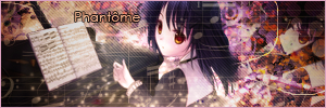 |
|
Re: A v y X S i g [The 3rd]
Link |
by
 on 2010-08-16 17:23:29 (edited 2010-08-18 16:56:29)
|
|
hey guys, I'm back from my trip to the atlantic province in Canada. Phew. . .since I'm back I took the chance of making a new set and watching anime as well. @toyumi, I like the font you use for fenris avi, however the font for the sigs that you did for all three of them is lacking a bit. Perhaps you should use some of the effects like value or grain merge for your text. Plain text is nice and all, but it have to match the signature. here is the set I made, but I think I have chosen the wrong effect for the text though on the first sig. Please comment.     |
|
Re: A v y X S i g [The 3rd]
Link |
by
on 2010-08-17 11:36:45 (edited 2010-08-18 15:49:10)
|
here is a set i'd make for shae, somehow.. i feel there is something lacking >_<  [EDIT] btw.. this is a set that tifa requested me   |
|
Re: A v y X S i g [The 3rd]
|
|
@Toyumi & Ocean hm, you're right about the brightness, I could tune it down a bit. Thankfully I saved a .psd of it, so I'll fix it later. Other than that I like your sigs. But your 3rd set Toyumi, it doesn't fit Emil at all. The text doesn't explain his personality XD and the squares are kind of unfitting. @GM your sig is ok, but I wouldn't make the render the same color as the rest of the sig, it doesn't give attention to it. Anyway, here's a set I made.   |
|
Re: A v y X S i g [The 3rd]
Link |
by
|
|
OMG! Naru-chan i love it although if i may point one thing out you spelled Lillith wrong. >.< Gomenasai if I'm picky about the spelling but i just wanted to point that out. But i'll still use it for now. ^^ @Gm OMFG! GM that looks awesome! O.O [EDIT:] My newest sig i made:  [EDIT:] lol that is alright you can still call me Tifa. ^^ |
|
Re: A v y X S i g [The 3rd]
Link |
by
|
|
Ah i can post again! =O Oki @Toyumi Lol music sigs are fun to do XD I like that one btw ^_^ looks a bit chaotic on the right side but it still looks awesome =P @GM I really like that second sig =O only problem is the lighting you used sorta eats the attention O_o other then that, nice job @Naru Looking nice ^_^ the "lilith" in the sig looks a bit outta place and the "Magical Wishes" is a bit hard to read, but otherwise its a good sig =) @Lillith (feels weird not to use tifa O_O) nice but it the heart around your render is ust bugging me for some reason... It cuts the flow and sotra looks positioned weird >_> Looking good though =D soo my latest sig... Had a lot of trouble with this one and it didn't turn out well >_< *sigh* my creativity is just blah recently -__-  perhaps i shall spend a few days playing around with some random tuts... Edit: @Toyumi ahh you're right... the bacground looks over smudged and the lighting is off DX meh i'll just write that sig off as a bad experiment XP For your new sig, i really like the colours =D the left side looks a bit lacking though O_o maybe thats just me though XD Alsooo for the text maybe you could use some different effects? the solid orange with stroke looks outta place in the sig >.< Anywhoo looking good as always (especially the avy in which i see nothing wrong XP) Annnd finally i made a sig for my bf XD I will probably make a matching avy to go with it later if i have more time >.<  I keep using reflected gradients DX Edit2: @Zero (assuming those comments were for the purple sig above) Yeh i just overdid the background on everything (very little brushing involved though, most C4Ds and various applied layers with filters) I now know what not to do XP. As for the text, i like using one - two word phrases, helps it leave a more dramatic impression i suppose? i'll try using "sub-text" on my next siggy though =P As for yours i like the squares you got there XD the white part just ending on the left side so suddenly looks off to me though O_o Also I tried doing a smudge sig >_> Last time i tried it it sorta turned out in disastor... still iffy on whether this one did or not >.< 
|
|
Re: A v y X S i g [The 3rd]
Link |
by
on 2010-08-19 18:34:57 (edited 2010-08-22 09:27:28)
|
|
Now that I can post again (That last post was getting so long XD)... @ GM- Very nice job with the request, Ocean's right about the lighting, and it also bugs me how the lighting is in two different spots in the sig, but other than that it's very nice! @ Tifa (Yes I will call you Tifa, Ocean's right about Lillith seeming weird XD)- The sig's nice, I can tell that you're improving. The only thing that really bugs me is how the text is in the corner, you should always try to make the text close to the render. Also, it would look nicer is you stroked the text in black instead of the bright red. @ Ocean- You're right about the sig seeming a bit blah. Don't get me wrong, it's still nice, but it looks like you over smudged it. Something about the lighting seems off to me as well, but then again that could just be me. XD Anyway, here's the set I'm using now, and like always comments are appreciated. (I know the avy doesn't look too good, but then again I say that about a lot of my avys. XD)   [Edit] @ Ocean- Thanks! And yeah I was getting lazy on the text (I usually am very lazy with text stuff XD). And that's a nice sig too, the only part that bugs me is how the left side of the sig is looking a bit blank. But making the sig smaller would take care of that (I love smaller sigs XD). Also, lowering the opacity on the gradients you used would make those blend into the sig more (And not as stand out-ish). @ Zero- That's a nice set, the only thing that bothers me is the white part behind the render since it takes attention away from the render. But other than that it's nice. Alright, So I tried out doing my first couples set, and I think it turned out pretty good. I'm not too good with avys, so instead I made the sigs the set part. This is the sig not split up.  And here are the sets (With the avys and the sigs split up).     [Edit 2] @ Ocean- Your 'Stone Cold' sig looks nice! The only thing that bugs me is that huge black spot right above the text. Other than that it looks good. But that sig has been following the same style as your last few, so maybe you should try to change it up a bit. (I know I've said this to you before, but try changing it again XD) The thing is that if you make so many sigs with the same style, it will be easier to pick out which one is yours from a group of sigs. You do want to have your own style, but you also need to make your sigs unique in their own way. (I hope you get what I'm trying to say XD) @ Holkers- Thanks! For the first sig, the only thing that bothers me are the scan lines, maybe you could switch them to a different setting (Soft Light or something like that) and just lower the opacity to make them blend in more. Other than that I like it! And for the second sig, I like everything except how the text is placed there. At first glance you can't really tell what it's supposed to say since 'of the' is below 'beauty musically hearted'. Putting 'musically hearted' below the 'of the' would make it not as confusing. XD @ Yuki- In both the avy and sig it's hard to see the text (Especially the sig, I can hardly read what it says, and I'm still not sure if I'm reading it correctly XD). Outlining it in black or making it a different color would make it easier to see. But other than that they're both looking good! |
|
Re: A v y X S i g [The 3rd]
Link |
by
on 2010-08-19 20:47:58 |
|
@Toyumi- Your font, try using different for that sig, for sans and such are nice but it doesn't seem to match with the sig itself. Also try to use the gradient tool for the font to get the special effects. @ocean-Nice one, but I feel that the render is a bit too sharp, and the background. I think you overdid it with the brush strokes. Just use a few of them not too many and set it to Grain merge or Overlay, it might look better that way. Like the font by the way. But instead of just one word not have a sub-text. A smaller phrase place beneath your main text. Well this just my suggestion. Tifa- Like I said before, your render is too stretched. when you try to resize the render make sure the height and width are anchored before resizing it. Try adding a few C4d to the background, it might bring out the sig. Just a suggestion though. Naru-The sig is nice, but tone down the fluorescent colours a bit, it might look better that way. GM-Nice one, you are getting a lot better. I like how you did with Tifa's set. Here is my newest set. I've been itching to make a setsuna f seiei set for a while. Been too long. Comment on my new set please. Thanks XD   |
|
Re: A v y X S i g [The 3rd]
|
|
So.. this probably isn't the place to post this... but oh well, i need some comments anyway xD Aaaaaaand.. I can't find the "Share You Graphics Here" forums Since some titles are too fancy to be searched. Thus, enjoy this new style of mine and new technique and signature. (2 signature in one day -w-!)   For your information, Lights is an artist. She has the best uhh.. electronic sounds. Like Owl City. In fact she toured with them. Thanks to Anna for the "What sentences should I put in the Katy Perry's signature?" Anyhow, that's from me today a new signature. Hopefull I'll start the techs on more animes render xD! PS Dear Ocean, your design are awesome! But try use some lights? I guess you like dark colours then... xD Dear GM, love your new stuff there man! Dear Sayuri, that's amazing. Keep up the good work! And try blur the polka dots on the render.. :3 Or clear it a little bit. Dear Ocean, love your Trickster sig! ... I mean Durarara. LOL didn't saw the render. Dear Toyumi, you have advanced! Not bad! I like it. Fenris set could be less complicated :D
I claimed someone that I can't remember because photobucket is ended.
|
|
Re: A v y X S i g [The 3rd]
Link |
by
 on 2010-08-22 04:21:16
 |
|
phew I finally get to do some photoshop >.< Please comments on my new set XD much appreciate :D everyone is doing so good with their amazing sets and sigs XD @Holkers; those are amazing >3 im practising how to make real people sig but i seem to cant choose the right style for them >: but i have to say the "original" bit is quite hard to see o; |


|
Re: A v y X S i g [The 3rd]
|
|
Yuki: thank you 83 I found a great tutorial for real people signature And thus, I experienced it on some of my favorite singers That's the main thing xD I blend it and I'm too lazy to render the image so I put on "Overlay" mode to disappear the backgrounds and focus on the words So, yesterday I had a foul mood, I made these instead to cheer myself up Took me some time with the Denmark's signature I got nothing to work with the image   Enjoy.
I claimed someone that I can't remember because photobucket is ended.
|
|
Re: A v y X S i g [The 3rd]
Link |
by
|
|
@Holkers =O i like those sigs, they look amazing =) And thanks =P i do like working with dark colours btw XD @Yuki Kuroshitsuji! nice job on that sig ^_^ and finally i made a quick and rushed sig XP i've been sorta short on time recently >_<  I think i might shorten it a bit since it looks like a lot of empty space
|
|
Re: A v y X S i g [The 3rd]
Link |
by
 on 2010-08-24 06:39:05
 |
 |
|
Re: A v y X S i g [The 3rd]
Link |
by
on 2010-08-24 07:36:25 |
|
@ Ocean- That's a very nice sig! My only complaint about it is that the render is low quality. But other than that it's very good (And I love the scratchy effects you added to it). @ Lei- With the avy it's kind of hard to see the name on it, Plus it looks like it could be a bit shorter (SInce there's an empty space towards the left side of it. And with the sig, it's okay. It only has a few brush strokes and it seems lacking. The other two images in it seem kind of small to me, and there's a lot of text there. It seems lacking and it needs some more work. Well, here's a sig I made last night. I'm really happy with it except for the text (I actually felt like it didn't need any, but I decided to put something on there XD).   Like always, comment on it! XD |