|
Re: A v y X S i g [The 3rd]
Link |
by
|
|
May i please request a set: I would like a set of this picture: http://scifiandtvtalk.files.wordpress.com/2009/12/alice7.jpg and on the avi i want it to say Tifa and on the sig i want it to say Hatter. Thank you much to whoever takes my request. ^_^ [edit] Can someone take my request?  |
|
Re: A v y X S i g [The 3rd]
Link |
by
 on 2011-11-06 15:00:42
 |
|
@ Yuki- That sig is really nice, my only complaint is that it could be shortened a bit on the right side since there isn't too much going on there. @ Zero- Your works in Photoshop don't seem to be lacking to me at all (Although the Shugo Chara theme seems to be a bit repetitive for your Photoshop works XD). I especially like the third one and the fifth one. As for your works using Gimp, I really like the second one. The first one seems like it needs to be sharpened or something. And I made a new set, one that I think I'll be using for quite some time (I might even use it all the way to Valentine's Day, at the latest). Comments?  |
|
Re: A v y X S i g [The 3rd]
Link |
by
 on 2011-11-21 02:09:00 (edited 2011-11-21 02:10:31)
|
Phew!~ Cool signatures as always. But I think this thread is going a bit slow and that's not a good thing. Anyway, I'm looking forward to more works from you guys. I just love them all. (Btw, I'm falling too far behind you guys now because you're all just too awesome HAHAHA Plus I don't even know how to use PS now after a long break.)  |
|
Re: A v y X S i g [The 3rd]
Link |
by
|
My new Winter sig~ evaluation plz~  |
|
Re: A v y X S i g [The 3rd]
Link |
by
 on 2011-12-30 15:27:08
 |
There's a lot of Grey in your sig... it leaves a very empty feel to it, just as if you could add things other than snow flakes. Also, the font of the "~SRT~" stands out, maybe because it's a different color than the large one.  |
|
Re: A v y X S i g [The 3rd]
Link |
by
|
What program does everyone use to make avatar/signature images? I'd like to know, since I want to practice making them. I don't really enjoy bothering other people for them all of the time, ahaha.  Thanks to liweny for this lovely Mystia claim icon! <3
 |
|
Re: A v y X S i g [The 3rd]
Link |
by
on 2012-01-01 11:08:39 (edited 2012-02-10 20:43:19)
|
|
@ Shae- Nice to see you around again, Shae! And don't worry, I feel like that with Photoshop whenever I take a long break from it, like it's something totally foreign to me even though I've used it before. XD @ SRT- I agree with Frozen about the snowflakes, and I also think that you should make the text in your sets the same color and style throughout, as well as making the text and color something that matches the rest of the sig so it can blend in better. @ Mystia- Most people use either Gimp, which is free, or Photoshop, which you have to buy. As some practice after a month-long break from Photoshop (Or something like that), I made this banner. Although, I know it's not that great, I've gotten a bit rusty with GFX because of school. >.> [Edit] @ Zero- The one thing that bugs me about the sigs you've posted is that they generally follow a similar style. I mean, with that I can see how you move from one style to another one that's kind of similar to the last, but it's almost like you're holding yourself back by just gradually building upon what you already know instead of learning something entirely different and trying it out as a change of pace or even just as an experiment. You might find out that you really like something you did with that style, and then you can combine it with your other one methods. What I'm really trying to say here is to go beyond your boundaries and experiment with your works. It looks like you're getting the hang of Photoshop, but I think you should experiment with it to get better at it. And here are some things that I've made in the past month. There's not much, really. >.> This next one has a Topaz filter on it, Haseo got a free trial of Photoshop along with Topaz so I whipped up this sig to see what it was like. XD |
|
Re: A v y X S i g [The 3rd]
Link |
by
 on 2012-01-01 12:36:49
 |
|
Well everyone it's been quite a while hasn't it? I figured that after months of absence that I would at least offer my critique from beyond my retired state, haha. I'm not going to critique a whole too much though, only what I can see while typing this up, as well as the post being fairly recent as well. @Toyumi: You already know what I think about that Unplugged signature. I think it's amazing, although you claim that you think it's "alright," at best. You call yourself rusty, yet you've seen my latest works. :P @SRT: I'm gone for a third of a year and you're making things exactly the same as you were back then? That doesn't sit too well with me. I highly recommend that you stray away from just using fills, brushes, and gradients. Look up tutorials, download more resources and branch off. You may think that one style is enough, but that is never the case. Skill in GFX isn't measured with how well you know your way around a program, it's measured by the artists creativity, and it's the truth to say that experimenting in other styles will help that creativity grow, and in turn, you'll become a better artist. I encourage you to move out of your comfort zone and experiment more. And since that's all of the recent stuff, time to move on to the mediocre works of my own that I've made. I retired from signature making completely since these works were finished, and they were made while I was technically. They're all not that good, Toyumi claims to be rusty, but this is truly rusty haha.      

|
|
Re: A v y X S i g [The 3rd]
Link |
by
 on 2012-01-01 14:00:17 (edited 2012-02-02 19:32:52)
|
|
@Srt; I agree with Frozen, toyumi and Haseo's comments about your sig. Perhaps you should try adding effects like C4D or something. Also try to experiment with the text a little. For almost all the signature that you did have almost the same font or text style. @Toyumi; The signature is good, though the text border for unplugged doesn't seem fit the image of your signature; since your background is mostly green, purple and black. Well that is my opinion. @haseo; nice signatures, though I notice many of the background on those sigs are kind of blur. Not sure if you did that on purpose or not. Some of the text style you use for most of your sigs, doesn't seem to go well like it doesn't blend or match. Like the paradox sig and Blue life. For blue life, I almost missed those words since the text style and font are too blend in with the background. For the Jump sig, the render looks a bit out of place with the stock background you use for the sig. Though the text suit the background, the render itself stands out a little, doesn't seemed blend in with the rest of the background. Your jump sig, no comments for that one nor the reboot sig. For I like the styles for those two. Here are some of my new work in PS. Though some of them had the same style, I'm still learning and trying to find good tutorials to improve my skills.   ↑Don't really like this sig, to me it is lacking and it suck...         EDIT 2 Newest signatures I made in photoshop. This sig is also featured in my new tutorial. Please check it out if you want.      |
|
Re: A v y X S i g [The 3rd]
Link |
by
on 2012-02-09 16:32:51 |
|
@Zero the sig you have right now, in my opinion, would be the best one you've made. That is, comparing the ones you had within the past two years. Secret service shows more art(by art I mean beautiful), rather than the coolness of putting a "shounen" within an abstract background. |
|
Re: A v y X S i g [The 3rd]
Link |
by
 on 2012-02-12 09:36:44
 |
|
Thought I would show off some of my recent logo designs. Recent being.. uh, a few months ago? LOL.  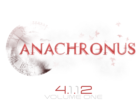 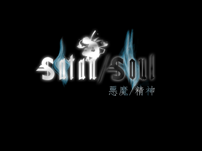 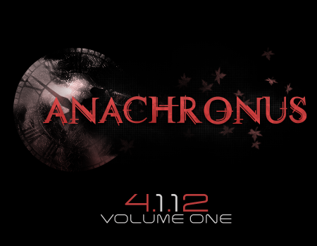 Imagine the Lucky 13 and Anachronus without the dates, LOL. They served as teasers, and the Anachronus one is actually the big time one, since it's for my light novel. The one I'm using for Anachronus as of now is the final one with the black BG. |

|
Re: A v y X S i g [The 3rd]
Link |
by
|
|
BUAHAHA surprise ninja appearance! And everyone's stuff looks awesome as usual @shuy those looks extremely professional =o may I ask which fonts you used for the "Lucky" and "Anachonous" ones? @zero very nice! I think your "never give up", "revelation", "devotion" and "secret service" sigs are perhaps some of your best stuff yet =D @haseo I've already stalked your deviantart and favorited those XD @toyumi Once again fabulous stuff XD The "blue rose" one looks amazing O_o annnd I actually haven't made anything =P I've been playing with my touchscreen though during class and doodling stuff, but none of them are anime related... heck none of them really involve anything that could have been done outside of ms paint >_> If anyone wishes to know how I draw by hand... I guess I can link it http://photobucket.com/umi_no_photoshopdoodles I've also been sporadically making more album art.. http://photobucket.com/umi-no-albumart ________ Finally finished this one... feels like its been sitting in my photoshop for months (which it has =P)  ________ @zero ahah thanks =P it's hard to break out of old habits after not making anything sig related for so long XD As for your guilty crown sig, tis quite nice. Although the text seems a bit off and the right of the render seems a bit empty. Other than that, the colour scheme and composition are very good =o annnd I've actually made another sig! (this time trying a few new things)  another new one (with the same-ish style from above)  and a third!  note that I actually don't like the starry sky anime nor have I ever played the game... the only reason for this spree is because I have stumbled upon some easy to render images XD and a forth  
 |
|
Re: A v y X S i g [The 3rd]
Link |
by
on 2012-02-12 10:46:36 |
|
Lucky's font [and XIII as well] are the same font as the Matrix movie logos and is called "Miltown II" -- a pretty nice font choice I thought, which surprised me. Anachronus' font is called "Technovia" and is one I really like. Sometimes I tend to do too much with fonts, like strokes and whatnot, but technovia is a font that looks loads better without a stroke. Also, thank you! :D I tend to go crazy when I work on logos, so it's nice to hear some praise for them, haha. |
|
Re: A v y X S i g [The 3rd]
Link |
by
on 2012-02-22 18:11:50 (edited 2012-02-23 12:00:08)
|
|
@Shuy; nice fonts. Its pretty cool in my opinion @Ocean; Nice flow, though I see some of your old style in that sig XD My newest sig..Trying new styles by experiment. I know this signature sucks. But it is the best I could do with having to juggle with midterms, school projects and my job. Please comment.  EDIT Another new sig, made this with the lack of brushes I had, since I was using the school computer. 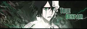 |
|
Re: A v y X S i g [The 3rd]
Link |
by
on 2012-02-24 19:20:41 (edited 2012-03-30 16:50:34)
|
|
@ Shuy- Nice logos! I also like the black version more for the Anachronus one, and I really like what you did with the Satan/Soul one. @ Ocean- Thank you! And I would have to say the same about your Constellation sig. I think it's one of the best sigs I've seen from you yet. That's not to say that the others aren't good too though. I like all of them except for Indecisive, the colors of that one don't really go together very well. And like what Zero said, your Distant Fragments sig definitely reminds me of your old style with sigs. XD @ Zero- I like your Guilty Crown sig, but like what Ocean said, the text for it seems a bit off. Other than that, I don't really have any complaints. Your True Despair one is alright, although I think you overdid it with the ripple effect on the left side of the sig and that the text stands out too much with the white outline and takes attention away from the rest of the sig. And here's my latest sig. I haven't been making as much recently due to school and other things that have been stealing my attention away from GFX. >.> [Edit] @ Emiya- The sig doesn't look that bright to me, and I really like the smudging you used in the background. @ Ocean- I like your Acceleration sig more, although the lighting seems a bit funky in it. The lighting for your Caught in a Daydream sig is better, although I think that sig it's lacking a bit in depth. And another sig. I don't think it's that great but I've been wanting to use this render for quite some time. Although it ended up being a pain to work with. XD I hope this one's not as "dark" as my previous sig(s). XD [Edit 2] Even though no one's updating anything here, just wanted to put up some of my more recent sigs since I made a few in the past month. >.> And two versions of the same sig. The first one is my current sig, my second one would have been my sig if it didn't go over the 100 kb sig limit. XD |
|
Re: A v y X S i g [The 3rd]
Link |
by
 on 2012-02-25 01:40:24 (edited 2012-04-05 22:14:53)
|
Yo everyone, it's been a while since I posted here (again). Anyways, I don't have a lot of works to show here, other than the lazy Reimu Hakurei and the untouched Naruto sig. It seems that I preferred something simple and clean lately. And by the way, the Reimu sig was taken from a stock image. My last render/C4D based sig. *cough* I know that it's too bright >_> Skills and steps used from Toyumi's 3rd tutorial. @Toyumi: It seems that your works looked darker. Then again, nice Zero sig you have there xD @Zero: Since I commented in Chat and Toyumi mentioned most of the points, so yeah :x @Ocean: I liked the Distant Fragments sig the most. Easy on the eyes and not too empty, although it might get dull looking at it after a while. About the Constellation, very very eye catchy xD Lots of details there, and I gonna admit, the BG is nice and got nice flows, but it proved to be too distracting from the render :x @Le Shuyin: Now that is some fine typography you made there. Liked the Satan Soul and white Anachronus. P.S: To be honest, I think I felt like semi-retired from the signature scene now. Edit 2 - Although I'm qualified to post a new reply, I only have minor updates to post. After looking at GM's work (You will know him as the pedobear in Gendou Chat. He used to create sigs and avys.) plus a couple of long overdue requests, I decided to search for new tutorials. Found a nice, smudging tutorial. The Dragon Age 2 is my first one, whereas my current sig is the second work with the smudging style. In case you guys want the Russian font in my Roy Revant sig, it's Kremlin from dafont. Courtesy of Holkers :x 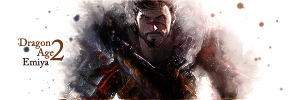 @Toyumi: The pair sig... hmm, perhaps the text "I Love You" would be enough. The Billowing text part looked a bit, distracting for me :x The Akazukin sig is very good, but the render needs to occupy uh, more space? Perhaps the sig have too much empty space. About the unnamed sig below the first one, no comment :x As for Yoko, hmm... Interesting style you have there. Feels like reading an old manuscript of some sort. Yeah, the 2nd one is better. Perhaps consider to use JPG compression? Further comments... 1st Yoko sig looked a bit bland. @Zero: It's okay Zero xD About your current sig, IMO you oversharpened the sig too much and it looked jagged. Sig is too contrastic. Overall, it's decent, but need some more work.   |
|
Re: A v y X S i g [The 3rd]
Link |
by
|
|
excuse me i want to request avatar and signature Avatar : name : Grey ( Picture : This ) Signature : can you add a simple phrase of "let's go" to this pic ? :) This thank you for your help :) 
 |
|
Re: A v y X S i g [The 3rd]
Link |
by
on 2012-02-26 12:35:32 (edited 2012-03-27 18:15:04)
|
|
@ Grey- I'll take your request. [Edit] Here's your avy, I'll try to get your sig done sometime this weekend so please be patient for a few more days.  Click on the image for the link. Also, I'm a girl, not a guy. XD [Edit 2] Sorry for such a long delay for the sig. >.>  |
|
Re: A v y X S i g [The 3rd]
Link |
by
|
|
@zero The ulquiorra sig feels somewhat off. The background and colours look fuzzy and sort of muddy =/ although ulquiorra isn't a very colourful character so I can understand the difficulty in working with such a render XD The text could be a bit less bold as well @toyumi I like that sig =O but it seems really dark to me... That may just be due to personal taste though XD @emiya I don't think its too bright >_> It looks really cool and somewhat magic-like. ___ and probably my last sigs for a long time (since my reading week is now over *cries*)   the last one uses mostly stuff I rendered myself =P also, I have discovered that photoshop CS4 is so much easier to use than CS2 XD
|
|
Re: A v y X S i g [The 3rd]
Link |
by
|
|
@ toyumi : thx dude :) appreciate it :D
|