|
Re: A v y X S i g [The 3rd]
Link |
by
|
|
Hey, I have aquestion, how do you guys/gals keep your sigs under 100kb? Like seriously, for me, cutting out a render and pasting it on a 100x300 transparent frame(100x600 will be 1Mb by it self) will pretty much bring me to 70kb. Seeing you guys are more skilled than me, I thought some one here might be able to help me out on the file size. I use: PS CS5 usually PNG file type  |
|
Re: A v y X S i g [The 3rd]
Link |
by
 on 2011-07-01 13:27:30 (edited 2011-07-01 14:44:44)
|
|
Yay I can finally post again after the many edits on my last post~ @ Ocean- Ahem. Anyway, I like your current set. The colors go well together (And you didn't make it as monotone as your last few sets, which I like a lot) and I like the effects you used for the avy. The only thing that bugs me is Kazehaya's left eye, it looks kind of weird for whatever reason. Other than that, I love the set. @ Zero- Both of the sigs you made are nice. Personally, I like the first one more, although I think that it could be cut down a bit more in size because both sides of the sig are a bit blank (Maybe bring it down to 300px width instead of having it at 320px width). The 'Organization XIII' text could probably be a bit bigger, or in a different font or something, since it seems kind of squished. For your second sig, like the first one the size of it could be cut down a bit. I don't think that it's as good as the first one, because the lighting on that one is a bit too extreme and the flow of it seems a bit off (The light behind the render seems to go out, while those two lines are going in towards the render. I also think that the render could blend in a bit more with the rest of the sig. @ SRT- Quite honestly, I don't know. I've never really checked my sigs with that file size stuff. I only just looked back at my sigs because you brought the topic up and found that most of my sigs are in the 70kb-80kb range. XD Well, I don't really have any advice for you because, like I said before, I've never really bothered to look out for it. Try Ocean's advice with saving it in that different form of .png file. And just posting the set and the different versions of it that are on my last post again, in case anyone didn't see it or something (There were a ton of edits on my last post so it's understandable that people might skip over it XD). Version 1: Version 2: Like always, comments? [Edit] @ Ocean- Yes, of course it was intentional. XD @ Naru- I don't know why you think there is that much space there, it isn't that much. But still, I get what you mean. XD As for your sigs, personally I don't like the first one. It just seems too messy, especially with all of those clipping masks. They just look too out of place with the rest of the sig. My advice for that would be pretty much the same as what Haseo said about that, so just follow what he said. And again, personally I think the second one you posted is the worst out of all the sigs you posted. I think the effects you put in there are just really messy, and the lighting in it needs a lot of fixing. Even though you said that you don't care about the font placement for it, that bothers me almost as much as the lighting does. >.> I think the third one you posted is the best out of all of them, needless to say that I like that one the most. The only things I have to say about it are that the lighting could be a bit less extreme on the right side of the sig and that the 'Music of' part of the text could stand out a bit more (Maybe make another layer of that part of the test without the stroke and just lower the opacity of it until it isn't as overcome by the stroke?). I like the third one as well, although I think it could be shortened a bit and that the don't for the test doesn't really go well with the rest of the sig. @ Haseo- We copy it because it's neat and it's something new to try, so stop complaining that you started a trend. Also, my Rin sigs are 'real' vector sigs. >.> Ahem. Anyway, that sig is really great, I love it except for one thing. I think that the lighting could be a bit less extreme at the center of the sig. Other than that, very nice job.  |
|
Re: A v y X S i g [The 3rd]
Link |
by
|
|
buahahaha moved this over to a new post since it seemed strange to have it on my last one: "ok onto comments... everyone seems to have gone into super graphic designer mode since everything looks pro >_> @ Toyumi all the sigs look aaawwwweeesssooommmmee O___O no complaints about any of 'em! my favorites are the alice phase one (the lighting is very very well done) and the rin version 2 one (the vector-layer look is really nice and the colours work well together) @ Jejechi i like the longing sig =O the boxes look really cool with the font =) the unexpected set is also nicely done. The sig is a bit bright for my taste though >_< @ GM zomg tis amazing o.o can someone point me to a tutorial that explains how to do such cool things with burst-y effects?? @ Zero I like em! the text, effects and lighting go perfectly together on both =D __________________ finally, since i got another week long vacation against my will, i have made one set (and four wallpapers but i'm only posting the set here XD)   i tried to make a watery-vectory effect using C4Ds and a little bit of brush-work >_> i liked the result so i whipped up an avy to go with it XD EDIT: @ SRT there are two png file types that you can save something as isn't there? like png-24 and a png 8-128 dithered or something like that. Try using the png-24 which is what i use and my sigs rarely go over 70kb. even the animated ones i did are under 100kb >_> the only way i think you can go over is if you have the full 400px width with transparent effects, but even then it only goes over by a little bit... also i don't think the 70kb is really enforced all too much since ive had sigs that were at 100kb (particularly my animated ones) set as my signature for a good number of months XD" __________________ and onto newer better things (ok not really): @toyumi buahah yesh it is kazehaya =P and the thing with his left eye, was it the weird darkness that i forgot to eras- i mean that i placed there completely intentionally *cough* >_> lol i have fixed that in the one in my signature :V @Naru For your first one i REALLY like the colours used and the different textures =O the only thing i would suggest for it is perhaps blurring the background or adding some smudges behind the render so the render stands out more Your second sig is my favorite out of the four. I like the colour combinations and lighting youve got going on there. The text is weird with the purple-y stroke but i still like the sig as a whole. for the third one, the colours could use a bit of toning down (adjustment layers at the end always help with this). the lighting is also kinda intense and it looks like the right side can be cut a bit DX however i do like the smudge-work and the text in it. for your forth one i already commented on it in the rate-sig thread thing =P Tis quite nice but i think the left side could be cropped a bit 
 |
|
Re: A v y X S i g [The 3rd]
|
|
@Toyumi SO MANY EDITS . _. Anyway. Hm...not much to say here, I like all of them. The only thing that confuses me is your recent sig, I dunno why you changed the color of it, I personally liked it before. Although the lower right throws me off as to why there seems to be space there. @SRT I dunno, I don't work with many layers when I do mine, plus I use bicubic sharp or bicubic, and that seems to work on lowering file size. @Zero the first one's okay, but the font doesn't seem to add up with the mood of the sig. The second one is kinda off, it's color-irrelevant, in simpler terms. Plus the font's too transparent, at least make it 83-91% if you're going for the transparent font thing. Plus the font could use stroke instead of outerglow, or both. After that, I guess I'll show mine. I didn't care about the font placement on this one, it wasn't for this site. Finally got the hang of smudging. Whee. Box was optional, but you wouldn't see the text if I left it out.  |
|
Re: A v y X S i g [The 3rd]
Link |
by
 on 2011-07-01 14:04:53 (edited 2011-07-02 09:30:18)
|
|
Oi. You guys give me too much to comment on. Why do you do this to me? Because I'm lazy, I'll start with Toyumi's latest post. @Toyumi: As I've already stated in the rate the signature thread, I really like that sig. It's a nice change of pace and style. @Ocean: I see you took my advice about forcing the focal, haha. Or maybe you forgot about it and it just happened that way? Haha, either way, it works. My main issue with that sig, is the dark blue lines going through it. There are a few of them that look a little out of place, and the fact that there's no light source or anything to really define a focal, bothers me for some reason ;w; @Naru: I like your first sig, it's the best out of the 4, but the clipping mask on the left side as well as the one on the top left are out of place. If you want to use clipping masks then, what I would suggest is bringing the brushes closer to the render, and adjusting the size of the splatter brush so where they're not too large and brush around the base of the render. Don't go too crazy with the splatter though. Your second one is ok, the light source is too bright in my opinion, and the text in the bottom right is just out of place. I think it would be fine if it was at 20% opacity though. The violet c4d on the right is kind of out of place as well. 3rd and 4th are ok as well, only gripe with the 4th is the black abyss on the left. It's been a while since I posted a sig here. Probably because I haven't been making many lately. And when I do, it's either a fail, it's my sig, or it goes to my deviantart which most, if not all, of you have. But I just finished this one, so.... And yes, I know the text is bland. Nothing really worked out so i went with this.  I'll go ahead and get Zero's request 

|
|
Re: A v y X S i g [The 3rd]
Link |
by
  on 2011-07-02 01:43:45
 |
|
*peep from behind the door* Hi...can i request for set featuring Syusuke Fuji from Prince of Tennis series? I'm currently very busy and has no time to make it myself >.< Avy length: 100px x 25px name: Zero Siggy length: 300-350 px text: The prodigy Feel free to use any picture you like^^ Thx before *bow*   |
|
Re: A v y X S i g [The 3rd]
|
|
hohoho hello fellas. k so, comments. @GM: can you teach me how to blend the render and the C4D so perfectly? O___O it's damn good, except for the text. it's nice, but i think it's giving more weight on the right side. well, keep up the good work! @Zero: the 1st one wins. the color blends nicely, well done. XD and yeah, i kinda overdo the lighting on both sets. T___Td @SRT: maybe you can save it as *.tiff instead of *.png. It supports transparency too, and much compressed than *.png. :3 (correct me if i'm wrong, please.) but yeah, i always use *.png, but my file just stay around 60-80kb. @Toyumi: ... so many editing indee--OMG. VECTOR SET WITH RIN ON IT. *drools* well, i think the 2nd version wins against the 1st one. I love the way you play the colors. It's veryveryveryveryvery nice for the first try. btw thanks for your comment, i really appreciate it. ;A; @Haseo: OU YEAH Ao no Exorcist. *____* well yea. i've seen the real picture, and then you colorize it to red. YOURS SURE IS VERY NEAT, dude. I love how you did it. not much to say. it's purely awesomeness. *hails* @Naru: for the 1st sig, i like it thou. but i think you can place the text somewhere else. and so as Haseo said, i think the splatter would be great if you bring it closer to the render. for the 2nd sig, i think you overdo the lighting. it's too bright. for the 3rd sig i don't have too many comment because it's kinda nice, and for the 4th sig you may crop it a bit on the left side, and do the text in the other way. :3 @Ocean: awww thanks buddy. <3 i made the "Longing" set after i saw your boxed one. It's giving me an inspiration although i'm still had the artblock. and for the "Sound of The Wind" set, i like the way you bring the calm colors. as always, nice effects. XDD btw. Toyumi said: @ Haseo- We copy it because it's neat and it's something new to try, ^ i stroked the last part thou--/bonked yeaaah! so now, it's time to show my result. well, i stole some styles (YEAH I STOLE IT--ahem, sorry guys. i know it's better if i ask you first but.. well, i'm sorry *bows*) from here then blend it. of course, i inserted my own style too, and did some instruction from some tutorials. i think i can do it better than this, but yeah.  now you know what i mean about stealing the styles. again, sorry guys. u_____u; *bows* the actual image size is 325 x 100 px, but i cropped it into 300 x 100 px only. kinda too long at the left side. and now. any comment? :3 |
|
Re: A v y X S i g [The 3rd]
Link |
by
 on 2011-07-03 16:34:42 (edited 2011-08-03 22:08:08)
|
|
@haseo; Lol Ao no exorcist. Nice! The signature is awesome, I like it a lot despite the color choice. It is still very good. @Jeje; Awesome Signature, your best one as far as I can tell. Though like Toyumi said about using the color white. @Naru: The signatures you mind, I could tell you have improve a lot. Though perhaps for the first signature you can try having the text going downwards like in Japanese writing format. Also the background is nice but still chaotic, I don't think long width are necessary in my opinion. Your second and third signatures, Its nice. . .the only thing that bothers me is the brightness. Try to tone down the brightness a bit and it will look awesome. And your last sig, I like it but the I don't like the font and text, perhaps try something else instead of stroke for your font. Try using different text effects for this sig. It might look great that way. @ocean; Nice signature, I like it but a bit chaotic and focal that are too close up are not my thing. But good work, keep improving. And now, I have taken the opportunity to make wallpapers again. Note that my pen name is ZeroPrimo1 whenever I make wallpapers or post my drawings up online.  Comments? I had also made another signature beside the wallpaper. Please comment on this.  EDIT 1 Wow no one had post anything XD. Anyway, I recently made a few signatures. Comment please.      EDIT 2 @Toyumi & ocean, the four sigs after my first one are not renders. I use stock for all four. The Time sig, the blue thing you mention is a symbol that is part of the anime screenshot. The neet sig, it is also a stock same for vampire one. The vampire one is somewhat difficult due to the stock rather its a wallpaper scan I use. Same thing applies to the white knight. Sorry if all four sigs after the ancient time one, seem like render. @Toyumi; your new sig is nice, but the background. ..the cd4 is kind of disturbing. It seem out of place to me. Along with the checker pattern you use. The font is ok, better than many of your other ones. However, transitions is lacking in color. I see the colors but seem more on the gray side though. Two more sigs I made.  For hibari kyoya signature, I tried make it more flame or wisp like for this one, but ended with one side darker than the other. :P 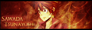 The sawada tsunayoshi sig, I tried making it a little tech like for it. Which explains the computer log data right of tsuna. As for the color, I decide to match it with the render or rather to the anime series. His element basically if you have watched hitman reborn. EDIT 4 @Toyumi; your sebastian signature. . .I'm sorry to say it is not the best sig you made that I seen. Reason is that, the background is chaotic and does not match the render aka Sebastian Michaelis. I know you are going for the vector theme here but its just look weird. Sebastian looks really out of place in that signature. Another thing that i don't like about is the font. The font is hardly readable and does not match the signature. I think you should try having your background to match the render more especially with a vector theme. Also I would suggest using a render that have more action in it instead of a still one. Using still one as vector theme doesn't goes well together. If you were to look at other vector signatures that other people made. The render they use are usually with action or render that is a superhero like spiderman, batman or superman. Reasons for those to come out great is the color choices and also the render itself. Well this is just my advice to you. Here is another signature I did. I decided not to do one that is from anime. There is a bit of white in it but is more on the light blue side. As for the font, I decided to experiment a little with this kind of font.  Comments? EDIT 5 @haseo; sorry I don't know the style of toyumi's, so I thought it is vector. But my opinion will still be the same about sebastian and background does not match. Sebastian standing out is weird still, to me. I could see the text a little but to my eyes it is not really readable. Font color too close to the background or perhaps the text is blend in too well due to the clipping mask text effect. But my view of toyumi's sig being not the best still stand. Also, it is just an opinion. You don't have to go all crazy and upset about it. Everyone tend to get negative comments at times, and everyone view things differently. I am not trying to be mean here, just stating what I think of each person's signatures. @Toyumi; I do not make excuses, when in truth I really do not know what the style is called. Btw your comment just now seems angry along with an attitude problem. And chill already, like I said it is just an OPINION. I know you did not state it is not your best. I am not blind. Anyway the yuuya sig. This is not an excuse nor giving you an attitude problem nor complaining. Just stating what it is. I use stock and tried to render it, which is why it is so pixel. Not easy rendering real life people if you ask me especially the hair. Jeez what is with kids these days. Opinion is just an opinion. Anyway enough with this topic, lets just move on. *sigh in exhaustion and irritation*  |
|
Re: A v y X S i g [The 3rd]
Link |
by
on 2011-07-04 17:57:51 (edited 2011-08-20 15:35:12)
|
|
I don't have any other works to post right now, kind of busy with quite a few things in life right now so I haven't had the time to really work on anything. For now, I'll just comment on Jejechi and Zero's works (Since I've made comments to everyone else's posts in my last post). @ Jejechi- I wouldn't say that you stole some styles, it just seems like you took some ideas from us here and then meshed them together and added your own touch to them. And quite honestly I think that sig is very nice and one of your better works recently. The only thing I have to comment on is the text, like I said in the Rate the Signature Above You thread, white is kind of a generic color and goes with just about anything. Try to experiment with colors for the text. @ Zero- The wallpaper you made is alright, except there are a few things I notice about it. First, I think that you overused the jitter/noise effect (Or whatever it's called) for it. Next, is the text. Like I said to Jejechi before, white is a generic color and goes with just about anything, so experiment more with text colors. Also, with 'The Blue Exorcist' text, white usually doesn't look good as an outline color for text, and this also is true for your wallpaper as well. Try using a darker color than the text is if you want to outline it. The sig is probably the nicest one out of the sigs you have made recently, I really like the flow and the lighting in it. The only thing I have to say about it is the same thing as I said about white text to Jejechi and about your wallpaper, about white being a generic color and to experiment more with text colors. Just kidding guys. It's great to see some people catching onto the series. XD [Edit] @ Zero- The first sig is really nice, personally I think that it's the best out of all the sigs you posted and the rest just kind of go downhill from there. But anyway, I like the color combinations and how you used the C4D's in it. The text looks good, although I would like it even more if the Times wasn't on top of the render. The second sig is good as well, although it seems like you used too many C4D's in it. Try not to go crazy with C4D's and to even things out with some brushes/clipping masks. With the third sig, I really don't understand why there's that blue spot in the middle of the sig. The sig looks good up until there, and then all of a sudden, there's that random blue spot. If you wanted that spot in there, then in my opinion it should be a warm color that goes with the rest of the sig. For the fourth sig, I agree with Ocean that the render was covered up way too much. And honestly, I think the effects you made with C4D's don't look very good, most of them are the same pale white color and it just looks weird in my opinion. And for the fifth one, I agree with Ocean on this one too, and that the lighting needs a lot of work in it. Also, it looks like you kind of reused the same style from the sig above it for this sig as well. @ Ocean- So much stuff in that folder! Well, I'll just make some comments on the whole thing in general. Doing them each individually would take forever. XD For most of them, they're either a hit or miss, you either did really well on them (Like with the Analog Fish, Aqua Timez, Ao no Exorcist, and AnoHana ones) or they're not really good (Like with the Yiruma and Shiki ones). With the ones you didn't do too well on, I suggest backing off a bit with the brushes, colors, or lighting effects, depending on the situation. Even though there are some works in there that aren't too great, there are some works that turned out really good as well, so overall they're not too bad. And I got around to making a new set! This sig was at first an experiment with a few things, but I really liked the way it turned out so I decided to use it. I also made an avy to go along with it since I haven't been in an avy making mood lately. XD Comments? [Edit 2] @ Zero- It doesn't matter whether they were made out of stocks or renders, the same problems that Ocean and I pointed out still apply to them. As for your two newer sigs, the first one has the problem that you pointed out, about one side being darker than the other. Also, I think that the scan lines look kind of weird on that sig, and you probably know how I feel about white text and that it goes with just about anything and to try and use a color other than white. XD As for the second sig, personally I think it's better than the first. Although, there are two things that I think seem out of place. First, why put the tech-like stuff in there when it looks fine without it? In my opinion, I think the sig would look a lot better without it. The second thing I notice that looks out of place is that box thing at the upper left corner of the sig. It wasn't noticeably at first, but now that I see it that box thing looks out of place. And another sig~ Comments, please? [Edit 3] @ Zero- First of all, like Haseo said, I don't even know how you got into your head that my latest sig was a vector sig. I never said that about it being a vector sig, and like Haseo pointed out, it's obviously not a vector. Not knowing the style of the sig really isn't an excuse for thinking that it was a vector, really, because it doesn't necessarily have to be a certain style. Also, I never said anything about my sig being the best either, so you really don't have to keep on pointing out that it's not the best. And honestly, I don't see how Haseo went "all crazy and upset" about it. I think he was merely just trying to educate you and inform you that it wasn't a vector sig (Which, as you now know, it isn't). On a different note, I'd have to agree with Ocean on the render and the text for your Yuuya sig. The render is really pixely and stands out too much because of it, and the stroke effect for the text just makes it too distracting. @ Ocean- Haha, I'm glad you like the coloring! Most of the time though, the coloring is fixed through Gradient Maps and other adjustment layers. Before that, it can look a bit... Weird, for the lack of a better word. XD @ Haseo- Thanks for pointing out that my latest sig isn't a vector! Also, your current vector sig is amazing. XD @ Zero (Tepie)- I can take your request. [Edit 4] @ Ocean- Your latest sig is really good, although there are a few things that could make it a bit better. I think it could be just a bit shorter, right now it kind of seems like it's long just for the sake of being a long sig. >.> Also, maybe you could try to make it a black and white sig? As much as I personally don't like black/white sigs, I think that this one would look good as a black/white sig because of the render. @ Zero- I was only trying to point out and correct a mistake you made, sorry if it offended you somehow. Anyway, moving on. Like what Ocean said about rendering people, there are different ways to work around pixely-ness of a render, you just have to experiment a bit. @ Zero (Tepie)- Your request is done! His eyes looked kind of weird for the avy, so I hope you don't mind the mouth avy. XD I hope you like it! And here are some sigs I made recently. I was being kind of lazy with the text on the Fly Away Stocking sig, so I'm well aware that the text could be better than it currently is. XD I also made a black and white version of the Fly Away Stocking sig (One of the few sigs I decided to make a black/white variation of. I'm not much of a fan of black/white sigs >.>). Like always, any comments? |
|
Re: A v y X S i g [The 3rd]
Link |
by
|
|
weird... didn't realize i could post XD wooops >_> I have been working on organizing my music collection recently (tagging the mp3s for album art and lyrics then organizing them) sooo i dont have any sigs that ive done DX although i do have a giant folder of album art i made if anyone wishes to comment on... note that most of it is the product of a 10 second filter+brush explosion fit to a square and then had a border added so it looks pretty darn terrible -_- http://photobucket.com/umi-no-albumart if anyone has oodles of free time on their hand, they can help me remake the uglier ones? =P only criteria is that it is a square >400px and has a pic of the artist/anime + border + artist/anime name on it. No time limits either XP onto comments: @Haseo lol i was using your focal point comment XD I was trying to create one with colour rather than light just as an experiment =P For your sig, once again i bow to your pro-awesome-sig-making-skills m_-_m the text effect i think is fine although i'd use a different colour maybe? it looks fine as it is though @jejechi gah it looks amazing O___O i don't know what else to say XD @zero zomgsomuch DX lol ok starting from the wallpaper, i think i already commented in chat saying that it was awesome =) next the first sig you have is perfect, i have no complaints... same with the second too actually >_> the third one the text sorta bothers me for some reason, maybe its the font or the stroke effect >.< also theres a lot of empty space i think so it could be shortened a bit. otherwise tis nice for the forth one, the focal point is kinda confusing since the lighting and colour use both draw your eye away from the render the fifth one is nice except for the render looks like its been covered up too much... that may just be the original render though finally for the 6th one i like the colours used but the lighting could use a bit of work since it looks like it should be coming from the left (from the shadows on the render) and below his face (from the lighting on the sig) simultaneously =/ ---------- Edit: Still haven't made anything new >_> sorta creativity deprived recently =/ @Zero If they are stock, you still can edit out the stuff that doesn't fit with your sig. Using blending options and various tools can edit out pretty much anything that you don't want and turn low quality images into higher ones. I once went over a particularly bad image and vectorized the whole thing (which took a good 4 hours). The more effort you put in the better it looks i guess >_> for your hibari sig. I quite like the wispy-flamey effect. The darker side thing probably wouldn't stand out so much it you shortened the sig on that side for the sawada sig the computer log part, while it is techy, it also cuts the flow from your sig. using circuit diagram-y stuff as well as tech-looking circles might have turned out better. I like the colour scheme though =) Also both this and the hibari one have nice font choices For your yuuya sig, i think the image is a bit pixely and perhaps a tad small for my tastes >_> also the font might have been better with a softer glow rather than a stroke to match the awesome background effect stuff =P @Toyumi lol you listed the album art in order of effort put in quite nicely XD the bad ones are indeed a flurry of haphazard effects as you noticed =P As for your sigs i quite like both the sket dance and the sebastian ones you've done =O the only thing i can see off is perhaps the font used in the sket dance one but its a minor detail =P the colouring in both sigs deserves an A+ ---------- Edit2: finally made something... the render had been sitting in my open photoshop window for a good couple weeks now so i figured i should do something with it XD  ---------- Edit3: @Zero i find that when rendering real life people (so long as you use it in something small like a sig), you can make the edges of the hair and whatnot softer/more transparent and somewhat blurred. Since its small no one will notice and it gets rid of that pesky pixel-y look. Also adding smudges or something similar behind your render would both help your render stand out and flow into the sig better. the yuuya sig you have there could use a layer like that since seeing the background effects behind the render (near his hair especially) makes the pixel-y effect worse. not to mention that lighter smudge layers can be used to hide white borders from rushed rendering jobs (thus you don't have to spend so much time rendering)
|
|
Re: A v y X S i g [The 3rd]
Link |
by
on 2011-08-01 14:32:18 |
|
I'm going to have to drop Zero's (tepie's) request; I just don't have the time right now to do it. Sorry. @Zero: Regarding your 4th edit on Toyumi's Sebastian sig, I'm going to have to disagree with you completely. First off, you brought up that it was a vector. It is clearly, not a vector. For comparison purposes, I brought a sig off deviantart made by Candido1225.  Before I get into the comparison, here's a few things about vector sigs. They usually only focus on 2 or 3 tones, all of which reside from the same color, or go well together on the color wheel. Take note on the Dark Samus signature, that there's a blue overtone which is the entire color scheme of the sig. Now if we look at Toyumi's signature I see some purples, oranges, whites, and blacks. Those definitely aren't the same color for a vector. Now you could argue that they're opposite colors which works with the color wheel - but it doesn't with vectors. Now also take a look at the design of the signatures; notice how the dark Samus Signature doesn't really have any shading when it comes to the effect. Compare the effects to Toyumi's signature and they're nothing alike. The only vector-ish component of the Sebastian signature is the pen-tool work, which is found in nearly every vector signature, so that must make it a vector signature, right? Wrong, then pool tool can be used in various ways that aren't just limited to vectors. You say that the vector theme doesn't go well with the sig, and there's a simple answer to that; it's not a vector. Vector signatures are easily distinguished by the lack of shades and colors. You also said the text was pretty hard to read; It is 100% readable.
|
|
Re: A v y X S i g [The 3rd]
Link |
by
on 2011-08-01 22:07:49 |
|
@haseo: it's ok. thx anyway^^ Seems that everyone (including me) is busy lately o.0 So, anyone would like to do my request? hehe... |
|
Re: A v y X S i g [The 3rd]
Link |
by
 on 2011-09-16 12:45:54
 |
|
Uhhh hey? :) Congratulations for a fresh thread. (i know it's late. LOL) You guys are really great. ^^ Great job, guys! :D And I hope you guys still remember me. LOL Anyway, stay safe guys! Continue being awesome and creating amazing works! Again, congratulations!!! ~~~ash :) |
|
Re: A v y X S i g [The 3rd]
Link |
by
on 2011-09-17 07:46:46 |
|
Thank you very much, toyumi-san!! You're great!!^^ and i don't mind with the mouth avy, hehe |
|
Re: A v y X S i g [The 3rd]
Link |
by
|
|
oh my... i dont know when was the last time i posted here... well! i made a brand-new Sig for this coming October  and Edit: I just came up with this idea, Why dont we do a Halloween Avatar/Signature contest? give me some tips plz ^_^ |
|
Re: A v y X S i g [The 3rd]
Link |
by
on 2011-09-24 10:14:08 (edited 2011-10-29 09:48:41)
|
|
@ Ashley- Of course we remember you Ashley! Well, at least I do. Not sure if you know me or not, but that's a different story. XD It's nice to see you pop in, and thanks for the kind words! @ SRT- There have been Halloween contests here before in the past, but I think the ones that have happened in past few years have been cancelled due to the lack of participation. With the forums being so slow as they are now, I don't think it would be such a good idea to have a contest. As for your set, it's okay. Not really good, but not really bad either. Just kind of... Boring, for the lack of a better word. >.> If you want some tips on how to improve, then you should look up some tutorials on sites like deviantArt and follow them. Tutorials give you tons of tips on how to make your works better, and once you've improved and learned from them, you can create your own style and your works will stand out more. It's been awhile since I updated here because things have been slow (Well, not only here but all around the forums), so I'll just post all of the sigs I've made since my last update. With this first one, I got kind of lazy with the test, so I'm well aware of the fact that the text for it could have been better than it is. XD With this one, I was experimenting a bit with some gradient maps. I don't think it came out too bad, but it just feels to me like something is lacking in it. And I can't tell what it is. >.> This sig was a bit of experiment with some C4D's, and needless to say, it kind of failed. XD And this final and my most recent sig failed a bit with it's experiment as well. The light blue parts around it were suppose to be kind of like flames, but now they just look kind of weird. Again, I got lazy with the text so I kind of copied the text style I used from the previous sig. Also, I think it's lacking a bit of depth. >.> Also, I made a wallpaper if you want to make some comments on that as well, although it's on deviantArt. The image there is just a preview of it, but you can get the gist of the wallpaper from it. There's a download for it in both a colored version and a black and white version, if you want to see more details of it or whatnot. Go here for the wallpaper. Well, any comments? Other than the things that I pointed out. >.> [Edit] @ Ocean- Haha, I've been doing about the same with Photoshop lately, using it for school related things. Making a poster on the American System really helps with maintaining one's Photoshop skills. >.> Anyway, more stuff~ This sig took me forever to be satisfied with it, and even now I think that it could still be better, especially with the text. >.> I was quite surprised with how this sig turned out. It was more of an experiment with text at first, and later turned into an experiment with lighting as well. I'm quite fond of this sig and I like how it turned out. This was another experiment, only this time it was an experiment with effects and whatnot. However, unlike the previous sig, I'm not so fond of how this one turned out. >.> And a Halloween sig, this one being much more Halloween-like than the one I had last year. I found this picture of the Mad Hatter from the Alice in Wonderland remake that was done not too long ago, and I thought it was really creepy. And that's the story behind this sig. XD Again, comments? |
|
Re: A v y X S i g [The 3rd]
Link |
by
|
|
hmm probably should be studying or doing the lab I have due in 2 days... oh well =D @ SRT hmm the render choice and positioning is really well done but all-in-all the sig could use a few more effects >_> try just going crazy with blending styles and filters for a bit, perhaps throw in a bit of experimenting with C4Ds and brushes? I did that too a while back and it really helps to realize what effects you like and what not =P @ Toyumi Soo much stuff! DX ok one at a time! first one is really good. the only thing I really see off with the text is the placement of it sorta unbalances the rest of the sig, making the right side look emptier. Other than that though, its awesome-cake-ness =D Second one is good, just the flow on the left side is kinda funky. Maybe cutting that side a tad shorter would do the trick? =/ the effects are really nicely done in that one though The third one isn't a fail XP it has awesome colouring to say the least. The vertical line where it seems like the C4D cut off it kinda strange but other than that its fine last one you were right about the lacking in depth. It looks like it could use just a touch more in-focus effects to add a bit more interest to it as well... The colouring is still awesome though (I'm quite jealous of your mastery of adjustment layers >_>) Finally the wallpaper is really nice. I love the vector-y bursty things XD I can never seem to get them to work with my stuff =( annnnnd I haven't actually made anything =P I've had a Natsume Yuujinchou sig in the making for about 2.5 months now D= perhaps one day I will actually finish it >_> The most I've been able to complete on photoshop is class-related stuff...nothing like cleaning scans of a western blot of sea-monkey proteins to polish one's skills =P
|
|
Re: A v y X S i g [The 3rd]
Link |
by
 on 2011-10-31 05:22:05
 |
|
Hello~ Long time no post. I've neglected photoshop for a while now. Since yea I don't have any computer related subjects anymore. Anyhow everyone's works are as awesome as always. @Toyumi Pwaa those are nice. I do like the C4D effects unfortunately for me and those stuffs can never mix >.> . Hm.. I did this sig recently to get back my skills to help out the claim banners. Just a little experience with light effects xD Opinions would be nice thnx c:  |


|
Re: A v y X S i g [The 3rd]
Link |
by
on 2011-11-04 00:15:14 |
|
@Yuki; Nice sig, though the right side of your sig seems a bit empty despite the added effects and texture. The contrast on your focal is a bit bright. @All; I finally got back into making signatures. Recently I have switched from using Gimp to Photoshop CS3. Please comment some of my latest work that I used in GIMP. Note I am still a beginner to this program. My work might be a bit lacking. ^^ First attempt in using PS:  Second attempt in using PS:  Third attempt in using PS:  Fourth attempt in using PS: 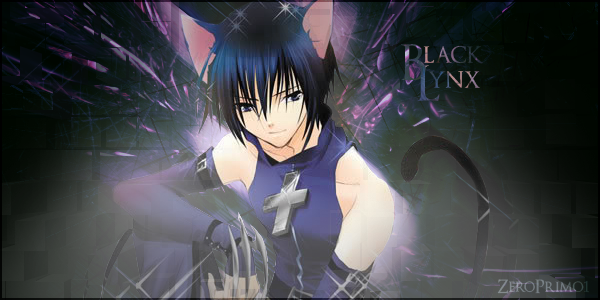 Fifth:  Sixth:  New GIMP works:   |
|
Re: A v y X S i g [The 3rd]
|
| /stalks o: Cool signatures. |