|
Re: A v y X S i g [The 3rd]
Link |
by
|
|
A set i did for risa. ^^ avi:  http://i711.photobucket.com/albums/ww114/CursedKitsuneLove/Avis/RisaFairyAvi.png http://i711.photobucket.com/albums/ww114/CursedKitsuneLove/Avis/RisaFairyAvi.pngSig:  http://i711.photobucket.com/albums/ww114/CursedKitsuneLove/Siggy/RisaFairySig.png http://i711.photobucket.com/albums/ww114/CursedKitsuneLove/Siggy/RisaFairySig.png________________________________________________________________________________ i made this for the YuGiOh fanclub on here:   |
|
Re: A v y X S i g [The 3rd]
Link |
by
|
|
Toyumi: Your "With Love" sig it actually looks better without the text, well to me. Somehow the "with" just seems a bit hard to read since it almost blends in the bg. But I really like it! And the clipping mask are amazing as well O_O. Lillith/Tifa: It's a nice sig, but I suggest for the text, to make it a bit brighter than the render's original color. It just seems to fade in the bg. Hunbby/Holkers: I only have one thing to say. . . I am jealous. Your works are amazing as always. And I just love the Charmed sig! God I love that show when I was growing up. Well here's a first attempt at using a person for a sig. It came out a bit good. Any comments?     |
|
Re: A v y X S i g [The 3rd]
Link |
by
 on 2010-08-26 22:02:37 (edited 2010-08-26 22:03:29)
|
|
Its a long time since I posted in here. I almost nearly forgot how to use photoshop. Poor me. But still am glad some of the techniques I once used stayed in my mind :)) The latest signature I made. NOTE: The girl in the image is not naked (some say its naked so I'm just making this clear) I'll appreciate if you could comment about this one :))   |
|
Re: A v y X S i g [The 3rd]
Link |
by
 on 2010-08-27 03:52:01
 |
|
its been a while that Id visited this thread :] im just visiting here to inform that we had created a Gendou Club at Deviantart. If you want to join and display your sets, pls feel free to join. Im going to overhaul the whole club this coming saturday xDD Gendou Club at Deviant Art Just be aware that were not accepting 1 sig or 1 avy but rather we want it to be compiled in 10's or 5's. Thanks for reading :]    You can visit me there!! |
|
Re: A v y X S i g [The 3rd]
Link |
by
 on 2010-08-27 05:52:30 (edited 2010-08-27 06:04:47)
|
|
@Toyumi thanks for the comments... i knew the plain black background on the sig doesn't really help... will take note of your suggestions.. thanks @Ich yey.. i will join.. ^^  |
|
Re: A v y X S i g [The 3rd]
Link |
by
 on 2010-08-28 17:43:05 (edited 2010-08-30 17:14:46)
|
|
@ Tifa- That's a nice sig. The text seems a bit dark to me, and I also suggest making the sig smaller since it's a bit plain on the left side, but other than that it's nice. And with the icon, that's really nice! The text is nicely placed, but the one thing that bothers me is how the hair and rest of the render get weird in that box where the text is. @ Sayuri- Thanks! And I think it would have been better without text too, but I felt like I had to put something on there. Don't ask me why, I just like it needed some sort of text. XD And for the sig in "Smiling for you" set, it's nice except for a few things. First, the render looks skinny/unnatural, and that looks weird. The next thing is the pattern in the background, it stands out too much. Putting it on something like soft light or overlay and lowering the opacity would take care of that. The next thing that bothers me is the clipping mask, since it stands out too much, but then again the pattern in the background could be making it that way. For the sig in your "Only for you" set, the background is very nice, but the render should blend into it better. What would look really nice on this is either making a copy of the render and stroking the bottom copy, or making a copy of it and using color overlay to fill the bottom copy with a nice color, then moving that layer over a bit, and then for an even better effect put a drop shadow on the bottom layer too. @ Shae- That set is very nice! The avy is really good, and the sig is very good as well. I like how you placed the text in it as well. @ Ich- Joined, and I plan to get some of my sigs there soon. Well, here's a set I made recently. I was trying out a new technique with this one and I think it turned out okay. Well anyway, like always, don't be afraid to comment!   [Edit] @ GM- Your first sig is very nice! The color combination is nice, and the text is okay too. The only thing that I would suggest is to make is a bit smaller towards the right side of the sig. Your second sig looks nice too, but it's way too bright (I can hardly see the render and a lot of the effects in it). I would suggest to put some sort of layer on top of it to make it darker. (What kind of layer is up to you to find out, I'm not very good with that sort of thing. Just do something that makes it look nicer and not as bright. XD) With your third sig, it's nice except for the brushes in the background and the text. The brushes you used don't really seem to go with the sig, and the font used for the text isn't a good one for the sig. And with your last sig, the effects and stuff are nice, but they seem dark in a way, whereas the rest of the sig gives off a lighter feeling (I don't know how else to describe it XD). Also, the text would look nicer if the font used for 'Maiden' was the same as the one used for 'fallen' (Or one that looks nice with the font you used for 'fallen'). [Edit 2] @ Tifa- The sig is nice, but like what Zero said the render seems stretched. Also, a lot of your sigs seem to be following the same style lately, you might want to change it up and experiment a bit. @ Zero- All of them are nice, I especially like the last one. But there are a few things that bother me. The first one is that the text for the first four seem to follow the same style, and you didn't really experiment with fonts until the last one. (Although I know I have a problem with this too XD) The other problem I have is that all of those sigs seem to follow the same style. Try to change it up a bit. Sure the sigs you make with that style are nice, but it can get boring after awhile (I don't really know how else to describe it XD). Oh and another set!    |
|
Re: A v y X S i g [The 3rd]
Link |
by
 on 2010-08-29 05:29:37
 |
|
its been a while.. i miss this thread ;_; anyway.. just a quick posting, i'll edit later... okay, some of my new works:      |
|
Re: A v y X S i g [The 3rd]
Link |
by
|
something i made for rabbit: i'm trying ^^ |
|
Re: A v y X S i g [The 3rd]
Link |
by
 on 2010-08-29 17:57:51 (edited 2010-09-02 16:42:58)
|
|
@toyumi, nice set, you are getting a lot better. Like the way you made the font at least better than the ones you tend to use all the time. keep up the good work. One thing though is the avi. The border kind of bother me. Perhaps you should make the border bevel or use the colour light blue to match the sig and the avi itself. @GM: Nice one, but the first sig seem a bit blurry especially the render. As for your second sig, too bright; tone done the lighting a bit. As for your third sig. . .no comment XD @Tifa: you have improve, you should try having your set around over 300 px in width a bit. Also the render, still a bit stretched, try anchoring the width and height when you resize the render. @Shae, I think I already commented that sig in the chat. Change your sub-font to the colour gold or golden orange might look better the current colour you are using. Still good sig Here are a few sigs I made.       EDIT Made few more sigs, the first one is an attempt to try use real live people into a set. Please comment.   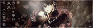      Don't ask me about silex set, for she requested the words.  |
|
Re: A v y X S i g [The 3rd]
|
|
@Zero your first and 4th sigs, the text seems to blend in with the sig a little too much, and with all of them you seem to do the same with the text. I would suggest using different text based on the feel of the sig. Catching on to the same text for different sigs will make your style feel stale. Anyway, I made a few sigs (I might make a matching avy if I'm not lazy), so here they are:     ↑ the 4th one is my new style, I might make another tut, dunno.  |
|
Re: A v y X S i g [The 3rd]
Link |
by
 on 2010-09-01 18:37:06
 |
|
/cracks knuckles time for comments yo. I'm only commenting on what I can see while posting, forgive me if I don't comment on you. @GM: That's waaaaaaaay too many clipping masks on the Kaito one, it's chaotic, and distracting. I wouldn't recommend brushing that much. Also, I don't know what you're using for the clipping mask, but use applied images, it'll look better. @Tifa: It looks like you use the same technique over and over again. I suggest you look up tuts for whatever program you use, on either google or deviantart; they both have an abundance of tutorials on a whole range of techniques that will help you in the long run. @Zero: Same goes for you with the tuts, you seem to have a very repetitive style, using the same technique every time. I for one, use the same techniques sometimes, but I use them in different ways. As a GFX artist, it's better not to memorize one way of making a sig, and learn the capacity of your program and it's filters, that way, you can improv effects but still know what you're doing. @Naru: [insert what was typed above] ._. AND NOW, WHAT YOU'VE BEEN WAITING FOR, A NEW SIG, BY HASEO!!!  

|
|
Re: A v y X S i g [The 3rd]
Link |
by
on 2010-09-03 06:53:33 |
|
@ Haseo- No, I don't think I was waiting for one of your sigs. XD But, still it is very nice! The text is very nice, but the only thing that bothers me about it is that it's pushed over to the corner of the sig. Putting it closer to the render would have looked nicer. @ Naru- I have to agree with Haseo, all of your sigs have had the same styles lately. But besides that, they all look nice except for the last one. With that one, the background is too complicated. And with your "Vessel of Stars" sig, the text would look better if it was in a different font. That font doesn't go with the rest of the sig. @ Zero- All of those sets are very nice! You strayed from your style with them, which is good (Although you can see hints of it in the last two sets, but it's not too obvious). Oh and I made a new set due to my Dragon Quest IX addiction at the moment, using Stella (Which is why the text is 'Stellar' XD). I was trying to get a fairy-ish/starry feel, I think I succeeded with that too. Well anyway, please comment! (And I know the avy is a bit weird, but if I placed it horizontally all you could have seen besides Stella's face was a part of her wing XD)   |
|
Re: A v y X S i g [The 3rd]
Link |
by
on 2010-09-03 07:00:48 |
|
@haseo: the smudging is godlike.. ;___; teach me~ @toyumi: my eyes is filled by a sea of stars @__@ @naru: [insert haseo's word], but the vessel of star is nice :3 anyway... due to some class skipping, i've made some new one    |
|
Re: A v y X S i g [The 3rd]
Link |
by
|
|
blaah i've been soo busy lately >.< pretty much traveled across a country and did a mad-dash prep for university... thus my absence here everyones works look really nice =) i think all the stuff i would have had to say has been said already XP and i also made this sig... the reason it looks rushed is because... well it was rushed DX  EDIT: @ Jejechi that claim set looks amazing O_o its really well done =P On another note, all day i was trapped inside with no internet (stupid hurricane >_<) soo i made a couple sigs   Comments please! i haven't done anything animated for a long time now... i think it needs slowing down DX 
 |
|
Re: A v y X S i g [The 3rd]
|
|
hi guys. finally i'm back. you guys sure have made many awesome signatures. *salute* i've made my claim banner and icon. the banner is quite large. i need some advices, because this is the 1st time i used C4Ds. :D   @GM: i always love your work. especially the new one, the 1st one. :D you always have a nice lighting on your siggies. *salute* @Haseo: that. is. awesome. i love the colors. XD @Zero: all of 'em is nice. especially the Kamui one. i like the effects. XD @Toyumi: i like the Pink set. that is just gorgeous. i like the font effect. XD @Ocean: the Break siggy. quite nice, but yeah. it was rushed ;-; but it's nice though. |
|
Re: A v y X S i g [The 3rd]
Link |
by
|
|
Zero: The light source on the current sig you're using is a bit bothering. It just seems to make the render brighter than it needs to be. Naru: Your last sig, I want to try out the tut for it. It seems like a lot of fun. XD Haseo: I have to agree with Toyumi, the text seems so lonely a bit. Toyumi: I like the stellar set. But the brightness in the font is a bit blinding. Other than that I like it overall. GM: The shattered into pieces is really cute, though maybe you should have the sig shattered so it goes with the text. Ocean: O_O I notice something glowing in your second sig. Am I just imaging it? Jejechi: Is that really your first time using a C4D D:! It's really good and everything! Kay. So this weekend I had no internet, which meant do homework. Well I did do that, but then I got lazy and decided to make some fun sets. Comments anyone?       Using Naru's tut, I made that sig.   Using Toyumi's tut, I made that sig.   |
|
Re: A v y X S i g [The 3rd]
Link |
by
on 2010-09-10 15:52:30 |
|
@Jejechi, nice claim banner, though a bit too big. lol going to comment on your main sig. It's nice, it would seem you took the second sig tutorial. But why did you set the render to dissolve I wonder. Oh well, awesome sig as always. @sayuri: the first sig is alright, but the text is just too big the one with " Searching for you". Your second sig:the image is too stretched from what I can tell. Try anchoring the width and height before scaling the render. Again the text is too big, along with the background colour, it just doesn't seem to flow Your third sig: Not much to comment on this one, since it's one of the best i've seen so far from all your work. Your fourth: The render seem out of place, try to blend the render with the background a bit more. Try using gradient map. When doing text, have one that is of main text to be big, since you like font to be big, but have a sub-text to balance it out. The sub-text must not be big that is the only thing. As for your fifth sig, dunno why but your sig seemed squished for some reason, not sure how other see it. But good work, experiment with the font by choosing a certain layer mode that best match the sig. K here is another attempt at making real live sig.     |
|
Re: A v y X S i g [The 3rd]
Link |
by
 on 2010-09-10 15:58:10 (edited 2010-09-10 16:11:09)
|
|
Heya! Was wondering if anyone here could make a set for me with this image. For the sig, any suitable phrases will do. Thanks in advance! Edit : Okay Haseo, I fixed the link. =D 


|
|
Re: A v y X S i g [The 3rd]
Link |
by
on 2010-09-10 16:06:08 |
|
Ill take Eufo's request; also, Eufo, that picture isn't working. It gives me a no hotlinking image instead.
|
|
Re: A v y X S i g [The 3rd]
Link |
by
on 2010-09-11 08:07:54 (edited 2010-09-13 12:01:23)
|
|
Finally I can post again. XD @ GM- Is that a good or a bad thing? XD Well, for the sigs you posted, the first one is very nice. It's simple, but that's a good thing! Plus it's different from the style you've been using recently. For the second one, the lighting is really nice. I would try to make the render blend in more to the background, but that's about it. The third one's really good too, but the text seems out of place since it's so far out. @ Ocean- Rushed sig is rushed. It's messy XD But the other two are very nice! I really love the glow-ish thingy in the "Fallen" sig! @ Jejechi- That's your first time using C4D's? It's very nice! The only thing I can say about the claim set is that the text is hard to read in the icon. Other than that it's really nice! @ Sayuri- Your first sig just seems too pink and purple-ish, not much variation in colors there. Zero's right about the text being too big, and the Cheesecake over to the right side of it seems out of place. And the clipping masks on the left side are a bit too big as well and they distract the attention from the rest of the sig. Your second sig is really long, and that's what makes it seem kind of bland to me (There's so much length, but there isn't really much there in all that space). Zero's also right about this one being stretched, and he's also right about it not seeming to flow. I think the size of the text is fine, but the font doesn't seem to go with the rest of the sig. Your third sig is better than the first two, the clipping masks are a lot nicer, but I would have put a different border on it (Since you can see some of the sig to the left of the clipping masks and it looks kind of weird). I think the stroke on the text looks weird, keeping it simple but stroking it in black at 1 px would look nicer. The rest of the sig is nice, although the avy concerns me with the clipping masks. I know I'm not very good at avys, but the two eyes in the different places just looks weird. Your fourth sig is really nice, I already commented on it in the tut thread. I'm not going to repeat myself. XD Your fifth sig is very nice, I like the effects in it and the text seems good as well. The Sayu on the rectangle part isn't tilted in the same direction as the rectangle, but that's just a small detail I noticed. But it's still a nice sig. XD @ Zero- Your first sig is nice, the lighting and text both look good. Not much I can say about it. XD Your second sig is too dark, do something to fix that. The colors blend in too much, and since they're all dark colors it's making the entire sig seem way too dark. Also, the main text (The "Forever Alone") seems a bit too big. The text in the avy also looks a bit weird, the capital Z in Zero. Changing it to a lower case would probably look better. Alright, so here's the set I've been using for awhile.   And here's a set request I got from Fenris. It's one of the first sigs I've made in awhile that's 400 px in width. XD   Here's the one that I've wanted to make for awhile but never had the opportunity to do so until today. XD   [Edit] @ Naru- It's Yui in that sig. And I'm surprised that you even saw that spot of blue. I had to have one of my friends show me where it was since I couldn't even see it. XD Anyway, your first sig is nice. The background looks good, and so does the text. The only thing I can say would be to make the render blend into the sig more. With the second one, it's very distracting in the sig. Try to make the sigs have the least amount of words as possible. But the background is nice and the render blends into it very nicely. And with your third sig, the render is really sharp here too (I think it's sharper than the second one). The background here seems a bit messy, and the text seems out of place (Especially since you're using too different colors and fonts for each of the texts). Again, try to have the least amount of words as possible. @ Jejechi- Thanks! And the BRS sig is very nice! But all that white toward the left makes it seem really blank, especially when comparing it to the nicely smudged and detailed right side (I love the checkerboard detail over the smudging!). Maybe you could move the text over and then make the sig smaller, or put some clipping masks or more smudging over to the left side. But it's still very nice! @ Shae- That's a very nice sig! Naru and Jejechi are right about it being too sharp, but it's still very nice. The text looks really good and so does the background. |