|
Re: A v y X S i g [ 002 ]
Link |
by
|
|
hmmm sure! Send it Ash ^^   |
|
Re: A v y X S i g [ 002 ]
Link |
by
  on 2008-09-08 14:34:29
 |
still waiting for amar's contest. i think imma join it, after knowing the theme first of course. XD   |
|
Re: A v y X S i g [ 002 ]
|
|
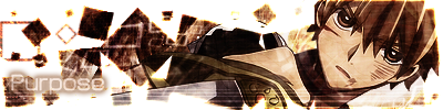
For non Animated Division Mjia   Appearance : 23.5 22 render used for the set was nice, too bad it wasn't manipulated well for each usage. Background was too plain... the set looks empty. And no... you can't call it "simplicity". 25 Render's size should be bigger so it'll fill more of the canvas and wont make the left side feels a bit plain. and the background is a bit too plain. Add something as the background.. Maybe some patterns would do. Quality of the render: 13.5 17 I dunno the original size of the render... but if in that size it is quite good... then it must be from a larger size... 10 Hmmm, THe render is a bit blurry... Should be sharpened a bit and it should be fine.. Colour Scheme: 4.5 4 blue + white + purple was alright... but then the yellow ruined it.. 5 The usage of Gradient maps is highly recommended to compensate the blue majority, so there'll be a balance between warm colour and cool colour Text usage: 8.5 10 since the stroke on the text is dark... it is noticeable... positioning is not quite right since it draws the attention from the oh-so little render. Hmm.. "smile always" is it the same as "always smile?" 7 You use black stroke on white text which is quite impressive and it will make the text noticable.. However, the font is too big that it make your main render to be unnoticable. And the text should be closely placed near the main render so that it'll look like both of them are correlated. Overall: 52/100 Comment: Try to practice more... learn from these "not-really-meant-as-mean" comments... and yeah... never giving up=win. You are on your way. Read more tutorials regarding the usage of gradient maps and Text placements ^^ And keep practicing, You can do it! Scarlett   Appearance: 29 30 render manipulation is present, brushwork was kinda sloppy but was fine, sig kinda empty on the right cause of the size... placement was alright... no overlapping... 28 Impressive way to blend the image.. Smudging tools are quite handy sometimes.. And the render placement is very unique in a good way. But the minus part or the downside of this positioning is the right part looked empty.. Perhaps you should try to use some effects to fill the left part. And oh yeah, about the avatar, There's a bit of space on the left part.. maybe you should cut it so it wont be redundant. The avatar is lacking of good BG. Render Quality: 13 11 not so good render used... or did the file type did that? 15 Hmmm, The render is quite good, however the effect made it,, Uhhh,, Rather choppy and grainy.. Well,, Im guessing it's a filter effect is it? Color Scheme: 6.5 8 color is balanced... the sig render is kinda too sharp... teh soft bg clashes with it... 5 the blue colour is dominating.. Which Well,, Make a very high contrass as well as high brightness.. Maybe lowering the brightness a little bit and adding Warm photofilter will do Text: 12.5 11 ava text = not covering anything... sig text= needs more "poof" to it.. XD and positioning... dun forget about placing it right. 14 For signature.. Hmmm.. The text is placed quite right.. just need to be a bit closer, and delete the empty hollow part ^^ as the avatar, Somehow,, It just doesnt match.. The font I mean.. Overall: 61/100 Comment: try saving in either .png or .tiff for better quality results... not bad for a beginner. Learn more and you could do more... XD You need to work on the effect used on the main render.. It's creative enough to use the filter gallery.. However, try and messing around with blur, motion blur and sharpen tools to make background. They are more effective I Believe ^^. As for the avatar.. Just turn it abit diagonally to give it this dynamic look to go ^^ Ayu   Appearance: 34.5 39 hmm.. the set is nice... the placement of render is kinda unique in a common way... XDD ... ayu-brushwork = well done, it wasn't too cluttered yet really not empty. Somewhere in teh border I can see a semi-sloppy line... erk... 30 Wow, Sure is nice.. But Hmmm,, The background is too distracting... Perhaps a Blur filter is necessary to blur out the background, and more sharpening on the main render Quality: 17.5 17 render looked like it was sponged... erk... it lack teh "luster" I am looking for.. XD 18 awesome choice of render, I Cant say much, but Hmmm,, something is missing there.. Not quite sure what though Color Scheme: 9 10 balance was met... not too "ouch" to the eyes... it is relaxing... 8 Agree,, The balance is quite astounding.. You didnt use any Grad maps? You sure have an eye for colours.. but the purpleness is too overpowering.. Reduce it a bit Text: 19 18 placement = nice... usage of word = win .. the stroke on the ava text is blended well with the avatar. 20 The placement is perfect, It's shown clearly, yet hardly any stroke is visible.. That's awesome technique you got there... The text is closely placed near the main render which is a plus point. Keep it short and simple.. Great one and I'm impressed Overall: 80/100 Comment: erk... should I give one??? Hmm... try a style change perhaps??? hmm.. explore new ways.. XDD Comment: Dont rely much on brushing, Other than that.. Nice work ^^ Really nice one I must say Dfly   Appearance: 38 36 the only thing that my eye saw kinda not quite right was teh avatar... erk.. what happened to teh render? light effect = awesome 40 The signature is magnificent.. Too bad the avatar turned me off... She looked kinda choked in the avatar .-. or is it just me? overall, they are all great. Except for some parts in the signature that looked a bit out of place like the shadow.. Well, Somehow that just doesnt feel right.. Dunno why Quality: 18.5 17 I should've given you a perfect score... but... teh avatar... erk... >.> 20 The render looked good enough for me, in fact, it's a Great render Color Scheme: 9 10 cold colors did well with your style... 8 You might want to add few warm colours on the avatar ^^;; She looked like she's drowned underwater Text: 15 16 blending wasn't that performed well.. message = shown in the pic but not really felt... 14 The text shouldnt be that far from the focal point >.> otherwise it could distract the flow. You should place it on the right instead on the left. Overall: 80.5/100 Comment: more power to your style... limitations are myths for our imagination.. XDD I notice that your style has changed quite a lot since like, 2-3 months ago ^^ In a really good way, keep it up! Saru   Appearance: 34 35 avatar too sharp since it dun have anything to go with... the sig's well done... brushwork = clean... not so empty yet it feels fine... 33 Wow.. So bright both of the avatar and the signature.. They are quite good.. But too bright >.> sure made the render stands out, but the usage of Light source is very recommended XDD Maybe from behind? Dunno Quality: 17 18 only the avatar is the problem again.. it kinda too much for teh eyes... XDD 16 it's kinda blurry.. From Filter effect I Presume.. Hmmmm, Too much blurring perhaps? lol Color Scheme: 9.5 9 a gradient of orange shade + green shade... it will work only if one didn't overlap the other... 10 Nice colour scheme... Right side is orange, while the left side is green.. now that's creative Text: 17.5 17 blending = splendid... the message itself was the problem... XD 18 Impressive, you made the emphasize using different font and colour... That's one way to put emphasize I must say. Well done Overall: 78/100 Comment: try manipulating both sides equally... like an equation.. XD Try reducing the brightness a bit, and Oh.. The main focal point of the signature shouldnt be blurred, instead Sharpen it ^^ Sena   Appearance: 31 32 blending wasn't done well... by reducing the opacity... the render was quite non-attention drawing... positiong was nice... avatar emptyness was the problem... border was too plain... it didn't work with your colors... 30 for the avatar, the left part is a bit too,, empty,, You should fill it out more with brushworks. For the signature, it's awesome.. a bit blurry, but still great. You make the sig with small size to fill everypart of it. Great job there. Quality: 13 14 hmm... the manipulation and the saving did most of the problem.. if you're gonna save it in .jpg... be sure to set it to the max level in order to attain high quality graphics... (same goes for scar~awr) 12 Hmmm, The manipulation kinda ruined the quality of the render >.>.. and yeah.. You should save it in the form of .jpg in max quality.. But then again, .png is more recommended Color Scheme: 8.5 9 the only thing I see not right is the dark blue in the avatar... 8 Hmmmm, It's almost perfect, the colours go very smooth, but needs more warm colours definitely to even things up. as for the avatar Text: 13,5 12 too transparent the name in the avatar... quite hard to read.. same message theme... in a different idea way... 15 The Glow doesnt looked good >.> it ruined the overall text.. but, yeah the placement is great, it goes well with the font and the overall sig. Overall: 66/100 Comment: try improving on blending styles and borders... quality check after saving is a must. work on your effects, as the technique you use reduce the quality for a bit. Snazzy technique is good on sigs, but Quality always Come First For animated ----------- Aolas -----------   creativity--> 35 quality --> 11.5 s & l --> 17.5 relevance --> 8 total --> 72 the avatar is too simple the animation in the sig also simple, and unfortunately it is not very attractive. but, to be honest, it is kinda creative. ----------- Amar -----------   creativity--> 35.5 quality --> 13.5 s & l --> 16 relevance --> 8 total --> 73 well, it may looks like just another blinking-eye animation. but hey! it's winking too ^_^. unfortunately not pretty smooth ----------- Rin -----------   creativity--> 36.5 quality --> 19.5 s & l --> 19 relevance --> 8 total --> 85 the avatar is neat and in pretty good quality the animation is simple , but it is pretty smooth and the heart animation does give a good impression COMMENTS by Ich: ill make a mass comment bout the works, its too "simple" I know its hard to make any animation bout this one since there are no certain ideas bout maids but the animation I saw was too simple thats all. WINNER! Fabey (Dfly) for the non-animated Rin for the animated Congrats! Here's the awards:    |
|
Re: A v y X S i g [ 002 ]
|
|
1. Claim an anime/manga/game (If the claim is made, no other can claim the same anime or manga or game) Person1: Claim: Kingdom Hearts(Game) Type: Animated and Non-Animated Person2: Claim: Kingdom Hearts(Manga) Type: Animated 3.Gendou avatar and signature sizes must be followed. 4.As much as possible, everyone can join even Ich 5.A person can join both Animated or Non-Animated as long as the avatar and signature entry they passed is on the same Anime/Manga/Game they claimed 6.Entries must submitted here too in thread. Entries send via PM will be ignored. 7.If you posted your entry and wish to redo it just delete the old post, then post a new one and you must put a note that you changed your set. 8.Changing of claims and the type of entry you are passing is allowed just make a post of a change of claim. 9.Claiming is a first come first serve basis. 10.Everyone can join. 11.The prizes contains a champion,a 1st runner-up,a 2nd runner-up, and a 3rdrunner-up. Since Animated has less participants I will only make a champion. 12.The claiming details are written below: Claim: (Name of Anime/Game/Manga) - (State what type is it. Is it an Anime/Manga/Game) Type of set you are doing: (Animated/Non-Animated/Both) For animated, creativity, size of the file, smoothness of the animation, and quality of the set itself Sorry that I'm not good in English and HTML Any questions about the event? You may ask your questions here in the thread or PM me... To @aolas:The theme is techincally any anime/manga/game you want and make a set out of it. Yes you can join both. Non-Animated: Amar Kira Ashley Animated: Amar |
|
Re: A v y X S i g [ 002 ]
Link |
by
on 2008-09-09 04:51:44 (edited 2008-09-25 14:19:38)
|
|
So liek EDIT : Claim : Saiyuki Type : Non-Animated. Hope to not back out this time ~   |
|
Re: A v y X S i g [ 002 ]
|
|
mmmmmmmmhm.. Lesseeeee... Claim: Touhou Series (Game) Type: non-animated |
|
Re: A v y X S i g [ 002 ]
Link |
by
|
|
Should i clam Kh or Code Geass? >w< Claim: Code Geass [anime] Type: animated I will try this type out >w< |
|
Re: A v y X S i g [ 002 ]
Link |
by
|
|
ugh, lost again >< ooo okay next contest here i come!!! @amar:anoo amar-san, can you give more explanation about the theme... anyway i will claim: Hayate no Gotoku (anime) umm can i join in both contest? if not i'll join the animated one...  visit aolas.soup.io for your usual dose of seiyuu pics |
|
Re: A v y X S i g [ 002 ]
Link |
by
 on 2008-09-10 04:50:29
 |
|
Ah, contest. can i be a judge? if not, well, ok. @dfly: on the way! :D |
|
Re: A v y X S i g [ 002 ]
Link |
by
|
|
@Renma:Thanz for the comment,i'll surely practice more. @Rin and Dfly:Congrats!! well,i wanna join the competition held by Amar too.^^ Claim: Gundam Seed Type: non-animated Try my best!! 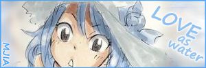


 |
|
Re: A v y X S i g [ 002 ]
Link |
by
 on 2008-09-12 10:20:53
 |
|
=O!! I wanted to congratulate xD so now I do it xD Gratz Df and Rin :DD~~~ 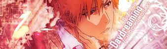
 |
|
Re: A v y X S i g [ 002 ]
Link |
by
 on 2008-09-12 15:05:46
 |
|
ooh...so this is the thread amar told me...ok now that i found it...XD good luck to the contestants!  |
|
Re: A v y X S i g [ 002 ]
Link |
by
 on 2008-09-13 18:49:51 (edited 2008-09-13 22:23:39)
|
|
Prince of Persia-Game Non animated    |
|
Re: A v y X S i g [ 002 ]
Link |
by
|
|
done! My animated dotes aren't good so let's test X3~  the url =http://i95.photobucket.com/albums/l153/fabiana_seto/sotmlulu-1.gif The sig  the url= http://i95.photobucket.com/albums/l153/fabiana_seto/sotmlulu.png |
|
Re: A v y X S i g [ 002 ]
Link |
by
 | |
|
SHAAARE! :) for the love of HYDE, I made an avatar-iconic thinga~ ♥ :3 ~
↑ oh he just kissed me! *u* did you see? +___+ ~ .keeps dreaming. ----- btw, thanks guys! >:D<    m y . L i F E . i . t r a d e . i n . f o r . y o u r . P A i N . |

|
Re: A v y X S i g [ 002 ]
Link |
by
|
|
OMG Hyyyyyyyde~ he is kissing <3333~ Thanks for the share Rin! Great work ;'D |
|
Re: A v y X S i g [ 002 ]
Link |
by
|
|
It's time to save the club~!! >__O I was searching for the thread. And I found it wasn't on the first page.. So I saved it ^^; Even though I am not yet a member here, am I allowed to share my works with the club? .__.' I wanna learn and improve with teh professionals here ^^; EDIT: zomg Hyde's hawt after he kissed. lawl XD   |
|
Re: A v y X S i g [ 002 ]
Link |
by Wanoooonie
on 2008-09-18 10:42:29 (edited 2008-09-19 00:00:50)
|
|
OMG Ayuuu~ O_O awesomeeee~ i'd like to join the contest too. Claim: Fate/stay night Type: Non-animated teh first contest i've ever joined >_O done, not very well made tho xD:  and  |
|
Re: A v y X S i g [ 002 ]
Link |
by
|
 Wanii~tan and Yatt~chi O__O nuuu~ >.< *got squished again* x_X Wanii~tan and Yatt~chi O__O nuuu~ >.< *got squished again* x_X |
|
Re: A v y X S i g [ 002 ]
Link |
by
 on 2008-09-19 06:17:45
 |
so another event here again?? just passing by xP    You can visit me there!! |